Security News
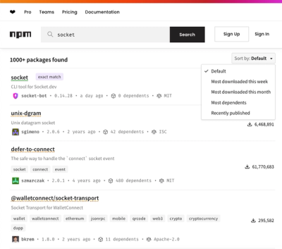
npm Updates Search Experience with New Objective Sorting Options
npm has a revamped search experience with new, more transparent sorting options—Relevance, Downloads, Dependents, and Publish Date.
@zendeskgarden/react-theming
Advanced tools
Theming utilities and components within the Garden Design System


The Theming package includes several utility components relating to theming and RTL capabilities in the Garden Design System.
npm install @zendeskgarden/react-theming
The ThemeProvider component can be used to apply granular theming to
Garden (and custom) components as well as providing a RTL context.
It is intended to be used at the root of an application to provide a global context for RTL.
ThemeProvider components can be nested within each other for areas that require
additional, custom theming.
All themes are auto-prefixed and has access to the props provided to the component.
import ThemeProvider from '@zendeskgarden/react-theming/ThemeProvider';
import Notification from '@zendeskgarden/react-notifications/Notification';

const theme = {
  'notification': `
    color: red;

    :hover {
      color: blue;
    }
  `
}

<ThemeProvider styles={theme}>
  <Notification>
    This notification content will have custom styling.
  </Notification>
</ThemeProvider>
import ThemeProvider from '@zendeskgarden/react-theming/ThemeProvider';
import Notification from '@zendeskgarden/react-notifications/Notification';

<ThemeProvider rtl>
  <Notification>This notification content will have custom styling.</Notification>
</ThemeProvider>;
The withTheme HOC utility
allows any component to interact with its ThemeProvider.
import withTheme from '@zendeskgarden/react-theming/withTheme';

const StyledDiv = ({ theme, children }) => (
  <div style={{ direction: theme.rtl ? 'rtl' : 'ltr' }}>{children}</div>
);

const LocalizedComponent = withTheme(StyledDiv);

<ThemeProvider rtl>
  <LocalizedComponent>RTL localizable</LocalizedComponent>
</ThemeProvider>;
You can change the target location that style-components injects its CSS into e.g. if you're using an iframe or shadow DOM.
import ThemeProvider from '@zendeskgarden/react-theming/ThemeProvider';
import Notification from '@zendeskgarden/react-notifications/Notification';

<ThemeProvider target={document.querySelector('.some-element')}>
  <Notification>This notification content will have custom styling.</Notification>
</ThemeProvider>;
Theming is meant to be used for small, global changes to a component (i.e accent color, padding changes, etc.)
If you find yourself "skinning" a component, it may be much easier (and maintainable)
if you were to create these presentation assets as standalone components and use
them with our advanced Container abstractions.
FAQs
Theming utilities and components within the Garden Design System
The npm package @zendeskgarden/react-theming receives a total of 74,933 weekly downloads. As such, @zendeskgarden/react-theming popularity was classified as popular.
We found that @zendeskgarden/react-theming demonstrated a healthy version release cadence and project activity because the last version was released less than a year ago. It has 1 open source maintainer collaborating on the project.
Did you know?

Socket for GitHub automatically highlights issues in each pull request and monitors the health of all your open source dependencies. Discover the contents of your packages and block harmful activity before you install or update your dependencies.

Security News
npm has a revamped search experience with new, more transparent sorting options—Relevance, Downloads, Dependents, and Publish Date.

Security News
A supply chain attack has been detected in versions 1.95.6 and 1.95.7 of the popular @solana/web3.js library.

Research
Security News
A malicious npm package targets Solana developers, rerouting funds in 2% of transactions to a hardcoded address.