Security News
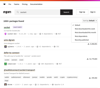
npm Updates Search Experience with New Objective Sorting Options
npm has a revamped search experience with new, more transparent sorting options—Relevance, Downloads, Dependents, and Publish Date.
angular-bootstrap-confirm
Advanced tools
Displays a bootstrap confirmation popover when clicking the given element.
A simple angular directive to display a bootstrap styled confirmation popover when an element is clicked.
Pull requests are welcome.
The calendar has a few dependencies, these are as follows, and must be included BEFORE the plugin files:
You can install through bower:
bower install --save angular-bootstrap-confirm
You will then need to include the JS files for the plugin:
<script src="bower_components/angular-bootstrap-confirm/dist/angular-bootstrap-confirm.min.js"></script>
And finally add the module dependency in your AngularJS app:
angular.module('myModule', ['mwl.confirm']);
Alternatively you can install through npm:
npm install --save angular-bootstrap-confirm
Then add as a dependency to your app:
angular.module('myApp', [require('angular-bootstrap-confirm')]);
There is a single directive exposed to create the confirmation popover, use it like so:
<button
  class="btn btn-default"
  mwl-confirm
  title="{{ title }}"
  message="{{ message }}"
  confirm-text="{{ confirmText }}"
  cancel-text="{{ cancelText }}"
  placement="{{ placement }}"
  on-confirm="confirmClicked = true"
  on-cancel="cancelClicked = true"
  confirm-button-type="danger"
  cancel-button-type="default">
  Click me!
</button>
An explanation of the properties is as follows:
The title of the popover. This value is interpolated. Note, if you use an expression, you may want to consider using "data-title" instead of "title" so that the browser doesn't show native tooltips with the angular expression listed.
The body text of the popover. This value is interpolated.
The text of the confirm button. This value is interpolated. Default "Confirm"
The text of the cancel button. This value is interpolated. Default "Cancel"
The placement of the popover. This value is interpolated. It can be either "top", "right", "bottom" or "left". Default "top"
An angular expression that is called when the confirm button is clicked.
An angular expression that is called when the cancel button is clicked.
The bootstrap button type of the confirm button. This value is interpolated. It can be any supported bootstrap color type e.g. default, warning, danger etc. Default "success"
The bootstrap button type of the cancel button. This value is interpolated. It can be any supported bootstrap color type e.g. default, warning, danger etc. Default "default"
A 2-way bound variable to control if the popover is currently open or not.
Whether to auto focus the confirm button. Default true.
There is also a value you can use to set the defaults like so:
angular.module('myModule').run(function(confirmationPopoverDefaults) {
  console.log(confirmationPopoverDefaults); //View all the defaults you can change
  confirmationPopoverDefaults.confirmButtonType = 'danger'; //set the default confirm button type to be danger
});
http://mattlewis92.github.io/angular-bootstrap-confirm/
npm install while current directory is this repoRun npm start to start a development server on port 8000 with auto reload + tests.
Run npm test to run tests once or npm run test:watch to continually run tests (this is automatic when you do npm start).
Run npm run build to build the project files in the dist folder
The MIT License
Permission is hereby granted, free of charge, to any person obtaining a copy of this software and associated documentation files (the "Software"), to deal in the Software without restriction, including without limitation the rights to use, copy, modify, merge, publish, distribute, sublicense, and/or sell copies of the Software, and to permit persons to whom the Software is furnished to do so, subject to the following conditions:
The above copyright notice and this permission notice shall be included in all copies or substantial portions of the Software.
THE SOFTWARE IS PROVIDED "AS IS", WITHOUT WARRANTY OF ANY KIND, EXPRESS OR IMPLIED, INCLUDING BUT NOT LIMITED TO THE WARRANTIES OF MERCHANTABILITY, FITNESS FOR A PARTICULAR PURPOSE AND NONINFRINGEMENT. IN NO EVENT SHALL THE AUTHORS OR COPYRIGHT HOLDERS BE LIABLE FOR ANY CLAIM, DAMAGES OR OTHER LIABILITY, WHETHER IN AN ACTION OF CONTRACT, TORT OR OTHERWISE, ARISING FROM, OUT OF OR IN CONNECTION WITH THE SOFTWARE OR THE USE OR OTHER DEALINGS IN THE SOFTWARE.
0.4.2 (2015-10-04)
FAQs
Displays a bootstrap confirmation popover when clicking the given element.
The npm package angular-bootstrap-confirm receives a total of 801 weekly downloads. As such, angular-bootstrap-confirm popularity was classified as not popular.
We found that angular-bootstrap-confirm demonstrated a not healthy version release cadence and project activity because the last version was released a year ago. It has 1 open source maintainer collaborating on the project.
Did you know?

Socket for GitHub automatically highlights issues in each pull request and monitors the health of all your open source dependencies. Discover the contents of your packages and block harmful activity before you install or update your dependencies.

Security News
npm has a revamped search experience with new, more transparent sorting options—Relevance, Downloads, Dependents, and Publish Date.

Security News
A supply chain attack has been detected in versions 1.95.6 and 1.95.7 of the popular @solana/web3.js library.

Research
Security News
A malicious npm package targets Solana developers, rerouting funds in 2% of transactions to a hardcoded address.