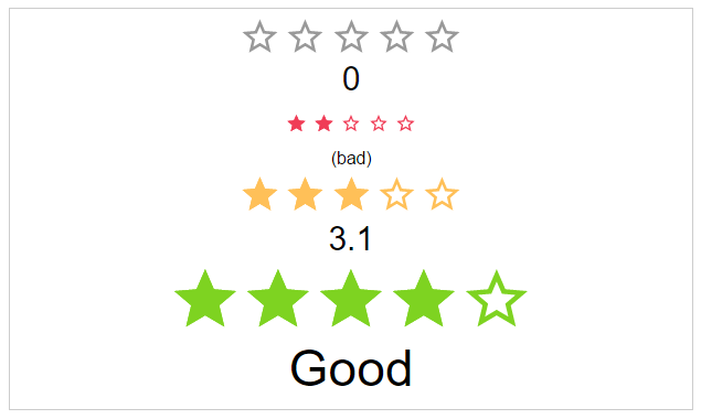
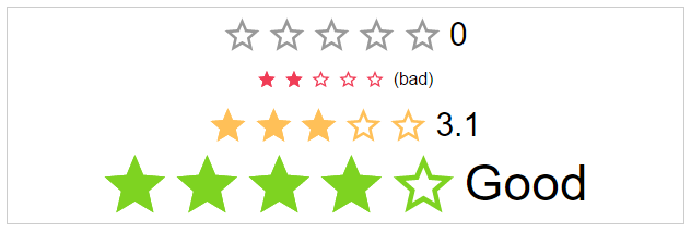
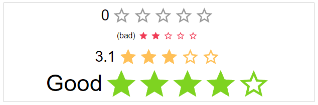
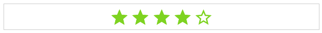
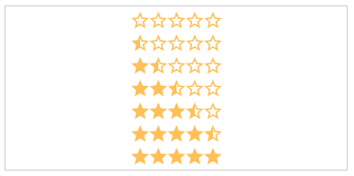
Angular Star Rating ⭐⭐⭐⭐⭐
⭐ Angular 1.5 Component written in typescript, based on css only techniques. ⭐


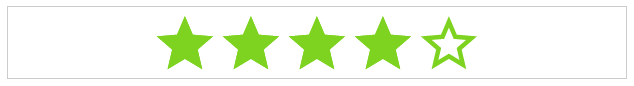
Angular Star Rating is a >1.5 Angular component written in typescript.
It is based on css-star-rating, a fully featured and customizable css only star rating component written in scss.
DEMO
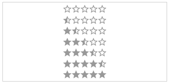
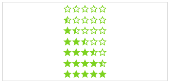
Features
This module implements all Features from CSS-STAR-RATING.
It also provides callbacks for all calculation functions used in the component as well as all possible event emitters.
Browser support
| IE | Firefox | Chrome | Safari | Opera |
|---|
| > 11 | > 50 | > 55 | > 10 | > 41 |
 |  |  |  |  |
Install
Get Angular Star Rating:
- clone & build this repository
- download as .zip
- via npm: by running
$ npm install angular-star-rating from your console - via bower: by running
$ bower install angular1-star-rating from your console
Load library
<script src="[bower or npm folder]/angular-star-rating/dist/index.js"></script>
Inject it into angular
angular.module('myApp', ['star-rating'])
Use it
<star-rating-comp
         size="'large'"
         rating="3"
         label-text="'Rating: '"
         on-update="crtl.onUpdate($event)">
 </star-rating-comp>
Component Properties
Input (< bindings)
id: string (Optional)
The html id attribute of the star rating
Default: undefined
<star-rating-comp id="'my-id'"></star-rating-comp>
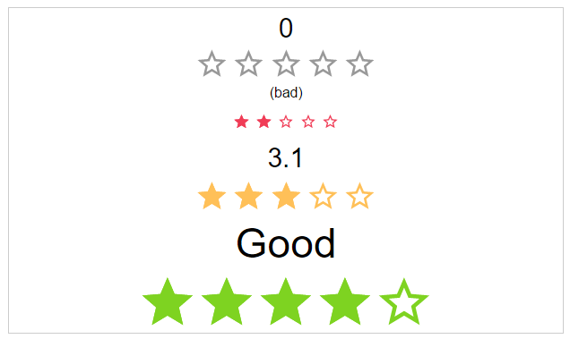
rating: number (Optional)
The actual star rating value
Default: 0
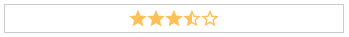
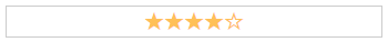
<star-rating-comp rating="3"></star-rating-comp>
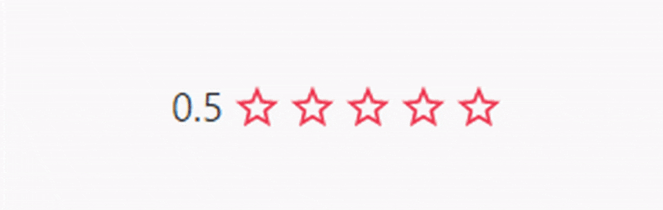
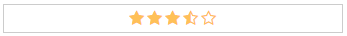
showHalfStars: boolean (Optional)
To show half stars or not
Options: true, false
Default: false
<star-rating-comp show-half-stars="true"></star-rating-comp>
numOfStars: number (Optional)
The possible number of stars to choose from
Default: 5
<star-rating-comp num-of-stars="6"></star-rating-comp>
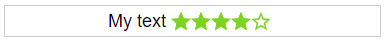
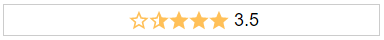
label-text: string (Optional)
The label text next to the stars.
Default: undefined
<star-rating-comp label-text="'My text!'"></star-rating-comp>
labelPosition: starRatingPosition (Optional)
The position of the label
Options: top, right, bottom, left
Default: left
<star-rating-comp label-position="'top'"></star-rating-comp>
space: starRatingStarSpace (Optional)
If the start use the whole space or not.
Options: no, between, around
Default: no
<star-rating-comp space="around"></star-rating-comp>


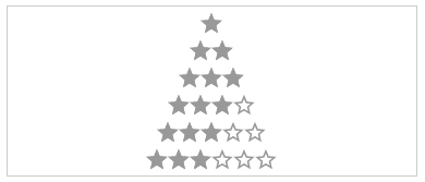
size: starRatingSizes (Optional)
The height and width of the stars.
Options: small, medium, large
Default: ok
<star-rating-comp size="'small'"></star-rating-comp>

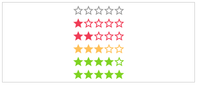
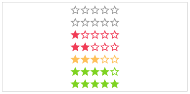
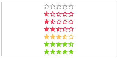
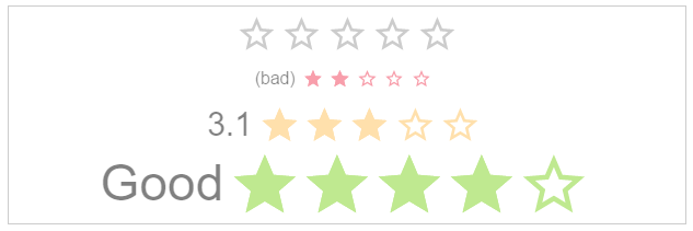
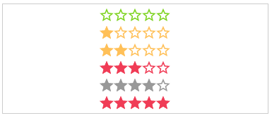
color: starRatingColors (Optional)
Possible color names for the stars.
Options: default, negative, ok, positive
Default: undefined
<star-rating-comp color="'positive'"></star-rating-comp>
disabled: boolean (Optional)
The click callback is disabled, colors are transparent
Default: false
<star-rating-comp disabled="true"></star-rating-comp>

direction: string (Optional)
The direction of the stars and label.
Options: rtl, ltr
Default: rtl
<star-rating-comp direction="'ltr'"></star-rating-comp>

readOnly: boolean (Optional)
The click callback is disabled
Default: false
<star-rating-comp read-only="true"></star-rating-comp>
speed: starRatingSpeed (Optional)
The duration of the animation in ms.
Options: immediately, noticeable, slow
Default: noticeable
<star-rating-comp speed="'slow'"></star-rating-comp>


starType: starRatingStarTypes (Optional)
The type of start resource to use.
Options: svg, icon, custom-icon
Default: svg
<star-rating-comp star-type="'icon'"></star-rating-comp>
getColor: Function (Optional)
Calculation of the color by rating.
Params: rating, numOfStars, staticColor
Return: colorName as string
<star-rating-comp get-color="parentCtrl.getColor(rating, numOfStars, staticColor)"></star-rating-comp>
getHalfStarVisible: Function (Optional)
Calculation for adding the "half" class or not, depending on the rating value.
Params: rating
Return: boolean
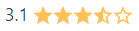
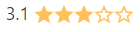
<star-rating-comp get-half-star-visible="parentCtrl.getHalfStarVisible(rating)" rating="3.1"></star-rating-comp>
function getHalfStarVisible(rating) {
    var absDiff = Math.abs(rating % 1);

    if(absDiff == 0.1) {
        return false;
    }

    return absDiff > 0;
}
Output (& bindings)
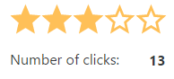
onClick: Function (Optional)
Callback function for star click event
Params: $event
<star-rating-comp on-click="parentCtrl.onClick($event)"></star-rating-comp>
function onClick($event) {
    parent.clickCount = parent.clickCount + 1;
}
onUpdate: Function (Optional)
Callback function for rating update event
Params: $event
<star-rating-comp on-update="parentCtrl.onUpdate($event)"></star-rating-comp>
function onUpdate($event) {
    parent.rating = $event.rating;
}


