Research
Security News
Malicious PyPI Package ‘pycord-self’ Targets Discord Developers with Token Theft and Backdoor Exploit
Socket researchers uncover the risks of a malicious Python package targeting Discord developers.

🔊 a downshift powered dropdown library for react vr
bassdrop is a downshift🏎️ powered dropdown library for building drop downs and select lists in react vr. It uses the function as child and “prop getter” patterns, which gives you maximum flexibility with a minimal API.
This module is distributed via npm which is bundled with node and
should be installed as one of your project’s dependencies:
npm install --save bassdrop
This package also depends on
react-vr,prop-typesandreact. Please make sure you have those installed as well.
import BassDrop from 'bassdrop';
import { Text, View, VrButton, Animated } from 'react-vr';

// Small helper function to choose item bg color.
function getDropdownItemBgColor(selectedItem, item, highlightedIndex, index) {
  if (selectedItem === item) {
    return 'gray';
  }
  if (highlightedIndex === index) {
    return 'lightgray';
  }
  return 'white';
}

function VrDropdown({ items, placeholder }) {
  return (
    <BassDrop
      // The string to show when no item is selected/highlighted. Defaults to ''.
      placeholder={placeholder}
      // The render prop is called on each render providing prop getters and state to be used in your UI.
      // This function can alternatively be called as a child prop <BassDrop>{(stateAndHelpers) => {...}}</BassDrop>
      render={({
        // Prop getters
        getItemProps,
        getToggleButtonProps,
        getRootProps,
        // State
        isOpen,
        selectedItemIsHighlighted,
        itemDisplay,
        highlightedIndex,
        selectedItem,
      }) => (
        <View
          // This is the main wrapper View for the dropdown
          style={{
            position: 'absolute',
            layoutOrigin: [0.5, 0.5],
            transform: [{ translate: [0, 0, -3] }],
          }}
          billboarding={'on'}
          {...getRootProps()}
        >
          <VrButton
            // This button will control toggling the dropdown open/closed
            {...getToggleButtonProps()}
            style={{
              display: 'flex',
              flexDirection: 'row',
              backgroundColor: 'white',
              justifyContent: 'space-between',
              alignItems: 'stretch',
              height: 0.7,
              width: 3,
              paddingLeft: 0.2,
            }}
          >
            <Text
              // This text represents the value or the highlighted value for the dropdown
              style={{
                backgroundColor: 'white',
                color: selectedItemIsHighlighted ? 'black' : 'grey',
                fontSize: 0.3,
                fontWeight: '400',
                textAlign: 'center',
                textAlignVertical: 'center',
              }}
            >
              {itemDisplay}
            </Text>

            <View
              // This is purely presentational -- why render props rock!
              style={{
                paddingRight: 0.2,
                paddingLeft: 0.2,
                backgroundColor: 'gray',
                display: 'flex',
                alignItems: 'center',
                flexDirection: 'row',
              }}
            >
              <Image
                source={asset('arrow.png')}
                style={{
                  justifyContent: 'center',
                  width: 0.5,
                  height: 0.5,
                }}
              />
            </View>
          </VrButton>
          {isOpen ? (
            <View
              // The list of items to be shown when the dropdown is open
              style={{
                width: 3,
                backgroundColor: 'white',
                transform: [
                  {
                    translate: [0, -1.3, -0.3],
                  },
                ],
              }}
            >
              {items.map((item, index) => (
                <VrButton
                  // Each item should be a VrButton
                  {...getItemProps({
                    item,
                    index,
                  })}
                  key={item}
                >
                  <Text
                    // This is the text for the item
                    style={{
                      fontSize: 0.3,
                      padding: 0.1,
                      textAlign: 'center',
                      textAlignVertical: 'center',
                      color: 'black',
                      backgroundColor: getDropdownItemBgColor(
                        selectedItem,
                        item,
                        highlightedIndex,
                        index
                      ),
                    }}
                  >
                    {item}
                  </Text>
                </VrButton>
              ))}
            </View>
          ) : null}
        </View>
      )}
    />
  );
}
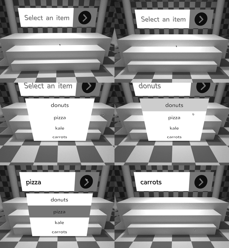
…creates something like this:

See the API Docs for information on the props exposed by this package. The usage example above is not an exhaustive list.
bassdrop 🔊 uses the child callback render function pattern. This is where you render whatever you want to based on the state of bassdrop which is passed to the callback as parameters. The function is passed as the child prop of the BassDrop component:
<BassDrop>
  {({/* parameters here */}) => (/* your render code here*/)}
</BassDrop>
or can be called from the render prop
<BassDrop
  render= {({/* parameters here */}) => (/* your render code here*/)}
/>
The paramters of this function can be split into two categories: State and Prop Getters.
See the API Docs for a list of these properties.
Check out the demo site to see how bassdrop 🔊 works in VR. See the demo repo for the code behind the demo site.
If you’d like to make bassdrop 🔊 better, please read our guide to contributing.
These wonderful people have contributed to bassdrop 🔊 in one way or another:
bassdrop is MIT licensed.
FAQs
🔊 a downshift powered dropdown library for react vr
We found that bassdrop demonstrated a not healthy version release cadence and project activity because the last version was released a year ago. It has 1 open source maintainer collaborating on the project.
Did you know?

Socket for GitHub automatically highlights issues in each pull request and monitors the health of all your open source dependencies. Discover the contents of your packages and block harmful activity before you install or update your dependencies.

Research
Security News
Socket researchers uncover the risks of a malicious Python package targeting Discord developers.

Security News
The UK is proposing a bold ban on ransomware payments by public entities to disrupt cybercrime, protect critical services, and lead global cybersecurity efforts.

Security News
Snyk's use of malicious npm packages for research raises ethical concerns, highlighting risks in public deployment, data exfiltration, and unauthorized testing.