Bootstrap Switch Button for React
Checkbox replacement using stylish bootstrap-4 switch button.
Lightweight (15kb), self-contained, compiled as a single CommonJS file for easy webpack integration.
Library Distributions
Demos
Demos and API Docs: https://gitbrent.github.io/bootstrap-switch-button-react/
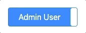
<BootstrapSwitchButton onlabel='Admin User' offlabel='Regular User' checked={false}/>
Installation
NPM
npm i bootstrap-switch-button-react --save
Yarn
yard add bootstrap-switch-button-react
Usage
Keep state in sync using the onChange function property
import BootstrapSwitchButton from 'bootstrap-switch-button-react'

<BootstrapSwitchButton
    checked={false}
    onlabel='Admin User'
    onstyle='danger'
    offlabel='Regular User'
    offstyle='success'
    style='w-100 mx-3'
    onChange={(checked: boolean) => {
        this.setState({ isUserAdmin: checked })
    }}
/>
Properties
| Name | Type | Default | Description |
|---|
onlabel | string/html | "On" | Text of the on switch-button |
offlabel | string/html | "Off" | Text of the off switch-button |
size | string | | Size of the switch-button. Possible values are: xs, sm, lg (no size specified means default bootstrap size). |
onstyle | string | "primary" | Style of the on switch-button. Possible values are: primary,secondary,success,danger,warning,info,light,dark |
offstyle | string | "light" | Style of the off switch-button. Possible values are: primary,secondary,success,danger,warning,info,light,dark |
style | string | | Appends the value to the class attribute of the switch-button. This can be used to apply custom styles. Refer to Custom Styles for reference. |
width | integer | | Sets the width of the switch-button. if set to null, width will be auto-calculated. |
height | integer | | Sets the height of the switch-button. if set to null, height will be auto-calculated. |
Events
Keep state in sync using the onChange function property
<BootstrapSwitchButton
    onChange={(checked: boolean) => {
        this.setState({ isUserAdmin: checked })
    }}
/>