
Security News
Oracle Drags Its Feet in the JavaScript Trademark Dispute
Oracle seeks to dismiss fraud claims in the JavaScript trademark dispute, delaying the case and avoiding questions about its right to the name.
By Sarah Gooding - Feb 07, 2025
color-calendar
Advanced tools


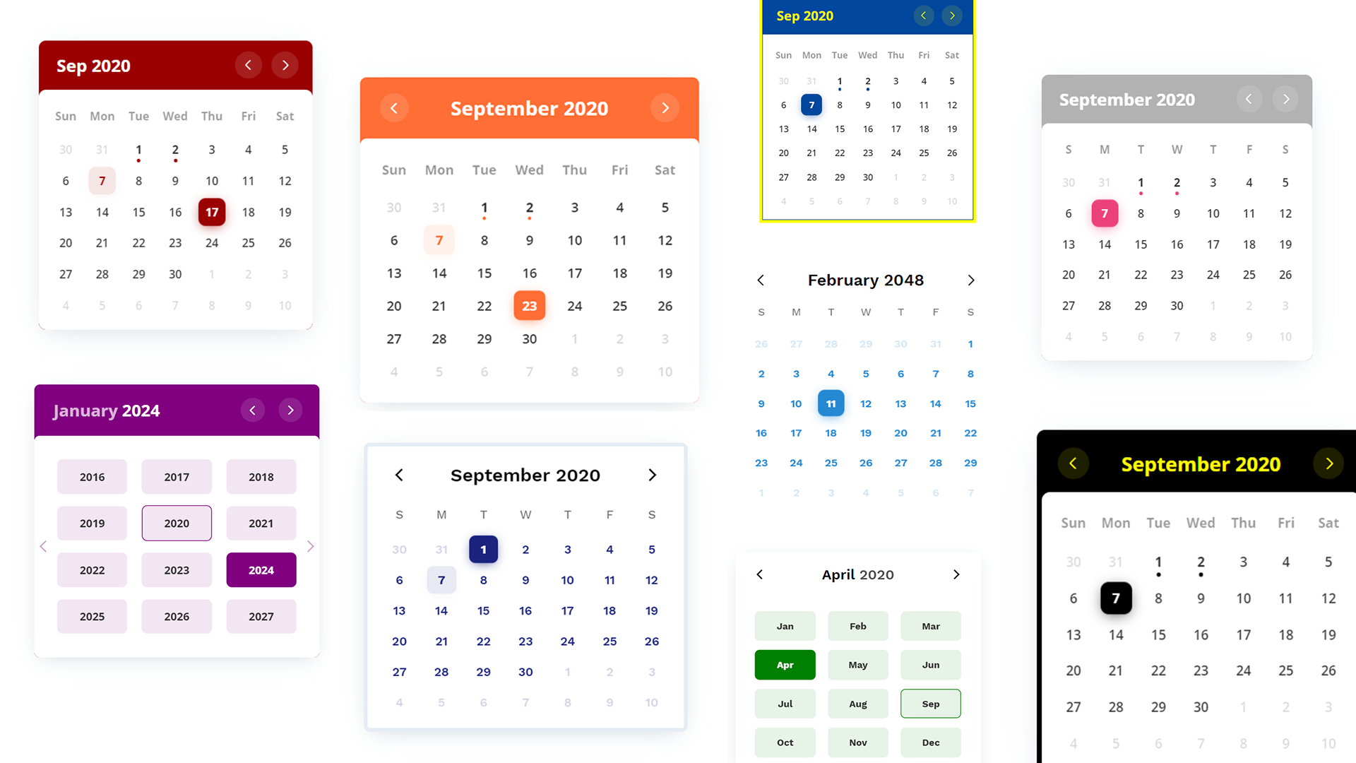
A customizable events calendar component library. Checkout Demo 1, Demo 2 and Demo 3.
<script src="https://cdn.jsdelivr.net/npm/color-calendar/dist/bundle.js">
Also available on unpkg.
Pick a css file according to the theme you want.
<link
  rel="stylesheet"
  href="https://cdn.jsdelivr.net/npm/color-calendar/dist/css/theme-basic.css"
/>
<!-- or -->
<link
  rel="stylesheet"
  href="https://cdn.jsdelivr.net/npm/color-calendar/dist/css/theme-glass.css"
/>
Get fonts from Google Fonts
<link
  href="https://fonts.googleapis.com/css2?family=Open+Sans:wght@400;600;700&display=swap"
  rel="stylesheet"
/>
Check what fonts the theme needs or pass your own fonts in options.
You might need to use a module bundler such as webpack, rollup, parcel, etc.
npm i color-calendar
import Calendar from "color-calendar";
import "color-calendar/dist/css/theme-<THEME-NAME>.css";
Then add fonts.
new Calendar();
Or you can pass in options.
new Calendar({
  id: "#color-calendar",
  calendarSize: "small",
});
<div id="color-calendar"></div>
idType: String
Default: #color-calendar
Selector referencing HTMLElement where the calendar instance will bind to.
calendarSizeType: String
Default: large
Options: small | large
Size of calendar UI.
layoutModifiersType: LayoutModifier[]
Default: []
Example: ['month-left-align']
Modifiers to alter the layout of the calendar.
eventsDataType: EventData[]
Default: null
[
    {
        start: '2020-08-17T06:00:00',
        end: '2020-08-18T20:30:00',
        name: 'Blockchain 101'
      ...
    },
    ...
]
Array of objects containing events information.
Note: Properties
startandendare required for each event in the ISO 8601 date and time format. You can optionally choose to add other properties.
themeType: String
Default: basic
Options: basic | glass
Choose from available themes.
primaryColorType: String
Default: based on theme
Example: #1a237e
Main color accent of calendar. Pick a color in rgb, hex or hsl format.
headerColorType: String
Default: based on theme
Example: rgb(0, 102, 0)
Color of header text.
headerBackgroundColorType: String
Default: based on theme
Example: black
Background color of header. Only works on some themes.
weekdaysColorType: String
Default: based on theme
Color of weekdays text. Only works on some themes.
weekdayDisplayTypeType: String
Default: short
Options: WeekdayDisplayType (short | long-lower | long-upper)
Select how weekdays will be displayed. E.g. M, Mon, or MON.
monthDisplayTypeType: String
Default: long
Options: MonthDisplayType (short | long)
Select how month will be displayed in header. E.g. Feb, February.
startWeekdayType: Number
Default: 0
Options: 0 | 1 | 2 | 3 | 4 | 5 | 6
Starting weekday. Mapping: 0 (Sun), 1 (Mon), 2 (Tues), 3 (Wed), 4 (Thurs), 5 (Fri), 6 (Sat)
fontFamilyHeaderType: String
Default: based on theme
Example value: 'Open Sans', sans-serif
Font of calendar header text.
fontFamilyWeekdaysType: String
Default: based on theme
Font of calendar weekdays text.
fontFamilyBodyType: String
Default: based on theme
Font of calendar days as well as month and year picker text.
dropShadowType: String
Default: based on theme
Set CSS of calendar drop shadow.
borderType: String
Default: based on theme
Example value: 5px solid black
Set CSS style of border.
borderRadiusType: String
Default: 0.5rem
Set CSS border radius of calendar.
disableMonthYearPickersType: Boolean
Default: false
If month and year picker should be disabled.
disableDayClickType: Boolean
Default: false
If day click should be disabled.
disableMonthArrowClickType: Boolean
Default: false
If month arrows should be disabled.
customMonthValuesType: String[]
Default: undefined
Set custom display values for Month.
customWeekdayValuesType: String[]
Default: undefined
Set custom display values for Weekdays.
["Lun", "Mar", "Mer", "Jeu", "Ven", "Sam", "Dim"];
dateChangedType: Function
Props:
currentDate
DatefilteredDateEvents
EventData[]const options = {
...
dateChanged: (currentDate?: Date, filteredDateEvents?: EventData[]) => {
// do something
};
...
}
Emitted when the selected date is changed.
selectedDateClickedType: Function
Props:
currentDate
DatefilteredMonthEvents
EventData[]Emitted when the selected date is clicked.
monthChangedType: Function
Props:
currentDate
DatefilteredMonthEvents
EventData[]Emitted when the current month is changed.
reset()Reset calendar to today's date.
// Example
let myCal = new Calendar();
myCal.reset();
setDate()Props:
| Props | Type | Required | Description |
|---|---|---|---|
| date | Date | required | New date to be set |
Set new selected date.
// Example
myCal.setDate(new Date());
getSelectedDate()Return:
DateCurrently selected dateGet currently selected date.
getEventsData()Return:
All eventsGet events array.
setEventsData()Props:
| Props | Type | Required | Description |
|---|---|---|---|
| events | EventData[] | required | Events to be set |
Return:
NumberNumber of events setSet a new events array.
addEventsData()Props:
| Props | Type | Required | Description |
|---|---|---|---|
| events | EventData[] | required | Events to be added |
Return:
NumberNumber of events addedAdd events of the events array.
setWeekdayDisplayType()Props:
| Props | Type | Required | Description |
|---|---|---|---|
| weekdayDisplayType | WeekdayDisplayType | required | New weekday type |
Set weekdays display type.
// Example
myCal.setWeekdayDisplayType("short");
setMonthDisplayType()Props:
| Props | Type | Required | Description |
|---|---|---|---|
| monthDisplayType | MonthDisplayType | required | New month display type |
Set month display type.
EventData{
start: string, // ISO 8601 date and time format
end: string, // ISO 8601 date and time format
[key: string]: any,
}
WeekdayDisplayType"short" | "long-lower" | "long-upper"
// "short"
M T W ...

// "long-lower"
Mon Tue Wed ...

// "long-upper"
MON TUE WED ...
MonthDisplayType"short" | "long"
// "short"
Jan Feb Mar ...

// "long"
January February March ...
LayoutModifier"month-align-left"
Currently 2 themes available. More on the way.
basic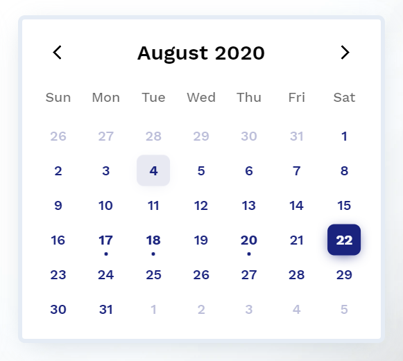
--cal-color-primary: #000000;
--cal-font-family-header: "Work Sans", sans-serif;
--cal-font-family-weekdays: "Work Sans", sans-serif;
--cal-font-family-body: "Work Sans", sans-serif;
--cal-drop-shadow: 0 7px 30px -10px rgba(150, 170, 180, 0.5);
--cal-border: none;
--cal-border-radius: 0.5rem;
--cal-header-color: black;
--cal-weekdays-color: black;
glass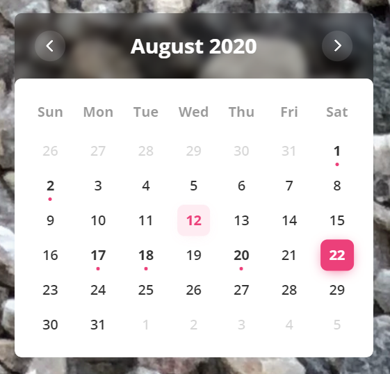
--cal-color-primary: #EC407A;
--cal-font-family-header: 'Open Sans', sans-serif;
--cal-font-family-weekdays: 'Open Sans', sans-serif;
--cal-font-family-body: 'Open Sans', sans-serif;
--cal-drop-shadow: 0 7px 30px -10px rgba(150, 170, 180, 0.5);
--cal-border: none;
--cal-border-radius: 0.5rem;
--cal-header-color: white;
--cal-header-background-color: rgba(0, 0, 0, 0.3);
Feel free to open an issue on GitHub if you find any bug.
Check here for release notes.
This software is open source, licensed under the MIT License.
FAQs
A customizable events calendar widget library
The npm package color-calendar receives a total of 238 weekly downloads. As such, color-calendar popularity was classified as not popular.
We found that color-calendar demonstrated a not healthy version release cadence and project activity because the last version was released a year ago. It has 1 open source maintainer collaborating on the project.
Did you know?

Socket for GitHub automatically highlights issues in each pull request and monitors the health of all your open source dependencies. Discover the contents of your packages and block harmful activity before you install or update your dependencies.
Security News
Oracle seeks to dismiss fraud claims in the JavaScript trademark dispute, delaying the case and avoiding questions about its right to the name.

Security News
The Linux Foundation is warning open source developers that compliance with global sanctions is mandatory, highlighting legal risks and restrictions on contributions.

Security News
Maven Central now validates Sigstore signatures, making it easier for developers to verify the provenance of Java packages.