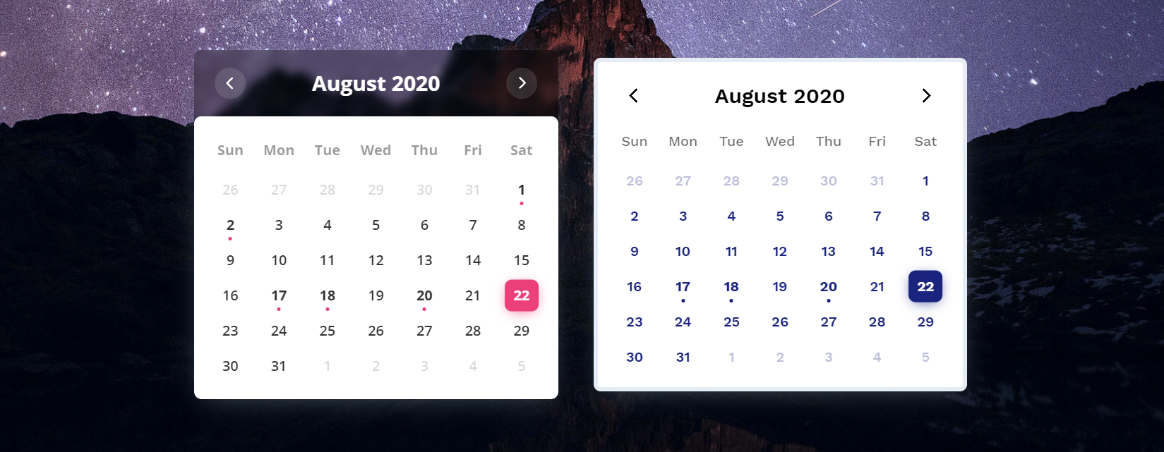
Color Calendar


A customizable events calendar component library. Checkout Demo 1 and Demo 2.
🚀 Features
- Zero dependencies
- Add events to calendar
- Perform some action on calendar date change
- Month and year picker built-in
- Themes available
- Customize using CSS variables or passing options parameters while creating calendar.
- More coming soon...
📦 Getting Started
CDN
JavaScript
<script src="https://cdn.jsdelivr.net/npm/color-calendar/dist/bundle.js">
Also available on unpkg.
CSS
Pick a css file according to the theme you want.
<link rel="stylesheet" href="https://cdn.jsdelivr.net/npm/color-calendar/dist/css/theme-basic.css">
<link rel="stylesheet" href="https://cdn.jsdelivr.net/npm/color-calendar/dist/css/theme-glass.css">
Fonts
Get fonts from Google Fonts
<link href="https://fonts.googleapis.com/css2?family=Open+Sans:wght@400;600;700&display=swap" rel="stylesheet">
Check what fonts the theme needs or pass your own fonts in options.
NPM
You might need to use a module bundler such as webpack, rollup, parcel, etc.
Installation
npm i color-calendar
Import
import Calendar from 'color-calendar';
CSS
import 'color-calendar/dist/css/theme-<THEME-NAME>.css';
Then add fonts.
🔨 Usage
JavaScript
new Calendar()
Or you can pass in options.
new Calendar({
    id: '#color-calendar',
    calendarSize: 'small'
})
HTML
<div id="color-calendar"></div>
⚙️ Options
id
Type: String
Default: #color-calendar
Selector referencing HTMLElement where the calendar instance will bind to.
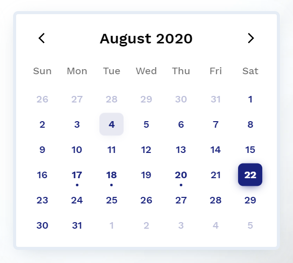
calendarSize
Type: String
Default: large
Options: small | large
Size of calendar UI.
layoutModifiers
Type: LayoutModifier[]
Default: []
Example: ['month-left-align']
Modifiers to alter the layout of the calendar.
eventsData
Type: EventData[]
Default: null
[
    {
        start: '2020-08-17T06:00:00',
        end: '2020-08-18T20:30:00',
        name: 'Blockchain 101'
      ...
    },
    ...
]
Array of objects containing events information.
Note: Properties start and end are required for each event in the ISO 8601 date and time format. You can optionally choose to add other properties.
theme
Type: String
Default: basic
Options: basic | glass
Choose from available themes.
primaryColor
Type: String
Default: based on theme
Example: #1a237e
Main color accent of calendar. Pick a color in rgb, hex or hsl format.
Type: String
Default: based on theme
Example: rgb(0, 102, 0)
Color of header text.
Type: String
Default: based on theme
Example: black
Background color of header. Only works on some themes.
weekdaysColor
Type: String
Default: based on theme
Color of weekdays text. Only works on some themes.
weekdayType
Type: String
Default: long-lower
Options: WeekdayType (short | long-lower | long-upper)
Select how weekdays will be displayed. E.g. M, Mon, or MON.
monthDisplayType
Type: String
Default: long
Options: MonthDisplayType (short | long)
Select how month will be displayed in header. E.g. Feb, February.
startWeekday
Type: Number
Default: 0
Options: 0 | 1 | 2 | 3 | 4 | 5 | 6
Starting weekday. Mapping: 0 (Sun), 1 (Mon), 2 (Tues), 3 (Wed), 4 (Thurs), 5 (Fri), 6 (Sat)
Type: String
Default: based on theme
Example value: 'Open Sans', sans-serif
Font of calendar header text.
fontFamilyWeekdays
Type: String
Default: based on theme
Font of calendar weekdays text.
fontFamilyBody
Type: String
Default: based on theme
Font of calendar days as well as month and year picker text.
dropShadow
Type: Boolean
Default: true
Whether to have a calendar drop shadow.
border
Type: String
Default: based on theme
Example value: 5px solid black
Set CSS style of border.
borderRadius
Type: String
Default: 0.5rem
Set CSS border radius of calendar.
disableMonthYearPickers
Type: Boolean
Default: false
If month and year picker should be disabled.
🖱 Events
dateChanged
Type: Function
Props:
currentDate
- Type:
Date - Currently selected date
filteredDateEvents
- Type:
EventData[] - All events on that particular date
const options = {
...
dateChanged: (currentDate?: Date, filteredDateEvents?: EventData[]) => {
};
...
}
Emitted when the selected date is changed.
monthChanged
Type: Function
Props:
currentDate
- Type:
Date - Currently selected date
filteredMonthEvents
- Type:
EventData[] - All events on that particular month
Emitted when the current month is changed.
🔧 Methods
reset()
Reset calendar to today's date.
let myCal = new Calendar();
myCal.reset();
setDate()
Props:
| Props | Type | Required | Description |
|---|
| date | Date | required | New date to be set |
Set new selected date.
getSelectedDate()
Return:
- Type:
Date - Description:
Currently selected date
Get currently selected date.
setEventsData()
Props:
| Props | Type | Required | Description |
|---|
| events | EventData[] | required | Events to be set |
Return:
- Type:
Number - Description:
Number of events set
Set a new events array.
addEventsData()
Props:
| Props | Type | Required | Description |
|---|
| events | EventData[] | required | Events to be added |
Return:
- Type:
Number - Description:
Number of events added
Add events of the events array.
setWeekdayType()
Props:
| Props | Type | Required | Description |
|---|
| weekdayType | WeekdayType | required | New weekday type |
Set weekdays display type.
setMonthDisplayType()
Props:
| Props | Type | Required | Description |
|---|
| monthDisplayType | MonthDisplayType | required | New month display type |
Set month display type.
💎 Types
EventData
{
start: string,
end: string,
[key: string]: any,
}
WeekdayType
"short" | "long-lower" | "long-upper"
// "short"
M T W ...

// "long-lower"
Mon Tue Wed ...

// "long-upper"
MON TUE WED ...
MonthDisplayType
"short" | "long"
// "short"
Jan Feb Mar ...

// "long"
January February March ...
LayoutModifier
"month-align-left"
🎨 Themes
Currently 2 themes available. More on the way.
basic
CSS Custom Properties
--cal-color-primary: #000000;
--cal-font-family-header: "Work Sans", sans-serif;
--cal-font-family-weekdays: "Work Sans", sans-serif;
--cal-font-family-body: "Work Sans", sans-serif;
--cal-drop-shadow: 0 7px 30px -10px rgba(150, 170, 180, 0.5);
--cal-border: none;
--cal-border-radius: 0.5rem;
--cal-header-color: black;
--cal-weekdays-color: black;
glass
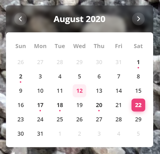
CSS Custom Properties
--cal-color-primary: #EC407A;
--cal-font-family-header: 'Open Sans', sans-serif;
--cal-font-family-weekdays: 'Open Sans', sans-serif;
--cal-font-family-body: 'Open Sans', sans-serif;
--cal-drop-shadow: 0 7px 30px -10px rgba(150, 170, 180, 0.5);
--cal-border: none;
--cal-border-radius: 0.5rem;
--cal-header-color: white;
--cal-header-background-color: rgba(0, 0, 0, 0.3);
🐛 Bug Reporting
Feel free to open an issue on GitHub if you find any bug.
⭐ Feature Request
I'd love ❤️️ to hear where you are using this library or any additional features you might need for your use case. Open an issue on GitHub or connect with me on LinkedIn.
📜 License
This software is open source, licensed under the MIT License.


