
Security News
Deno 2.2 Improves Dependency Management and Expands Node.js Compatibility
Deno 2.2 enhances Node.js compatibility, improves dependency management, adds OpenTelemetry support, and expands linting and task automation for developers.
console-gui-tools-cjs
Advanced tools
Clone of console-gui-tools library with minor changes to build it as CommonJS module.
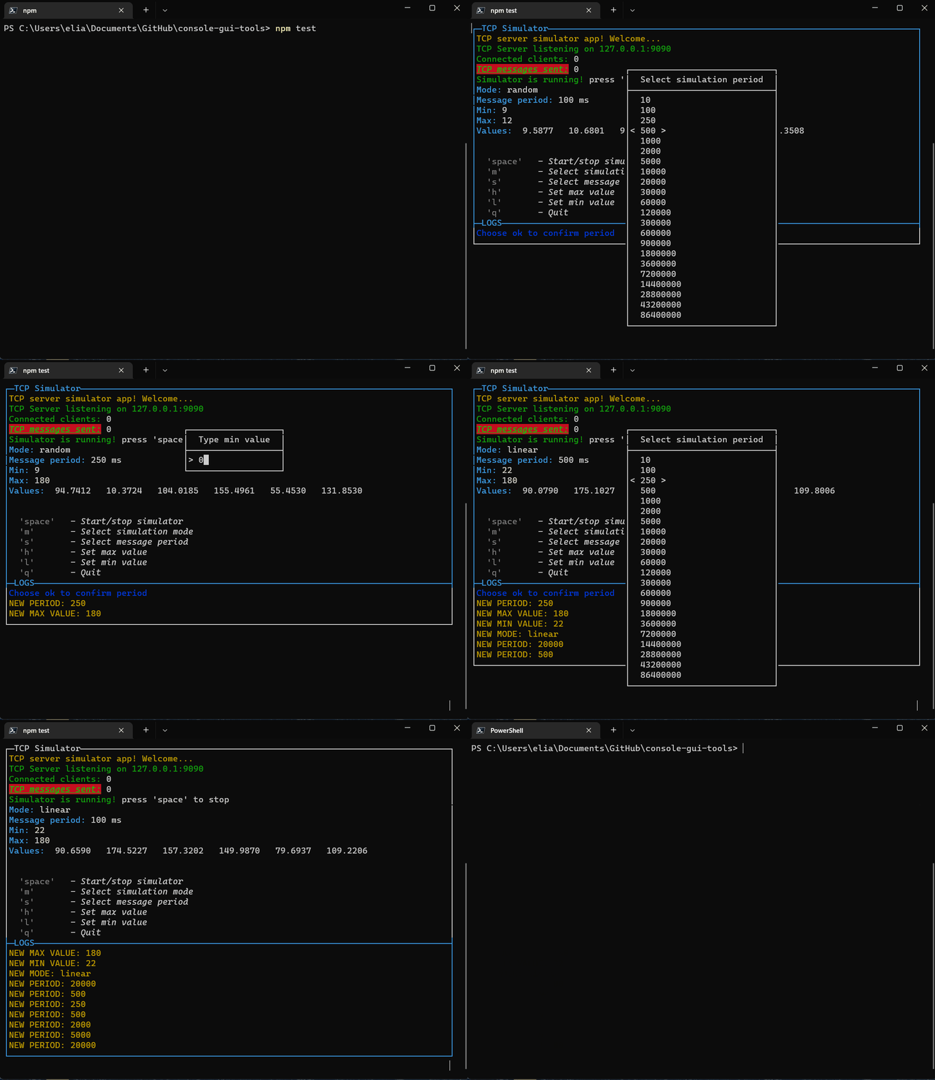
A simple Node.js library to create Console Apps like a wizard (or maybe if you like old style colored screen or something like "teletext" programs 😂) Apart from jokes, it is a library that allows you to create a screen divided into a part with everything you want to see (such as variable values) and another in which the logs run. Moreover in this way the application is managed by the input event "keypressed" to which each key corresponds to a bindable command. For example, to change variables you can open popups with an option selector or with a textbox. It's in embryonic phase, any suggestion will be constructive :D
This is a Typescript module that is compiled as ES module. It should be used in other ES application. If you want to use it in a Commonjs app you can learn on the internet how to wrap it in, or you can clone this repo and change the tsconfig.json -> module: commonjs and package.json -> type: commonjs than build it for your project.
Version: >= 14
It works well in all os with a terminal that supports styling, colors and other nice features. I've tested it on Linux: Ubuntu LTS, Arch, and Windows 10 and 11
In windows you can use it in both 10, and 11 but don't use the old Powershell (💩), make you a favor and use Windows Terminal with Powershell Core (the last official) That is currently installed by default in Windows 11. In alternative i've runned this also with git bash shell.
Install with:
npm i console-gui-tools
The library has a few options that can be set in the constructor.
The title of the application. It will be displayed in the top of the screen.
The number of lines that will be displayed in the logs page.
Choose where the logs are displayed: number (0,1) - to pot them on one of the two layouts, string ("popup") - to put them on a CustomPopup that can be displayed on the window.
The key that will be used to show the logs popup if the logLocation is set to "popup".
The options that will be passed to the layout.
const layoutOptions = {
    boxed: true, // Set to true to enable boxed layout mode
    showTitle: true, // Set to false to hide titles
    changeFocusKey: 'ctrl+l', // The key or the combination that will change the focus between the two layouts
    type: "double", // Can be "single", "double" or "quad" to choose the layout type
    direction: 'vertical', // Set to 'horizontal' to enable horizontal layout (only for "double" layout)
    boxColor: 'yellow', // The color of the box
    boxStyle: 'bold', // The style of the box (bold)
}
Example of usage:
// Import module with ES6 syntax
import { ConsoleManager, OptionPopup, InputPopup, PageBuilder, ButtonPopup, ConfirmPopup } from '../src/ConsoleGui.js'
const GUI = new ConsoleManager({
    title: 'TCP Simulator', // Title of the console
    logsPageSize: 8, // Number of lines to show in logs page
    changeLayoutKey: 'ctrl+l', // Change layout with ctrl+l to switch to the logs page
})

// Creating a main page updater:
const updateConsole = async() => {
    const p = new PageBuilder()
    p.addRow({ text: `TCP server simulator app! Welcome...`, color: 'yellow' })
    p.addRow({ text: `TCP Server listening on ${HOST}:${PORT}`, color: 'green' })
    p.addRow({ text: `Connected clients:`, color: 'green' }, { text: ` ${connectedClients}`, color: 'white' })
    p.addRow({ text: `TCP messages sent:`, color: 'green', bg: 'bgRed', bold: true, italic: true, underline: true }, { text: ` ${tcpCounter}`, color: 'white' })

    // Print if simulator is running or not
    if (!valueEmitter) {
        p.addRow({ text: `Simulator is not running! `, color: 'red' }, { text: `press 'space' to start`, color: 'white' })
    } else {
        p.addRow({ text: `Simulator is running! `, color: 'green' }, { text: `press 'space' to stop`, color: 'white' })
    }

    // Print mode:
    p.addRow({ text: `Mode: `, color: 'cyan' }, { text: `${mode}`, color: 'white' })
        // Print message frequency:
    p.addRow({ text: `Message period: `, color: 'cyan' }, { text: `${period} ms`, color: 'white' })
        // Print Min and Max
    p.addRow({ text: `Min: `, color: 'cyan' }, { text: `${min}`, color: 'white' })
    p.addRow({ text: `Max: `, color: 'cyan' }, { text: `${max}`, color: 'white' })
        // Print current values:
    p.addRow({ text: `Values: `, color: 'cyan' }, { text: ` ${values.map(v => v.toFixed(4)).join('   ')}`, color: 'white' })

    // Spacer
    p.addSpacer()

    if (lastErr.length > 0) {
        p.addRow({ text: lastErr, color: 'red' })
        p.addSpacer(2)
    }

    p.addRow({ text: "Commands:", color: 'white', bg: 'black' })
    p.addRow({ text: `  'space'`, color: 'gray', bold: true }, { text: `   - Start/stop simulator`, color: 'white', italic: true })
    p.addRow({ text: `  'm'`, color: 'gray', bold: true }, { text: `       - Select simulation mode`, color: 'white', italic: true })
    p.addRow({ text: `  's'`, color: 'gray', bold: true }, { text: `       - Select message period`, color: 'white', italic: true })
    p.addRow({ text: `  'h'`, color: 'gray', bold: true }, { text: `       - Set max value`, color: 'white', italic: true })
    p.addRow({ text: `  'l'`, color: 'gray', bold: true }, { text: `       - Set min value`, color: 'white', italic: true })
    p.addRow({ text: `  'q'`, color: 'gray', bold: true }, { text: `       - Quit`, color: 'white', italic: true })

    GUI.setPage(p)
}

GUI.on("exit", () => {
    closeApp()
})

// And manage the keypress event from the library
GUI.on("keypressed", (key) => {
    switch (key.name) {
        case 'space':
            if (valueEmitter) {
                clearInterval(valueEmitter)
                valueEmitter = null
            } else {
                valueEmitter = setInterval(frame, period)
            }
            break
        case 'm':
            new OptionPopup("popupSelectMode", "Select simulation mode", modeList, mode).show().on("confirm", (_mode) => {
                mode = _mode
                GUI.warn(`NEW MODE: ${mode}`)
                drawGui()
            })
            break
        case 's':
            new OptionPopup("popupSelectPeriod", "Select simulation period", periodList, period).show().on("confirm", (_period) => {
                new ButtonPopup("popupConfirmPeriod", "Confirm period", `Period set to ${period} ms, apply?`, ["Yes", "No", "?"]).show().on("confirm", (answer) => {
                    if (answer === "Yes") {
                        period = _period
                        GUI.warn(`NEW PERIOD: ${period}`)
                    } else if (answer === "?") {
                        GUI.info(`Choose ok to confirm period`)
                    }
                    drawGui()
                })
            })
            break
        case 'h':
            new InputPopup("popupTypeMax", "Type max value", max, true).show().on("confirm", (_max) => {
                max = _max
                GUI.warn(`NEW MAX VALUE: ${max}`)
                drawGui()
            })
            break
        case 'l':
            new InputPopup("popupTypeMin", "Type min value", min, true).show().on("confirm", (_min) => {
                min = _min
                GUI.warn(`NEW MIN VALUE: ${min}`)
                drawGui()
            })
            break
        case 'q':
            new ConfirmPopup("popupQuit", "Are you sure you want to quit?").show().on("confirm", () => closeApp())
            break
        default:
            break
    }
})

const drawGui = () => {
    updateConsole()
}
All the page is prerendered before printing on the console to prevent noisy flickering.
Introduced new styling design pattern: Each page need to be created with the new class
const p = new PageBuilder()
and to add a styled row it's neccessary to call:
p.addRow({ text: ` 'm'`, color: 'gray', bold: true }, { text: ` - Select simulation mode`, color: 'white', italic: true })
The arguments of that function is an array of object (function arguments syntax, no []!), so in a row you can add different phrases with different styles.
The styles are converted to the Chalk modificator:
eg:
p.addRow({ text: `TCP messages sent:`, color: 'green', bg: 'bgRed', bold: true, italic: true, underline: true }, { text: ` ${tcpCounter}`, color: 'white' })
And so, we can add the PageBuilder to the first page
GUI.setPage(p, 0)
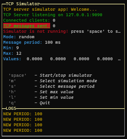
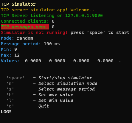
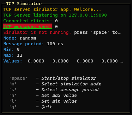
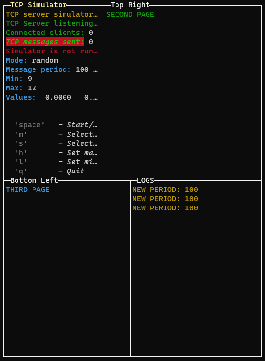
The application instance needs to output the content through a layout class. In the "layoutOptions" provided to the ConsoleManager, we can set the layout:
| boxed: true | boxed: false |
|---|---|
 |  |
| type: "single" | type: "double" | type: "quad" |
|---|---|---|
 |  |  |
To draw multiple pages, we need to use the setPage or setPages methods:
GUI.setPage(p, 0) // Add the first page without explicit name (default: application title)

const p1 = new PageBuilder()
p1.addRow({ text: "SECOND PAGE", color: "green" })

const P2 = new PageBuilder()
P2.addRow({ text: "THIRD PAGE", color: "cyan" })

GUI.setPage(p1, 1, "Top Right")
GUI.setPage(P2, 2, "Bottom Left")

// Or if we want to add the pages in the same order (only one render):
GUI.setPages([p, p1, P2], ["App Title", "Top Right", "Bottom Left"])
If we are in quad layout mode or double horizontal layout, we can change the aspect ratio of the layout rows by pressing the "left" and "right" keys:
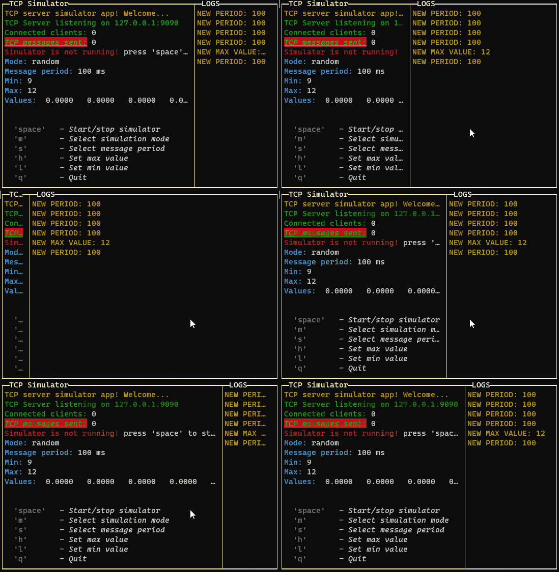
If you are using the quad layout mode the arrow keys will change the aspect ratio of the layout selected row (the top or the bottom row, depending on the selected page)
new OptionPopup("popupSelectPeriod", "Select simulation period", periodList, period).show().on("confirm", (_period) => {
    period = _period
    GUI.warn(`NEW PERIOD: ${period}`)
    drawGui()
})
constructor(id, title, options, selected)
The response is triggered via EventEmitter using "on" The result is this:
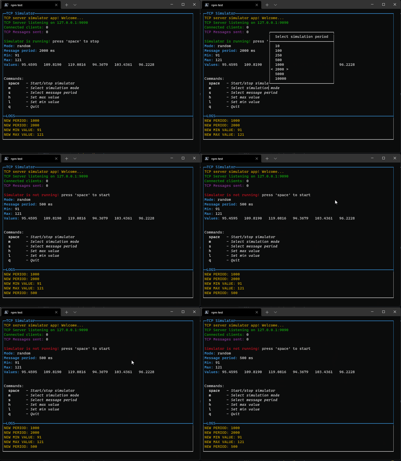
Pressing enter it will close the popup and set the new value. If the list is too long, it will scroll reaching the bottom or top. Now you can also use "pageup" amd "pagedown" keys to navigate faster.
new InputPopup("popupTypeMax", "Type max value", max, true).show().on("confirm", (_max) => {
    max = _max
    GUI.warn(`NEW MAX VALUE: ${max}`)
    drawGui()
})
constructor(id, title, value, isNumeric)
You can use it for example to set a numeric threshold:
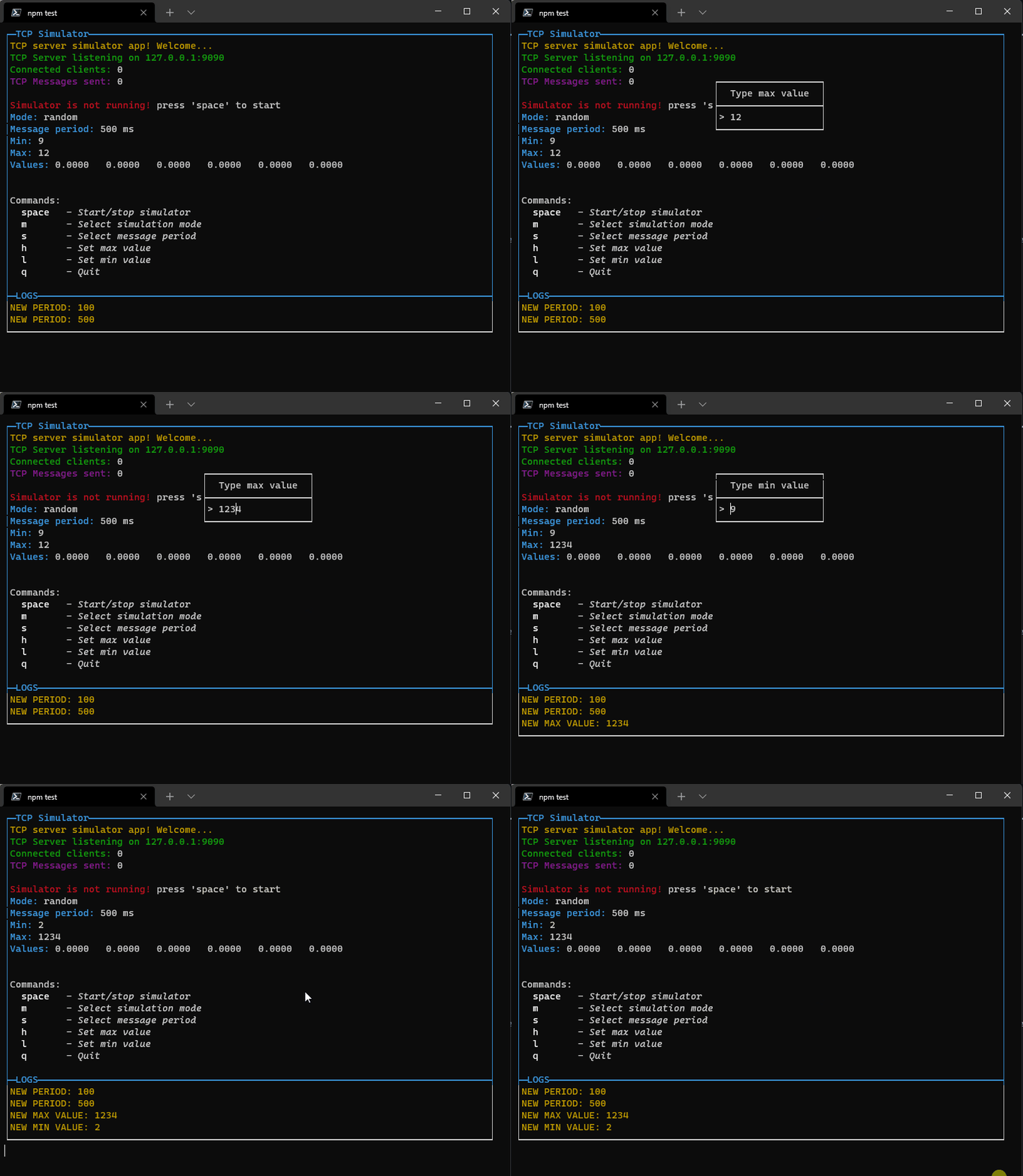
If you set isNumeric to true, only numbers are allowed. All class of components will be destroyed when the popup is closed. The event listeners are removed from the store. Then the garbage collector will clean the memory.
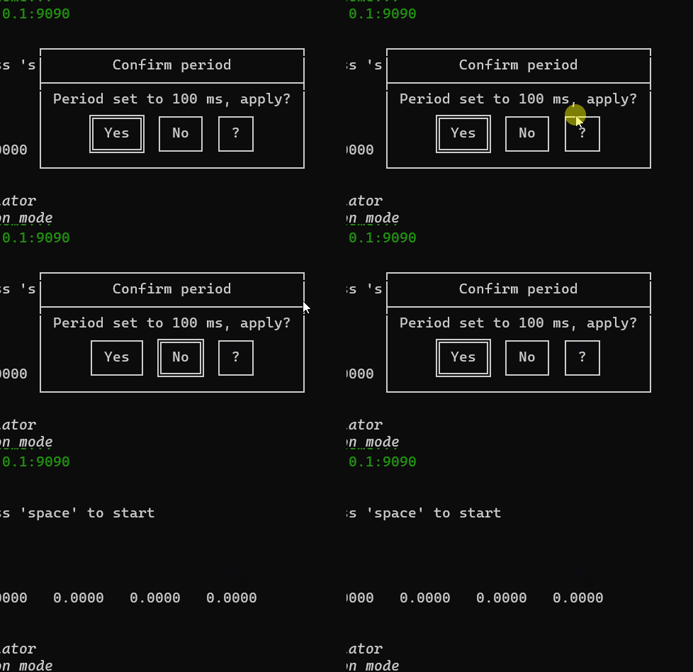
new ButtonPopup("popupConfirmPeriod", "Confirm period", `Period set to ${period} ms, apply?`, ["Yes", "No", "?"]).show().on("confirm", (answer) => {
    if (answer === "Yes") {
        period = _period
        GUI.warn(`NEW PERIOD: ${period}`)
    } else if (answer === "?") {
        GUI.info(`Choose ok to confirm period`)
    }
    drawGui()
})
constructor(id, title, message, buttons = ["Ok", "Cancel", "?"])
You can use it for example to make a question:
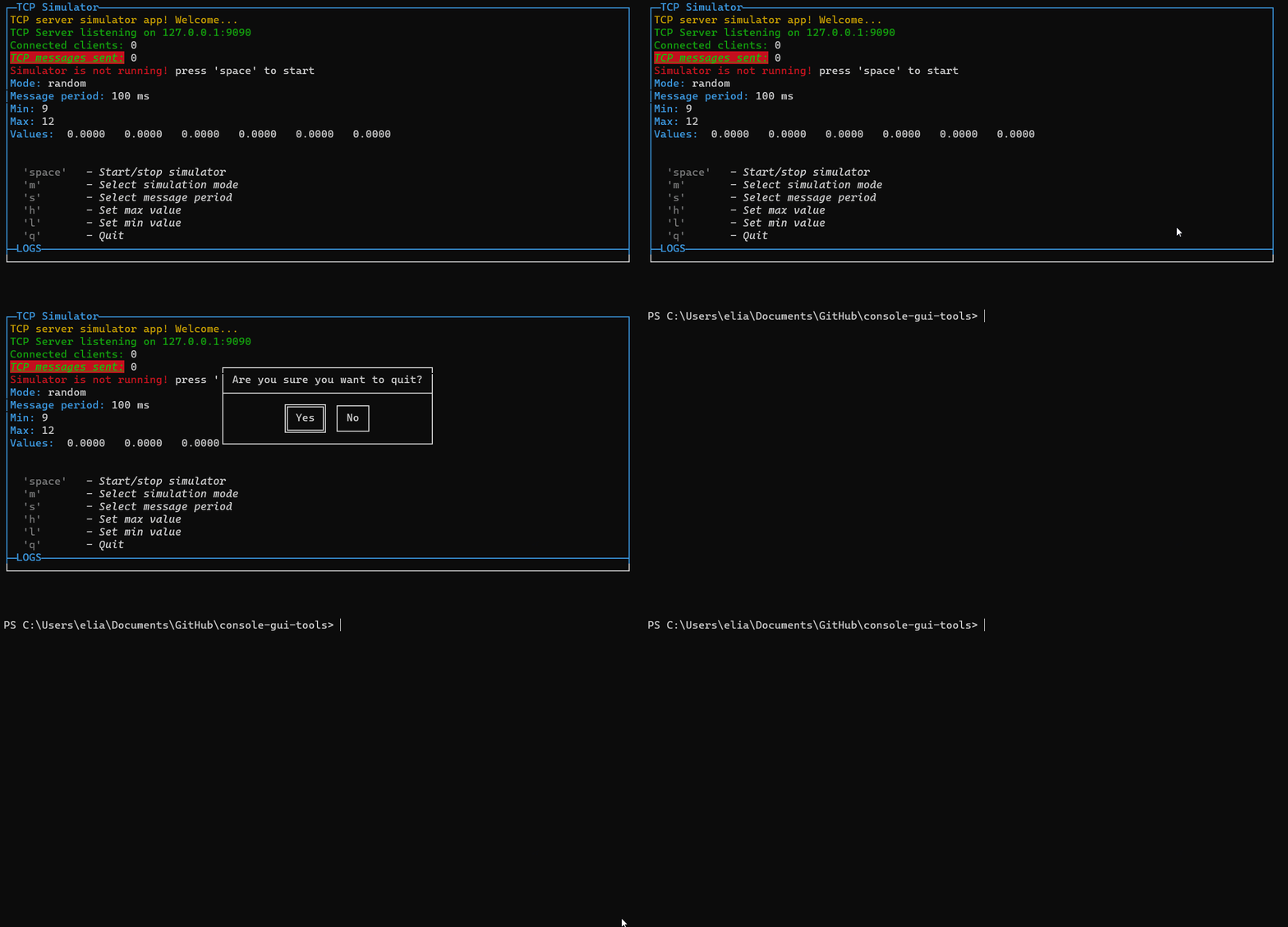
new ConfirmPopup("popupQuit", "Are you sure you want to quit?").show().on("confirm", () => closeApp())
constructor(id, title)
You can use it for example to confirm before quit the app:
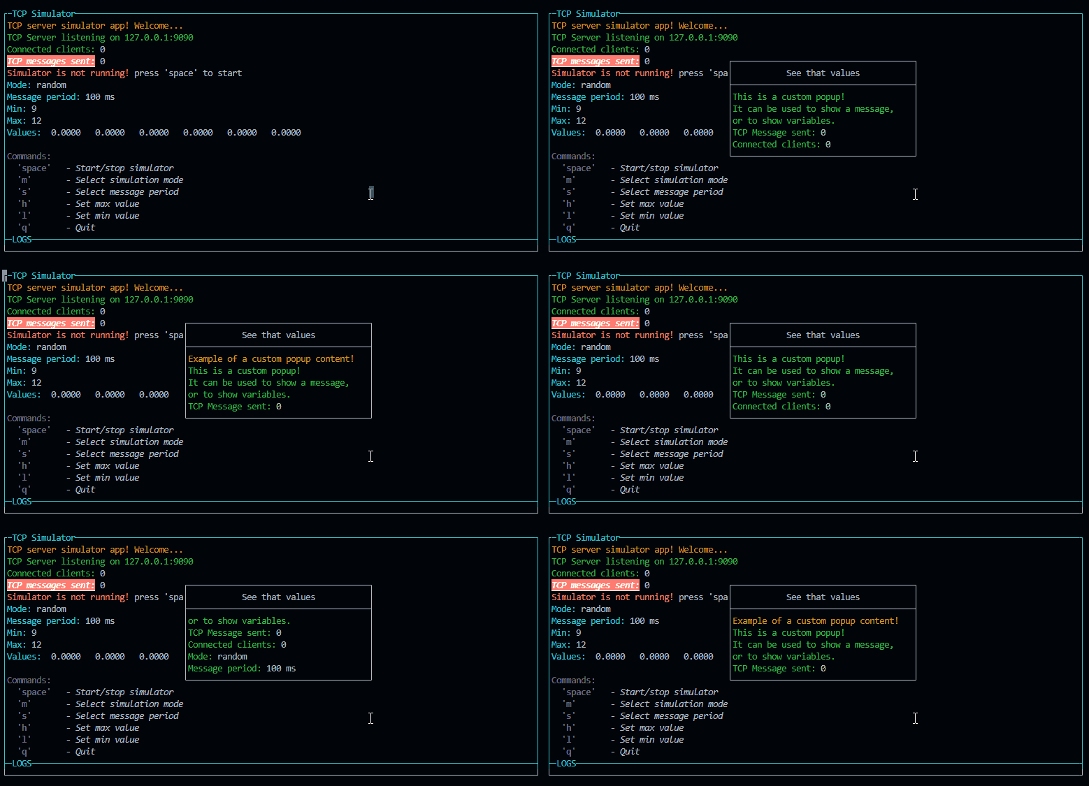
const p = new PageBuilder(5) // Add a scroll limit so it will be scrollable with up and down
p.addRow({ text: `Example of a custom popup content!`, color: 'yellow' })
p.addRow({ text: `This is a custom popup!`, color: 'green' })
p.addRow({ text: `It can be used to show a message,`, color: 'green' })
p.addRow({ text: `or to show variables.`, color: 'green' })
p.addRow({ text: `TCP Message sent: `, color: 'green' }, { text: `${tcpCounter}`, color: 'white' })
p.addRow({ text: `Connected clients: `, color: 'green' }, { text: `${connectedClients}`, color: 'white' })
p.addRow({ text: `Mode: `, color: 'green' }, { text: `${mode}`, color: 'white' })
p.addRow({ text: `Message period: `, color: 'green' }, { text: `${period} ms`, color: 'white' })
new CustomPopup("popupCustom1", "See that values", p, 32).show()
constructor(id, title, content, width)
You can use it for example to snow some custo text or values. If you declare it as a global variable, you can update it anytime. In the next steps I will add a new kind of components: InPageComponents, that will be added as a child of a PageBuilder class. That means that they allows to build a custom popup widget with components inside.
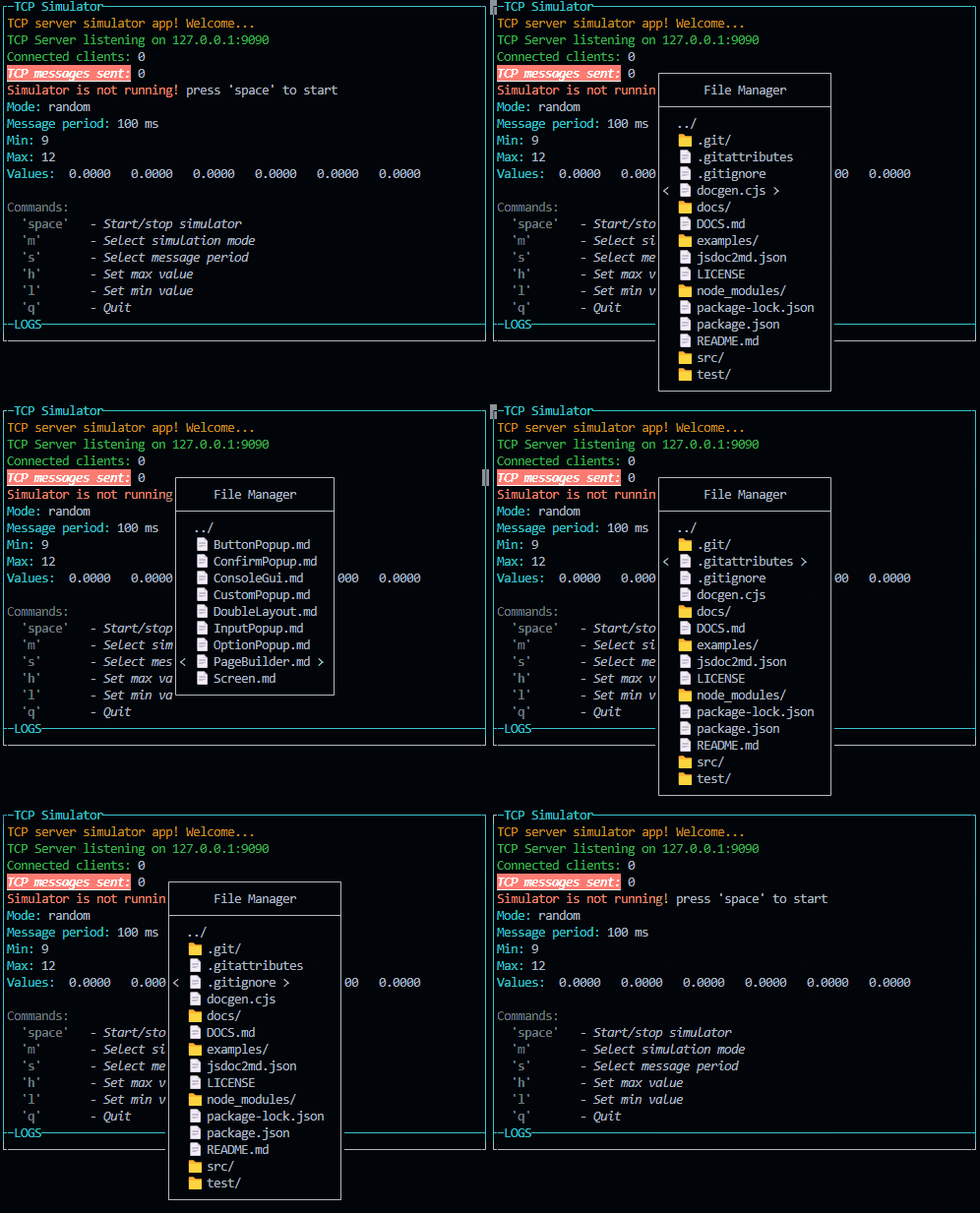
new FileSelectorPopup("popupFileManager", "File Manager", "./").show().on("confirm", (file) => {
    GUI.warn(`File selected: ${file}`)
    drawGui()
})
constructor(id, title, content, width)
stringstringstring - The main path of the popup. re case sensitive.boolean - If true, the user can select a directory. Otherwise, only files are selectable. When true, to enter a directory, the user must press the space key instead of the enter key.Array<string>This class is used to create a popup with a file input to select a file or a directory. It will run a promise with fs.readdir to get the list of files and directories. The user can select a file or a directory and the popup will be closed.
Emits the following events:
All class of components will be destroyed when the popup is closed. The event listeners are removed from the store. Then the garbage collector will clean the memory.
To log you have to use the following functions:
GUI.log(`NEW MIN VALUE: ${min}`)
GUI.warn(`NEW MIN VALUE: ${min}`)
GUI.error(`NEW MIN VALUE: ${min}`)
GUI.info(`NEW MIN VALUE: ${min}`)
And then written to the bottom of the page.
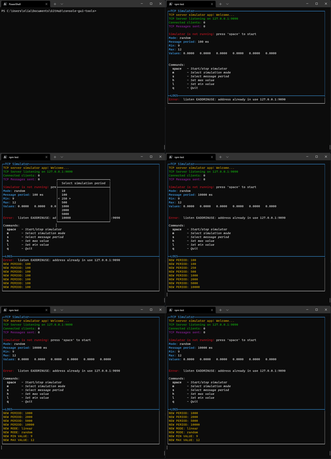
You can switch to the log view by pressing the "changeLayoutKey" key or combination: The maximum number of lines is set to 10 by default but you can change it by setting the option "logsPageSize". When the logs exceed the limit, you can scroll up and down with up and down arrows (if you are in the log view).
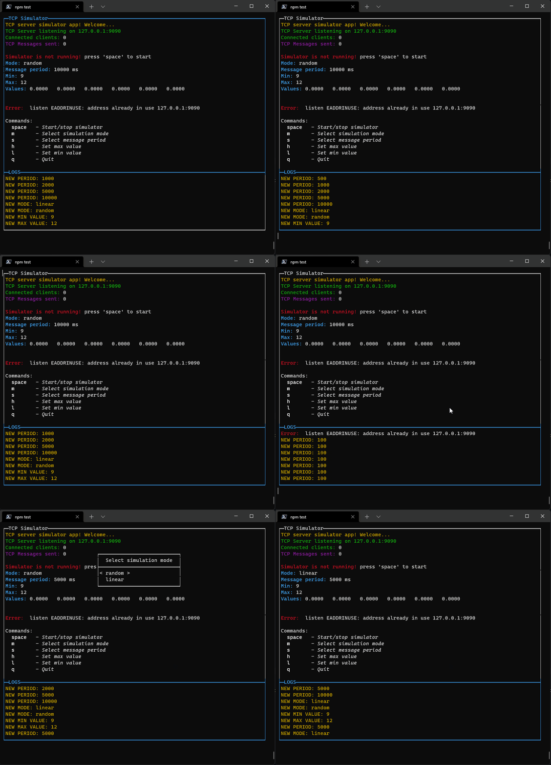
This library is in development now. New componets will come asap.
MIT License Copyright (c) 2022 Elia Lazzari
Colors and styles are managed using Chalk

To see the code documentation, please click on the following link:
FAQs
Clone of console-gui-tools library with minor changes to build it as CommonJS module.
The npm package console-gui-tools-cjs receives a total of 3 weekly downloads. As such, console-gui-tools-cjs popularity was classified as not popular.
We found that console-gui-tools-cjs demonstrated a not healthy version release cadence and project activity because the last version was released a year ago. It has 1 open source maintainer collaborating on the project.
Did you know?

Socket for GitHub automatically highlights issues in each pull request and monitors the health of all your open source dependencies. Discover the contents of your packages and block harmful activity before you install or update your dependencies.

Security News
Deno 2.2 enhances Node.js compatibility, improves dependency management, adds OpenTelemetry support, and expands linting and task automation for developers.

Security News
React's CRA deprecation announcement sparked community criticism over framework recommendations, leading to quick updates acknowledging build tools like Vite as valid alternatives.

Security News
Ransomware payment rates hit an all-time low in 2024 as law enforcement crackdowns, stronger defenses, and shifting policies make attacks riskier and less profitable.