Research
Security News
Malicious npm Packages Inject SSH Backdoors via Typosquatted Libraries
Socket’s threat research team has detected six malicious npm packages typosquatting popular libraries to insert SSH backdoors.

npm i corners
yarn add corners
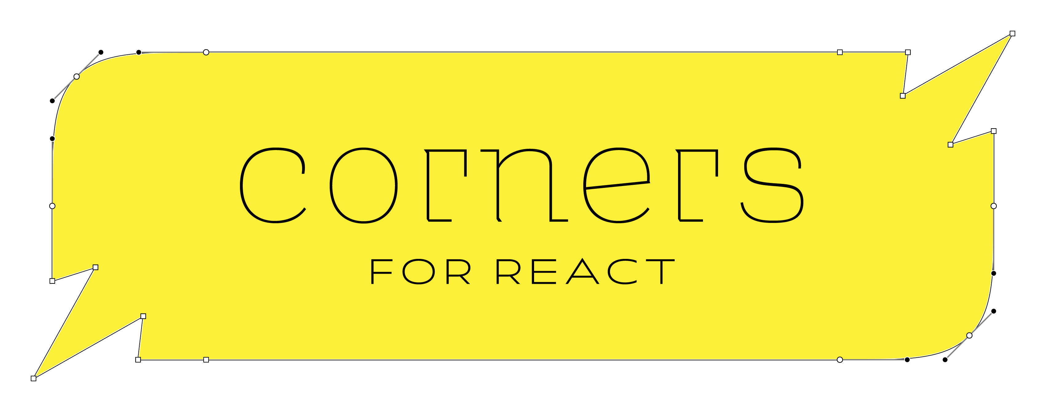
Create react components with angled or smooth-rounded corners.
const MyRoundedButton = rounded.button
const dogEared = corners(chamfer, null, null, null).size(40)
const MyDogEaredButton = dogEared.button
rounded.size(10).div)corners(round).options({shadow: {...}}).div)corners(...cornerFns).with({ cornerSize, noClipping, above, below }) => ComponentFactory
Creates a new component factory with the given corner functions. The corner functions are applied in the order they are given.
| Argument | Type | Required? | Description |
|---|---|---|---|
| cornerFns | Nullable<DrawCorner>[] | Yes | 1, 2, or 4 functions that specify the corners for this factory in clockwise order |
| cornerSize | number | No | Equivalent to N in css border-radius: Npx |
| noClipping | boolean | No | true is equivalent to css overflow: visible |
| above | Partial<Layer>[] | No | Layers with the same shape as the component, but rendered above the component |
| below | Partial<Layer>[] | No | Layers with the same shape as the component, but rendered below the component |
| Returns | Type | Description |
|---|---|---|
| ComponentFactory | ComponentFactory | A new component factory with the given corner functions and options applied. |
A function that draws a corner
| Argument | Type | Required? | Description |
|---|---|---|---|
| p1 | { x: number; y: number; } | Yes | The first point of the corner |
| p2 | { x: number; y: number; } | Yes | The second point of the corner |
| idx | number | Yes | The index of the corner. 0 = top right, 1 = bottom right, 2 = bottom left, 3 = top left. |
| Returns | Type | Description |
|---|---|---|
| pathPoints | string[] | svg path commands |
A layer takes the same shape as the component it is applied to.
| Property | Type | Required? | Description |
|---|---|---|---|
| color | string | Yes | The color of the layer |
| x | number | Yes | The x offset of the layer |
| y | number | Yes | The y offset of the layer |
| blur | number | Yes | The blur radius of the layer |
| spread | number | Yes | The spread radius of the layer |
| stroke | Stroke | No | The stroke of the layer |
 /¯¯¯¯¯¯¯¯¯|
/          |
|          |
|__________|
(it should look like a dog-eared page)
import type { FC } from "react"
import corners, { chamfer } from "corners"

const upperLeftDogeared = corners(null, null, null, chamfer).with({ cornerSize: 20 })

const DogearedDiv = upperLeftDogeared.div

const MyComponent: FC = () => (
  <DogEaredDiv style={{ background: "black" }}>
    Hello, World!
  </DogEaredDiv>
)
import type { FC } from "react"
import { rounded } from "corners"

const LAYER: Record<string, Partial<Layer>> = {
  FAINT_SHADOW: { color: `#0003`, spread: -4, blur: 12, y: -4 },
  LIGHT_FILL: { color: `#f3f3f3` },
}
const RoundedSpanWithShadow = rounded.span.with({
  cornerSize: 15,
  below: [LAYER.LIGHT_FILL, LAYER.FAINT_SHADOW],
  noClipping: true,
})

const MyComponent: FC = () => (
  <RoundedSpanWithShadow>
    Hello, World!
  </RoundedSpanWithShadow>
)
MIT
FAQs
Unknown package
We found that corners demonstrated a not healthy version release cadence and project activity because the last version was released a year ago. It has 1 open source maintainer collaborating on the project.
Did you know?

Socket for GitHub automatically highlights issues in each pull request and monitors the health of all your open source dependencies. Discover the contents of your packages and block harmful activity before you install or update your dependencies.

Research
Security News
Socket’s threat research team has detected six malicious npm packages typosquatting popular libraries to insert SSH backdoors.

Security News
MITRE's 2024 CWE Top 25 highlights critical software vulnerabilities like XSS, SQL Injection, and CSRF, reflecting shifts due to a refined ranking methodology.

Security News
In this segment of the Risky Business podcast, Feross Aboukhadijeh and Patrick Gray discuss the challenges of tracking malware discovered in open source softare.