npm i corners
yarn add corners
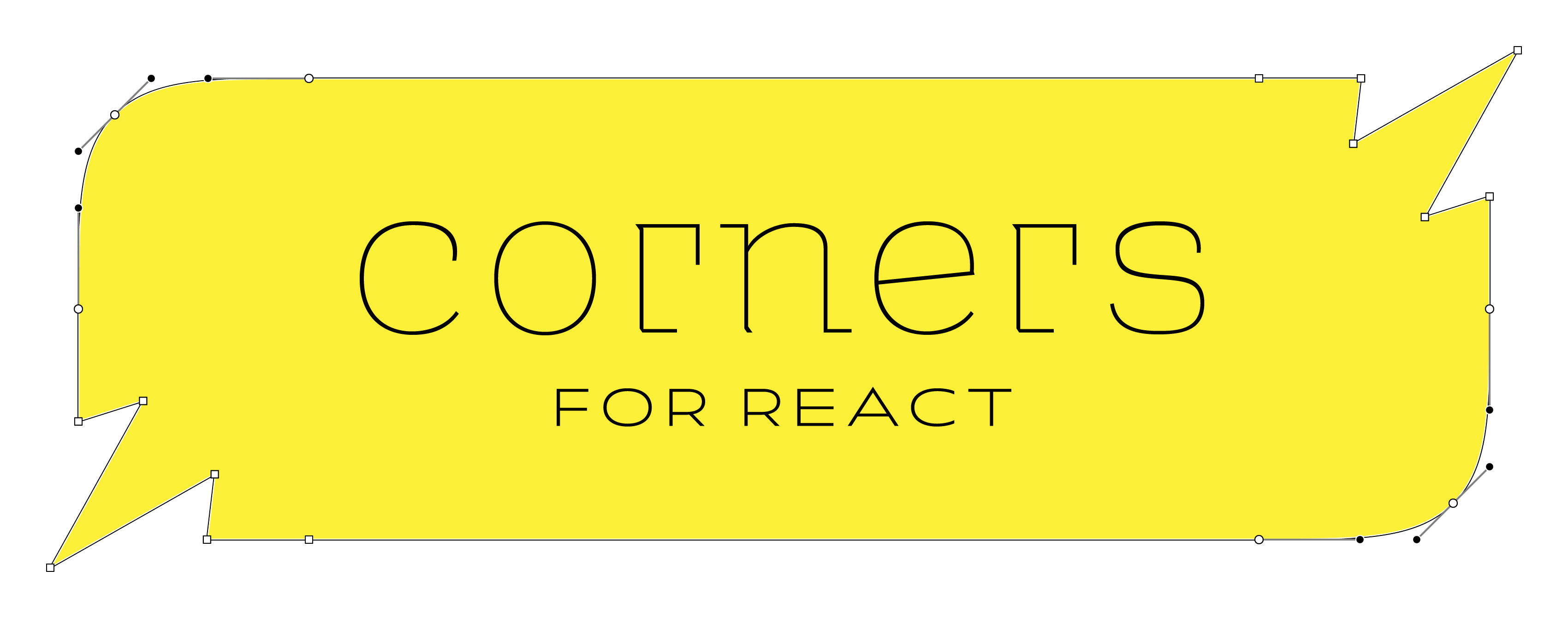
Create react components with angled or smooth-rounded corners.
Features
API
corners
corners(...cornerFns).with({ cornerSize, noClipping, above, below }) => ComponentFactory
Creates a new component factory with the given corner functions. The corner functions are applied in the order they are given.
| Argument | Type | Required? | Description |
|---|
| cornerFns | Nullable<DrawCorner>[] | Yes | 1, 2, or 4 functions that specify the corners for this factory in clockwise order |
| cornerSize | number | No | Equivalent to N in css border-radius: Npx |
| noClipping | boolean | No | true is equivalent to css overflow: visible |
| above | Partial<Layer>[] | No | Layers with the same shape as the component, but rendered above the component |
| below | Partial<Layer>[] | No | Layers with the same shape as the component, but rendered below the component |
| Returns | Type | Description |
|---|
| ComponentFactory | ComponentFactory | A new component factory with the given corner functions and options applied. |
DrawCorner
(p1, p2, idx) => pathPoints
A function that draws a corner
| Argument | Type | Required? | Description |
|---|
| p1 | { x: number; y: number; } | Yes | The first point of the corner |
| p2 | { x: number; y: number; } | Yes | The second point of the corner |
| idx | number | Yes | The index of the corner. 0 = top right, 1 = bottom right, 2 = bottom left, 3 = top left. |
| Returns | Type | Description |
|---|
| pathPoints | string[] | svg path commands |
Layer
A layer takes the same shape as the component it is applied to.
| Property | Type | Required? | Description |
|---|
| color | string | Yes | The color of the layer |
| x | number | Yes | The x offset of the layer |
| y | number | Yes | The y offset of the layer |
| blur | number | Yes | The blur radius of the layer |
| spread | number | Yes | The spread radius of the layer |
| stroke | Stroke | No | The stroke of the layer |
Examples
Make a "dog-eared" component
 /¯¯¯¯¯¯¯¯¯|
/          |
|          |
|__________|
(it should look like a dog-eared page)
import type { FC } from "react"
import corners, { chamfer } from "corners"

const upperLeftDogeared = corners(null, null, null, chamfer).with({ cornerSize: 20 })

const DogearedDiv = upperLeftDogeared.div

const MyComponent: FC = () => (
  <DogEaredDiv style={{ background: "black" }}>
    Hello, World!
  </DogEaredDiv>
)
Make a "squircled" component with a drop shadow
import type { FC } from "react"
import { rounded } from "corners"

const LAYER: Record<string, Partial<Layer>> = {
  FAINT_SHADOW: { color: `#0003`, spread: -4, blur: 12, y: -4 },
  LIGHT_FILL: { color: `#f3f3f3` },
}
const RoundedSpanWithShadow = rounded.span.with({
  cornerSize: 15,
  below: [LAYER.LIGHT_FILL, LAYER.FAINT_SHADOW],
  noClipping: true,
})

const MyComponent: FC = () => (
  <RoundedSpanWithShadow>
    Hello, World!
  </RoundedSpanWithShadow>
)
LICENSE
MIT