Security News
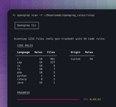
Opengrep Emerges as Open Source Alternative Amid Semgrep Licensing Controversy
Opengrep forks Semgrep to preserve open source SAST in response to controversial licensing changes.
css-media-vars
Advanced tools
A brand new way to write responsive CSS. Named breakpoints, DRY selectors, no scripts, no builds, vanilla CSS.
A brand new way to write responsive CSS. Named breakpoints, DRY selectors, no scripts, no builds, vanilla CSS.
Docs+Demos at: https://propjockey.github.io/css-media-vars/
NPM: https://www.npmjs.com/package/css-media-vars
GitHub: https://github.com/propjockey/css-media-vars
Install:
$ npm install css-media-vars
Then include the /node_modules/css-media-vars/css-media-vars.css file before any stylesheets that use it.
OR
Use your favorite NPM CDN and include it on your page before other stylesheets for small projects. Like so:
<link rel="stylesheet" type="text/css" href="https://unpkg.com/css-media-vars/css-media-vars.css">
  .breakpoints-demo > * {
    --xs-width: var(--media-xs) 100%;
    --sm-width: var(--media-sm) 49%;
    --md-width: var(--media-md) 32%;
    --lg-width: var(--media-gte-lg) 24%;
    width: var(--xs-width, var(--sm-width, var(--md-width, var(--lg-width))));

    --sm-and-down-bg: var(--media-lte-sm) red;
    --md-and-up-bg: var(--media-gte-md) green;
    background: var(--sm-and-down-bg, var(--md-and-up-bg));
  }
VS Writing this same basic responsive CSS in the traditional way:
  .breakpoints-demo > * {
    width: 100%;
    background: red;
  }
  @media (min-width: 37.5em) and (max-width: 56.249em) {
    .breakpoints-demo > * {
      width: 49%;
    }
  }
  @media (min-width: 56.25em) and (max-width: 74.99em) {
    .breakpoints-demo > * {
      width: 32%;
    }
  }
  @media (min-width: 56.25em) {
    .breakpoints-demo > * {
      background: green;
    }
  }
  @media (min-width: 75em) {
    .breakpoints-demo > * {
      width: 24%;
    }
  }
css-media-vars let you write responsive, vanilla, CSS with named breakpoints, DRY selectors, and easier to mantain code.
Write CSS that responds to the browser's support of @property from Houdini:
  .warning-at-property-unsupported {
    --display-block-if-unsupported: var(--media-at-property-unsupported) block;
    display: var(--display-block-if-unsupported, none); /* display: none if @property is supported */
  }
  .congrats-at-property-supported {
    --display-none-if-unsupported: var(--media-at-property-unsupported) none;
    display: var(--display-none-if-unsupported, block); /* display: block if @property is supported */
  }
  :root {
    --at-prop-unsupported-color: var(--media-at-property-unsupported) red;
    --at-prop-color: var(--at-prop-unsupported-color, green);
    /* var(--at-prop-color) will return: */
    /* red if @property is unsupported */
    /* green if @property is supported */
  }
Environments that force minification with PostCSS and cssnano (or other CSS minifiers) may produce invalid CSS by striping the space from a --custom-var: ; assignment. To avoid this with Create React App, copy css-media-vars.css into the public folder and manually include it in the index.html file to avoid the minification until they're fixed.
You can read more about using the public folder here: https://create-react-app.dev/docs/using-the-public-folder/
v1.1.0 - June 27th, 2021:
--media-at-property-unsupported space toggle that detects CSS @property supportv1.0.0 - July 16th, 2020:
FAQs
A brand new way to write responsive CSS. Named breakpoints, DRY selectors, no scripts, no builds, vanilla CSS.
We found that css-media-vars demonstrated a not healthy version release cadence and project activity because the last version was released a year ago. It has 1 open source maintainer collaborating on the project.
Did you know?

Socket for GitHub automatically highlights issues in each pull request and monitors the health of all your open source dependencies. Discover the contents of your packages and block harmful activity before you install or update your dependencies.

Security News
Opengrep forks Semgrep to preserve open source SAST in response to controversial licensing changes.

Security News
Critics call the Node.js EOL CVE a misuse of the system, sparking debate over CVE standards and the growing noise in vulnerability databases.

Security News
cURL and Go security teams are publicly rejecting CVSS as flawed for assessing vulnerabilities and are calling for more accurate, context-aware approaches.