Dark React Starter Template + UI Kit.
-
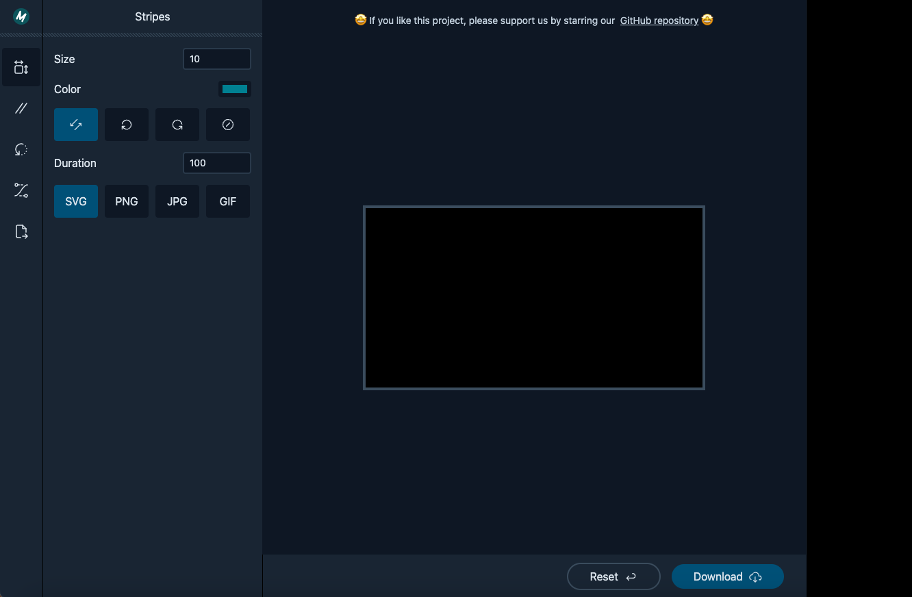
Buttons Group
export interface IButtonsGroup {
    children?: React.ReactNode;
    classes?: string;
}

export interface IButtonsGroupButton {
    children?: React.ReactNode;
    classes?: string;
    title?: string;
    selected?: boolean;
    onClick?: Function;
}
<ButtonsGroup>
    <ButtonsGroupButton selected={ myValue === 0 } onClick={ () => {
        setMyValue(0);
    }}>My Value 1</ButtonsGroupButton>

    <ButtonsGroupButton selected={ myValue === 1 } onClick={ () => {
        setMyValue(1);
    }}>My Value 2</ButtonsGroupButton>

    <ButtonsGroupButton selected={ myValue === 2 } onClick={ () => {
        setMyValue(2);
    }}>My Value 3</ButtonsGroupButton>
</ButtonsGroup>
-
Icons Radio Buttons
export interface IIconRadioButtonGroup {
    children?: React.ReactNode;
    classes?: string;
}

export interface IIconRadioButton {
  groupName: string;
  children?: React.ReactNode;
  classes?: string;
  title?: string;
  checked?: boolean;
  onChange?: Function;
}
<IconRadioButtonGroup>
    <IconRadioButton
        groupName="my-group"
        title="My Title 1"
        checked={ myValue === 0 }
        onChange={ () => {
            setValue(0);
        }}>
        My Radio 1
    </IconRadioButton>

    <IconRadioButton
        groupName="my-group"
        title="My Title 2"
        checked={ myValue === 1 }
        onChange={ () => {
          setValue(1);
        }}>
      My Radio 2
    </IconRadioButton>

</IconRadioButtonGroup>
-
Color Picker
export interface IColorPicker {
    color: string;
    setColor?: Function;
    children?: React.ReactNode;
    classes?: string;
}
<ColorPicker classes="m-4" color={ color } setColor={ setColor }>
    Color
</ColorPicker>
-
Numbers TextBox
export interface INumberTextBox {
    children?: React.ReactNode;
    classes?: string;
    width?: string|number;

    min?: number | string;
    max?: number | string;
    step?: number | string;
    decimalPlaces?: number;
    removeRegex?: RegExp;

    value?: number | string;
    setValue?: Function;
}
<NumberTextBox classes="m-4" width="100px" value={ size } setValue={ setSize }>
    Size
</NumberTextBox>