Security News
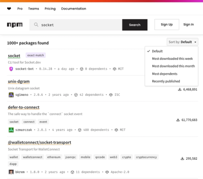
npm Updates Search Experience with New Objective Sorting Options
npm has a revamped search experience with new, more transparent sorting options—Relevance, Downloads, Dependents, and Publish Date.
easy-react-form
Advanced tools
Simple, fast and easy-to-use React Form.
npm install easy-react-form --save
<Form/> element with onSubmit property being a function of values.<Field/>s inside the <Form/> each one having a name and a component.<Form/>.Simplest example:
import { Form, Field } from 'easy-react-form'

<Form onSubmit={ values => console.log(values) }>
  <Field
    name="phone"
    component="input"
    type="tel"
    placeholder="Enter phone number" />

  <button> Submit </button>
</Form>
Advanced example:
import { Form, Field, Submit } from 'easy-react-form'

class AdvancedExample extends React.Component {
  // Form field validation example.
  // If `validate` returns a string
  // then it becomes the `error` of the `<Field/>`.
  validatePhone = (value) => {
    if (value && !isValidPhoneNumber(value)) {
      return 'Invalid phone number'
    }
  }

  // Form submit function.
  // Can be `async/await`.
  // Can return a `Promise`.
  submit = (values) => {
    console.log(values)
    return new Promise(resolve => setTimeout(resolve, 3000))
  }

  render() {
    // Initial form field value example.
    const { user } = this.props

    return (
      <Form onSubmit={ this.submit }>
        <Field
          required
          name="phone"
          component={ TextInput }
          type="tel"
          placeholder="Enter phone number"
          // Initial value for this field.
          value={ user.phone }
          validate={ this.validatePhone } />

        <Submit component={ SubmitButton }>
          Save
        </Submit>
      </Form>
    )
  }
}

// `error` is passed if the field is invalid.
function TextInput({ error, ...rest }) {
  return (
    <div>
      <input type="text" { ...rest }/>
      { error && <div className="error">{ error }</div> }
    </div>
  )
}

// `wait` is `true` while form is submitting.
function SubmitButton({ wait, children }) {
  return (
    <button disabled={ wait }>
      { children }
    </button>
  )
}
The <Form/> takes the following required properties:
onSubmit : Function(values) — Can be async or return a Promise.The <Form/> takes the following optional properties:
values : object — The initial values for this form's fields.
trim : Boolean – Set to false to disable trimming strings. Defaults to true.
requiredMessage : String – The default error message for <Field required/>. Is "Required" by default.
onError : Function(Error) — Submit error handler. E.g. can show a popup with error message.
autoFocus : Boolean — Set to true to automatically focus on the first form field when the form is mounted. Defauls to false.
wait : Boolean — The initial wait state of the submit button. Can be used when the form is "loading" on first render.
onBeforeSubmit : Function
onAfterSubmit : Function
onAbandon : Function(fieldName, fieldValue) — If a form field was focused but then the form wasn't submitted and was unmounted then this function is called meaning that the user possibly tried to fill out the form but then decided to move on for some reason (e.g. didn't know what to enter in a particular form field).
The <Form/> component instance (ref) provides the following methods:
focus(fieldName : String) — Focuses on a field.
scroll(fieldName : String) — Scrolls to a field (if it's not visible on the screen).
clear(fieldName : String) — Clears field value.
get(fieldName : String) — Gets form field value.
set(fieldName : String, value : any) — Sets form field value.
watch(fieldName : String) : any — Watches a form field's value. Returns the current form field's value and re-renders the whole form whenever that value changes.
values() — Returns form field values (an alternative to get(fieldName : String)).
reset() — Resets all form field values.
Upon form submission, if any one of its fields is invalid, then that field will be automatically scrolled to and focused, and the actual form submission won't happen.
The <Form/> can also accept children being a function(parameters) returning a React.Element that will be called on any form value change, so it can be used in cases when re-rendering the whole <Form/> is required on any form value change. Available parameters:
values : Object — Form values. Is undefined until the form is initialized (mounted) (<Field/> values are undefined until those <Feild/>s are mounted).
set(fieldName : String, value : any) — Sets form field value.
clear(fieldName : String) — Clears field value.
reset() — Resets all form field values.
watch(fieldName : String) : any — Watches a form field's value. Returns the current form field's value and re-renders the whole form whenever that value changes. Returns undefined until the form is initialized (mounted) (<Field/> defaultValues are not set until those <Feild/>s have mounted).
focus(fieldName : String) — Focuses on a field.
scroll(fieldName : String) — Scrolls to a field (if it's not visible on the screen).
submitting : boolean — Whether the form is currently being submitted.
<Field/> takes the following required properties:
name : String
component : (React.Component|Function|String) — React component (can also be a string like input). Must accept a ref for calling ref.current.focus() and also must provide the means of obtaining the DOM Element for calling element.scrollIntoView(). Therefore, component must be either a string, or a React.Component, or a "functional" component wrapped in React.forwardRef(), or a "functional" component using useImperativeRef() "hook" providing .focus() and .getDOMNode() methods.
<Field/> takes the following optional properties:
value - the initial value of the field.
validate(value, allFormValues) : String — form field value validation function returning an error message if the field value is invalid.
error : String - an error message which can be set outside of the validate() function. Can be used for some hypothetical advanced use cases.
required : String or Boolean — adds "this field is required" validation for the <Field/> with the error message equal to required property value if it's a String defaulting to "Required" otherwise. Note that value={false} is valid in case of required because false is a non-empty value (e.g. "Yes"/"No" dropdown), therefore use validate function instead of required for checkboxes that are required to be checked, otherwise an unchecked checkbox will have value={false} and will pass the required check.
<Field/> passes the following properties to the field component:
value
onChange
onFocus
onBlur
disabled : Boolean — is true when form is submitting.
required : Boolean — is true when the <Field/> is required and the value is missing.
error : String — error message.
All other properties are passed through.
The error display algorythm is as follows:
Initially error for a field is not passed.
Whenever the user submits the form, errors are displayed for all invalid form fields.
Whenever the user edits a field's value, error becomes undefined for that field while the user is focused on the field.
Whenever the user focuses out of a field it is re-validated and error is passed if it's invalid.
Whenever a new error property is manually set on the <Field/> component that error is displayed.
Therefore, the error message is only shown when the user is not editing the field. For example, while the user is typing a phone number that phone number is invalid until the used inputs it fully, but it wouldn't make sense to show the "Invalid phone number" error to the user while he is in the process of inputting the phone number (it would just be an annoying distraction).
<Submit/> takes the following required properties:
component : (React.Component|Function|String) — React component (can also be a string like button).<Submit/> passes the following properties to the component:
wait : Boolean — indicates if the form is currently being submitted.
All other properties are passed through.
function Example() {
  return (
    <Form onSubmit={ ... }>
      <Field name="text" component={ Input } />

      <Submit component={ SubmitButton }>
        Submit
      </Submit>
    </Form>
  )
}

function SubmitButton({ wait, children }) {
  return (
    <button disabled={ wait }>
      { wait && <Spinner/> }
      { children }
    </button>
  )
}
An error property can be set on a <Field/> if this field was the reason form submission failed on the server side.
This must not be a simple client-side validation error because for validation errors there already is validate property. Everything that can be validated up-front (i.e. before sending form data to the server) should be validated inside validate function. All other validity checks which can not be performed without submitting form data to the server are performed on the server side and if an error occurs then this error goes to the error property of the relevant <Field/>.
For example, consider a login form. Username and password <Field/>s both have validate properties set to the corresponding basic validation functions (e.g. checking that the values aren't empty). That's as much as can be validated before sending form data to the server. When the form data is sent to the server, server-side validation takes place: the server checks if the username exists and that the password matches. If the username doesn't exist then an error is returned from the HTTP POST request and the error property of the username <Field/> should be set to "User not found" error message. Otherwise, if the username does exist, but, say, the password doesn't match, then the error property of the password <Field/> should be set to "Wrong password" error message.
One thing to note about <Field/> errors is that they must be reset before form data is sent to the server: otherwise it would always say "Wrong password" even if the password is correct this time. Another case is when the error is set to the same value again (e.g. the entered password is wrong once again) which will not trigger showing that error because the error is shown only when its value changes: nextProps.error !== this.props.error. This is easily solved too by simply resetting errors before form data is sent to the server.
import { connect } from 'react-redux'
import { Form, Field, Submit } from 'easy-react-form'

@connect(state => ({ loginError: state.loginForm.error }))
class LoginForm extends Component {
  validateNotEmpty(value) {
    if (!value) {
      return 'Required'
    }
  }

  submit(values) {
    // Clears `state.loginForm.error`
    dispatch({ type: 'LOGIN_FORM_CLEAR_ERROR' })

    // Sends form data to the server
    return dispatch(sendHTTPLoginRequest(values))
  }

  render() {
    const { loginError } = this.props

    return (
      <Form onSubmit={this.submit}>
        <Field
          name="username"
          component={Input}
          validate={this.validateNotEmpty}
          error={loginError === 'User not found' ? loginError : undefined} />

        <Field
          name="password"
          component={Input}
          validate={this.validateNotEmpty}
          error={loginError === 'Wrong password' ? loginError : undefined} />

        <Submit component={SubmitButton}>
          Log In
        </Submit>
      </Form>
    )
  }
}

function Input({ error, ...rest }) {
  return (
    <div>
      <input {...rest}/>
      { error && <div className="error">{ error }</div> }
    </div>
  )
}
Sometimes there're forms on which new rows can be added by clicking "Add new row" button. For such cases there's <List/> component that handles adding new rows and removing existing ones.
import React from 'react'
import { Form, Field, List, Submit } from 'easy-react-form'

export default function Page() {
  return (
    <Form onSubmit={...}>
      <h1>
        The list of employees
      </h1>
      <List name="employees">
        {(items) => (
          <React.Fragment>
            {items.map((i) => (
              <React.Fragment>
                <Field
                  i={i}
                  name="firstName"
                  .../>
                <Field
                  i={i}
                  name="lastName"
                  .../>
                <button onClick={() => items.remove(i)}>
                  Remove
                </button>
              </React.Fragment>
            ))}
            <button onClick={items.add}>
              Add
            </button>
          </React.Fragment>
        )}
      </List>
      <Submit component="button">
        Save
      </Submit>
    </Form>
  )
}
<List/> accepts properties:
name: String — (required) The name of the list property in form values.count: Number — The initial items count. Is 1 by default.Nested <List/>s are not supported.
FAQs
Simple, fast and easy-to-use React Form
The npm package easy-react-form receives a total of 32 weekly downloads. As such, easy-react-form popularity was classified as not popular.
We found that easy-react-form demonstrated a not healthy version release cadence and project activity because the last version was released a year ago. It has 1 open source maintainer collaborating on the project.
Did you know?

Socket for GitHub automatically highlights issues in each pull request and monitors the health of all your open source dependencies. Discover the contents of your packages and block harmful activity before you install or update your dependencies.

Security News
npm has a revamped search experience with new, more transparent sorting options—Relevance, Downloads, Dependents, and Publish Date.

Security News
A supply chain attack has been detected in versions 1.95.6 and 1.95.7 of the popular @solana/web3.js library.

Research
Security News
A malicious npm package targets Solana developers, rerouting funds in 2% of transactions to a hardcoded address.