Research
Security News
Malicious npm Packages Inject SSH Backdoors via Typosquatted Libraries
Socket’s threat research team has detected six malicious npm packages typosquatting popular libraries to insert SSH backdoors.
easy-vue-camera
Advanced tools
The easiest way possible to have a camera view that supports mobile and looks close the native camera apps on mobile phones
This vue component is powered by easy-js-camera library.
This component has two sub-components. One is called FullscreenViewCamera and the other is StandardViewCamera.
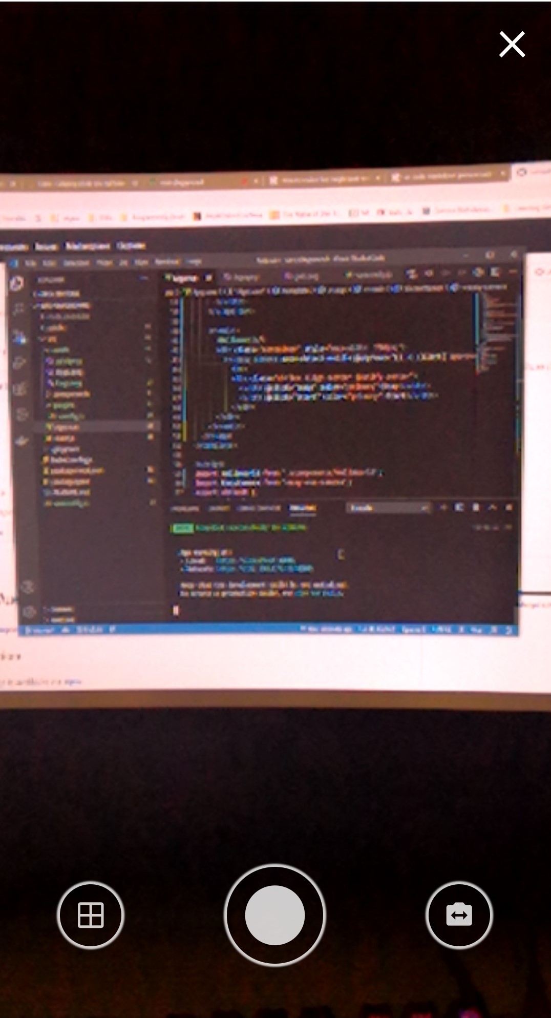
FullscreenViewCamera: This component provides a native app like look for the camera and the only part which is customizable is the Header. The picture below shows how it looks like.

StandardViewCamera: This component does not provide any UI actions and just renders the Video element along with a canvas to show the snapped picture in. This component is controllable via reference.
Note: If you enable the auto-detect-mobile property the mother component will automatically will decide which of the sub-components should be rendered. If this property is off you can toggle between the two, by toggling fullscreen property.
The package is available via npm. For using this package you also need to install easy-js-camera.
npm install easy-js-camera easy-vue-camera
After the installation is complete you can add the component with the following code.
import EasyCamera from 'easy-vue-camera';

Vue.use(EasyCamera);
or
import EasyCamera from 'easy-vue-camera';

//inside your vue options api
export default {
    components: {
        ...
        'v-easy-camera': EasyCamera
        ...
    }
}
After adding the EasyCamera component to your vue components you can use it like below.
<v-easy-camera
    v-model="picture"></v-easy-camera>
default: truedefault: falsedefault: falseoutput image that you expect from the component. You can set this to dataUrl or blob. default: dataUrlmask image.default: trueYou can access the functions inside the component by referencing the component.
close event.mustApprove property is not set then it will emit input and will send the picture back.loading event on beging and end of the function. loading event has a value of true or falseStandardView and will let you to toggle the overlayMask. On FullscreenView the mask is controlled by the component's UI actions.loading event with the value of true/false.FullscreenView or the StandardView finished a close request.FullscreenView. From the inside the component it already sends an input event to update you v-model value but it also emits this event to let you know that this new update is because of user approval. (This only occurs if must-approve property is on).FullscreenView and will let you to set a header. Please notice that setting custom header will replace the default close button.Please note that on desktop just the video is adjusted and no actions are shown. On desktop it is better that the actions are placed manually than using the component actions. The actions are available in fullscreen mode
FAQs
The easiest way possible to have a camera view that supports mobile and looks close the native camera apps on mobile phones
The npm package easy-vue-camera receives a total of 113 weekly downloads. As such, easy-vue-camera popularity was classified as not popular.
We found that easy-vue-camera demonstrated a not healthy version release cadence and project activity because the last version was released a year ago. It has 1 open source maintainer collaborating on the project.
Did you know?

Socket for GitHub automatically highlights issues in each pull request and monitors the health of all your open source dependencies. Discover the contents of your packages and block harmful activity before you install or update your dependencies.

Research
Security News
Socket’s threat research team has detected six malicious npm packages typosquatting popular libraries to insert SSH backdoors.

Security News
MITRE's 2024 CWE Top 25 highlights critical software vulnerabilities like XSS, SQL Injection, and CSRF, reflecting shifts due to a refined ranking methodology.

Security News
In this segment of the Risky Business podcast, Feross Aboukhadijeh and Patrick Gray discuss the challenges of tracking malware discovered in open source softare.