Font Handsome
‘Font Handsome’ aims to improve messy presentational classes and the huge predefined CSS file Font Awesome provides. Font Handsome lets you assign icons onto the very elements you need them to be.
Semantic issue aside, the main purpose of the project is to take back full control within style sheets. We don’t need no changing the HTML structure every time we want a different icon or modifying the DOM tree for other interactional effects, anymore.
Check out the demo →
Current version: 0.1.0, with all icons from Font Awesome 4.2.0.
Install
- NPM
npm i --save font-handsome - Bower
bower install --save font-handsome
Basic usage
Font Handsome currently supports Sass format. Import Font Handsome in your sheet,
@import ../(node_modules|bower_components)/font-handsome/index
Move the presentational classes fa-* into your Sass style sheets with the prefix fh-*.
Syntax
[container]
+fh( $icon, $color: false )
@extend %fh-* // Optional utility @extend(s)
Put icon’s name from http://fontawesome.io/icons/ without the prefix fa-.
Example
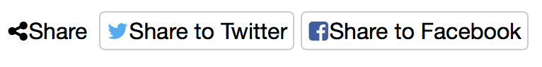
An old form in Font Awesome syntax would look like,
<span class="share"><i class="fa fa-share-alt"></i> Share</span>
<button class="share-twitter"><i class="fa fa-twitter"></i> Share to Twitter</button>
<button class="share-fb"><i class="fa fa-facebook-square"></i> Share to Twitter</button>
With Font Handsome, write no more presentational markups and classes,
<span class="share">Share</span>
<button class="share-twitter">Share to Twitter</button>
<button class="share-fb">Share to Twitter</button>
Import icons and assign colours to them with Sass mixin fh( $icon[, $color] ).
span.share
  +fh( $icon: share-alt )
button.share-twitter
  +fh( $icon: twitter, $color: #50aaf1 )
button.share-fb
  +fh( facebook-square, #405b9d )
Font Handsome smartly avoids code bloat. The @mixin syntax is equal to the @extend one below.
button.share-twitter
  @extend %fh, %fh-twitter
  +fh-color( #50aaf1 )
Starting or end point (::before/::after)
Defaultly Font Handsome uses ::before pseudo element for placing icons, which places icon at the starting point of an element. Assign icons onto ::after pseudo element with the prefix fha-*. This normally makes the icon appear in the end point of its container.
Syntax for end-point icon
[container]
+fha( $icon, $color )
@extend %fha-* // Optional utility @extend(s)
Example
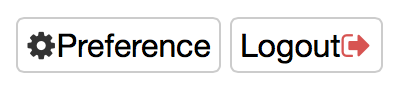
<button class="config">Preference</button>
<button class="logout">Logout</button>
button.config
  +fh( cog )
button.logout
  +fha( sign-out, #d9534f )
Utilities
Hide the original text
For accessibility reasons, it is strongly recommended to put related text inside icon or image containers, which screen readers would naturally read.
Hide the text presentationally with the @extend %fh-hide-text.
If an icon isn’t assigned with colour, hiding its text automatically makes the icon inherit the default colour $fh-color.
A bad example
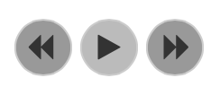
<div id="media-control"  data-state="paused">
  <button class="backward">
    <i class="fa fa-backward"></i>
  </button>
  <button class="play-pause">
    <i class="fa fa-play"></i>
    <i hidden class="fa fa-pause"></i>
  </button>
  <button class="forward">
    <i class="fa fa-forward"></i>
  </button>
</div>
The best practice
<div id="media-control" data-state="paused">
  <button class="backward">Backward</button>
  <button class="play-pause">Play/Pause</button>
  <button class="forward">Forward</button>
</div>
#media-control
  button
    @extend %fh, %fh-hide-text // hide the original text on the selector
  .backward
    @extend %fh-backward
  .forward
    @extend %fh-forward
  &[data-state="paused"] .play-pause
    @extend %fh-play
  &[data-state="playing"] .play-pause
    @extend %fh-pause
With this approach, we don’t even need semantic attributes like aria-label. It is semantic and accessible itself.
Larger icons
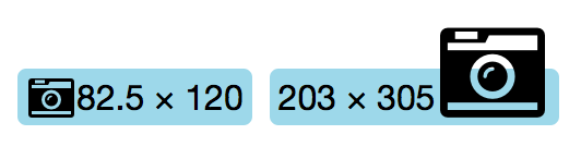
To increase the icon sizes, extend the selector with %fh-lg (33% larger), %fh-2x, %fh-3x, %fh-4x or %fh-5x.
.photo
  +fh( camera-retro )
  @extend %fh-lg
Onto ::after pseudo element,
.huge-photo
  +fha( camera-retro )
  @extend %fha-3x
Alternate the colour
Use mixin fh() or fha()’s second parametre $color to assign icons’ colour while including them.
Use mixin fh-color( $color ) or fha-color( $color ) to alternate the colour in different inherited situations.
.airport
  +fha( wifi, #666 )

  &:hover
    +fha-color( #ac586f )
  &.off
    +fha-color( #ccc )
Fixed width icons
Extend the selector with %fh-fw to set icons at a predefined fixed width.
End point — %fha-fw.
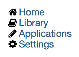
<nav class="main">
  <ol>
    <li class="home"><a href="#">Home</a>
    <li class="lib"><a href="#">Library</a>
    <li class="app"><a href="#">Applications</a>
    <li class="config"><a href="#">Settings</a>
  </ol>
</nav>
nav.main li
  @extend %fh, %fh-fw

  &.home
    @extend %fh-home
  &.lib
    @extend %fh-book
  &.app
    @extend %fh-pencil
  &.config
    @extend %fh-cog
Unordered lists
Mix an unordered list with @mixin fh-ul( $icon, $color ) to assign an icon as the list item marker, and with @mixin fh-li( $icon, $color ) to assign a certain icon to a certain item.
Note: There are no end point support for lists.

<article class="recipe">
  <p>Here are what you need to cook a delicious pake,
  <ul class="cooker">
    <li>An oven
    <li class="checked">A Pot
    <li>A non-sticky pan
    <li>Knives
    <li class="cutlery">3 forks
    <li>A whipper
  </ul>
  …
</article>
article ul.cooker
  +fh-ul( square, #999 )

  li:hover,
  li.checked
    +fh-li( check-square, #337ab7 )
  li.checked:before
    color: #5cb85c
  li.cutlery
    +fh-li( cutlery, #f0ad4e )
Bordered & pulled icons
Extend a selector with %fh-border and %fh-pull-right or %fh-pull-left for bordered and pulled icon.
End point — %fha-border, %fha-pull-right or %fha-pull-left.
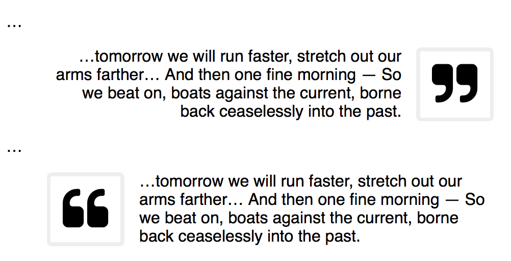
<div class="entry">
  …
  <blockquote>
    <p>…tomorrow we will run faster, stretch out our arms farther… And then one fine morning— So we beat on, boats against the current, borne back ceaselessly into the past.
  </blockquote>
  …
  <blockquote></blockquote>
</div>
.entry blockquote
  &:nth-child(odd) p:first-child
    +fh( quote-right )
    @extend %fh-border, %fh-pull-right, %fh-3x
    text-align: right
  &:nth-child(even) p:first-child
    +fh( quote-left )
    @extend %fh-border, %fh-pull-left, %fh-3x
    text-align: left
Spinning icons
Extend a selector with %fh-spin to get any icon to spin. Works well with icons spinner, circle-o-notch, refresh and cog.
End point — %fha-spin.
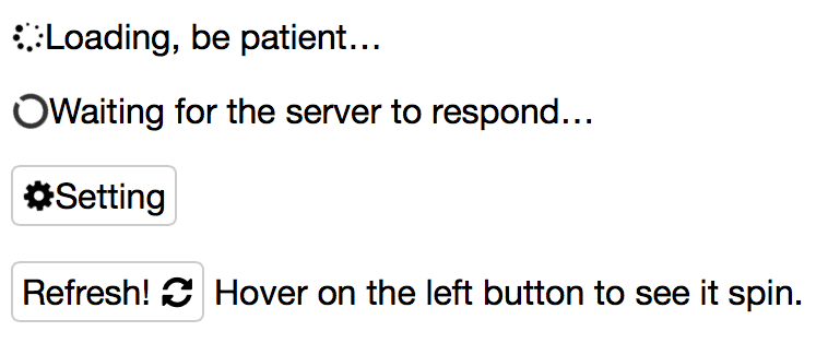
p.loading
  +fh( spinner )
  @extend %fh-spin

p.waiting
  +fh( circle-o-notch )
  @extend %fh-spin

span.setting
  +fh( cog )
  @extend %fh-spin
On ::after pseudo element,
button.refresh
  +fha( refresh )
  &:hover,
  &.ing
    @extend %fha-spin
Rotated & flipped
Extend a selector with %fh-rotate-* and %fh-flip-* to rotate and flip.
End point — %fha-rotate-* and %fha-flip-*.
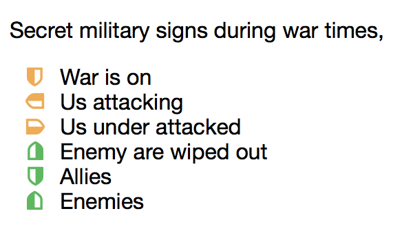
.military-code
  list-style: none
  padding-left: .5em

  li,
  span
    +fh( shield, #f0ad4e )
    @extend %fh-fw
    &:before
      margin-right: .5em
  .attacking
    @extend %fh-rotate-90
  .attacked
    @extend %fh-rotate-270
  .wiped-out
    @extend %fh-rotate-180
    +fh-color( #5cb85c )
  .ally
    @extend %fh-flip-horizontal
    +fh-color( #5cb85c )
  .enemy
    @extend %fh-flip-vertical
    +fh-color( #d9534f )
Stacked icons
Use mixin fh-stack() to stack double icons. The first parametre $i1x is the icon of regular size while the second one $i2x is of double size.
Note: There are no end point support for stacked icons.
Syntax
fh-stack( $i1x, $i2x, $i1x-color: false, $i2x-color: false, $i2x-on-top: false )
Example
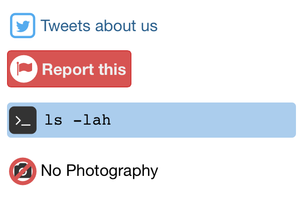
a.tweet
  +fh-stack( twitter, square-o )
Inverse colour
Switch to the inverse colour ($fh-inverse) with @extend %fh-1x-inverse or %fh-2x-inverse.
Alternatively %fh-inverse or %fha-inverse, choose whichever matches the context.
button.report
  +fh-stack( flag, circle, #d9534f )
  @extend %fh-2x-inverse
  background-color: #d9534f
  color: #f3f3f3
pre.cli
  +fh-stack( terminal, square )
  @extend %fh-1x-inverse
  padding: .5em .5em .55em 2.3em
Colours
The mixin fh-stack()’s third/forth parametres $i1x-color/$i2x-color are optional. Assign the colours of the two icons seperately or just use the inherited one.
Which icon to be on top
Originally icon-1x is put on top of icon-2x, set the fifth parametre $i2x-on-top to true to put the icon-2x on top.
p.no-photo
  +fh-stack( camera, ban, false, #d9534f, true )
Summary
Mixins
- Import icons
fh( $icon[, $color] )/fha( $icon[, $color] ) - Assign colour
fh-color( $color )/fha-color( $color ) - Unordered lists
- Entire list item
fh-ul( $icon[, $color] ) - Certain list item
fh-li( $icon[, $color] )
- Double icon stack
fh-stack( $i1x, $i2x[, $i1x-color, $i2x-color, $i2x-on-top] )
Extends
- Font and basic declaration
%fh/%fha - Icons
%fh-[icon-name]/%fha-[icon-name] - Hide original text
%fh-hide-text/%fha-hide-text - Larger sizes
%fh-lg, %fh-2x, %fh-3x, %fh-4x or %fh-5x%fha-lg, %fha-2x, %fha-3x, %fha-4x or %fha-5x
- Fixed-width
%fh-fw/%fha-fw - Bordered icon
%fh-border/%fha-border - Pull right or left
%fh-pull-right or %fh-pull-left%fha-pull-right or %fha-pull-left
- Spining
%fh-spin/%fha-spin - Rotate (90, 180 or 270 deg.)
%fh-rotate-*/%fha-rotate-* - Flip
%fh-flip-horizontal, %fh-flip-vertical%fha-flip-horizontal, %fha-flip-vertical
- Inverse colour
%fh-inverse or %fh-1x-inverse%fha-inverse or %fh-2x-inverse
Browser support
Font Handsome supports all modern browsers.
License
Font Handsome is licensed under MIT license.


