Security News
Fluent Assertions Faces Backlash After Abandoning Open Source Licensing
Fluent Assertions is facing backlash after dropping the Apache license for a commercial model, leaving users blindsided and questioning contributor rights.
fractal-component
Advanced tools
`fractal-component` is a javascript library that can help you to encapsulate decoupled resuable UI component easily
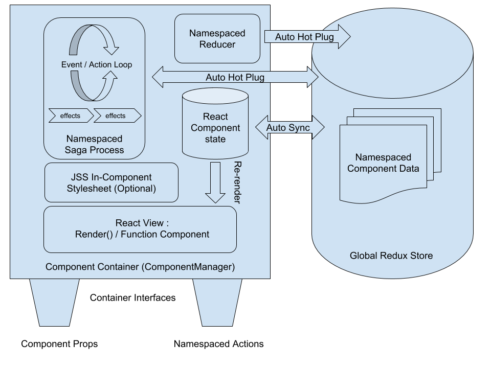
fractal-component is a javascript library that can help you to encapsulate decoupled UI component easily. It aims to provide a one-stop solution that allows state store (redux) management, actions (messages, events) processing & routing, side-effect management and component styling to be encapsulated into one single software module. You can then reuse your component to create new components (composition), use in a different project or publish it as a NPM module. You can not only use those components in web browsers but also can render them at server-side (SSR) & create redux store snapshot easily (see example).
In order to achieve that, fractal-component introduce the following features to react / redux ecosystem:
Multicast ActionsHot Plug Redux Reducer & Auto mount / unmountHot Plug Saga & Auto mount / unmountWith fractal-component, you can create reusable Container Components and construct scalable fractal architecture application while still enjoy the convenience of Redux dev tool & predictable single global store.
A typical structure of Container Components created by fractal-component is illustrated in the graph below:

To try it out, take a look at the example apps and find out how fractal-component solves the classical Scalable Architecture Problem.
yarn add fractal-component
or
npm install --save fractal-component
Alternatively, you may use the UMD builds from unpkg directly in the
A Reusable RandomGif Component. You can also find complete source code here.
import React from "react";
import PropTypes from "prop-types";
import { AppContainerUtils } from "fractal-component";

import reducer from "./reducers";
import saga from "./sagas";
import * as actions from "./actions";
import * as actionTypes from "./actions/types";
import partialRight from "lodash/partialRight";

import jss from "jss";
import styles from "./styles";

class RandomGif extends React.Component {
    constructor(props) {
        super(props);
        /**
         * You can set component initState via AppContainerUtils.registerComponent options as well.
         * this.state gets higher priority
         */
        this.state = {
            isLoading: false,
            imageUrl: null,
            error: null
        };
        this.componentManager = AppContainerUtils.registerComponent(this, {
            namespace: "io.github.t83714/RandomGif",
            reducer: reducer,
            saga: partialRight(saga, props.apiKey),
            /**
             * Register actions for action serialisation / deserialisation.
             */
            actionTypes,
            // --- only accept one type of external multicast action
            // --- By default, component will not accept any incoming multicast action.
            // --- No limit to actions that are sent out
            allowedIncomingMulticastActionTypes: [actionTypes.REQUEST_NEW_GIF],
            /**
             * Namespace callbacks make sure style sheet only create once
             * for all component instances
            */
            namespaceInitCallback: componentManager => {
                const styleSheet = jss
                    .createStyleSheet(styles, {
                        generateClassName: componentManager.createClassNameGenerator()
                    })
                    .attach();
                return { styleSheet };// --- stored as namespace data
            },
            namespaceDestroyCallback: ({ styleSheet }) => {
                styleSheet.detach();
            }
        });
    }

    render() {
        const { styleSheet } = this.componentManager.getNamespaceData();
        const { classes } = styleSheet;
        return (
            <div className={classes.table}>
                <div className={classes.cell}>RandomGif</div>
                <div
                    className={`${classes.cell} ${classes["image-container"]}`}
                >
                    {this.state.imageUrl &&
                        !this.state.isLoading &&
                        !this.state.error && (
                            <img
                                alt="Gif"
                                src={this.state.imageUrl}
                                className={`${classes.image}`}
                            />
                        )}
                    {(!this.state.imageUrl || this.state.isLoading) &&
                        !this.state.error && (
                            <p>
                                {this.state.isLoading
                                    ? "Requesting API..."
                                    : "No GIF loaded yet!"}
                            </p>
                        )}
                    {this.state.error && (
                        <p>{`Failed to request API: ${this.state.error}`}</p>
                    )}
                </div>
                {this.props.showButton && (
                    <div className={`${classes.cell} `}>
                        <button
                            onClick={() => {
                                this.componentManager.dispatch(
                                    actions.requestNewGif()
                                );
                            }}
                            disabled={this.state.isLoading}
                        >
                            {this.state.isLoading
                                ? "Requesting API..."
                                : "Get Gif"}
                        </button>
                    </div>
                )}
            </div>
        );
    }
}

RandomGif.propTypes = {
    showButton: PropTypes.bool,
    apiKey: PropTypes.string
};

RandomGif.defaultProps = {
    showButton: true,
    apiKey: "xxxxxxxxxxxxxxx"
};

export default RandomGif;

//--- actions component may send out
const exposedActionTypes = {
    NEW_GIF : actionTypes.NEW_GIF,
    LOADING_START: actionTypes.LOADING_START,
    LOADING_COMPLETE: actionTypes.LOADING_COMPLETE
};
//--- action component will accept
const exposedActions = {
    requestNewGif: actions.requestNewGif
};
/**
 * expose actions for component users
 */
export { exposedActionTypes as actionTypes, exposedActions as actions };
3.1.2
process is undefinedredux-saga in distribution bundle anymore to avoid UMD use case issue@redux-saga/isFAQs
`fractal-component` is a javascript library that can help you to encapsulate decoupled resuable UI component easily
The npm package fractal-component receives a total of 61 weekly downloads. As such, fractal-component popularity was classified as not popular.
We found that fractal-component demonstrated a not healthy version release cadence and project activity because the last version was released a year ago. It has 1 open source maintainer collaborating on the project.
Did you know?

Socket for GitHub automatically highlights issues in each pull request and monitors the health of all your open source dependencies. Discover the contents of your packages and block harmful activity before you install or update your dependencies.

Security News
Fluent Assertions is facing backlash after dropping the Apache license for a commercial model, leaving users blindsided and questioning contributor rights.

Research
Security News
Socket researchers uncover the risks of a malicious Python package targeting Discord developers.

Security News
The UK is proposing a bold ban on ransomware payments by public entities to disrupt cybercrime, protect critical services, and lead global cybersecurity efforts.