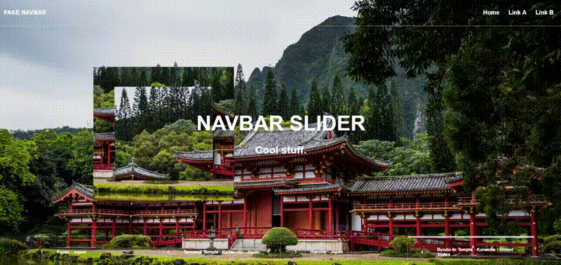
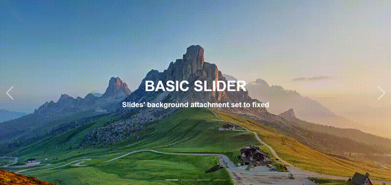
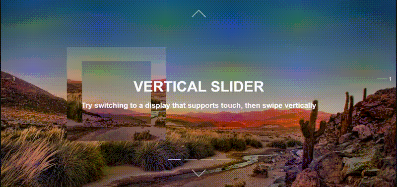
hero-slider
A hero slider component inline with how you would expect most React components to work. Includes autoplay, lazy loaded backgrounds, support for touch swiping and direction to change slides, multiple navs, settings, memoization, event callbacks, among other features.


Introduction
This package contains multiple components with a fair range of options to help developers quickly set up a hero slider. In short, it functions just how you would expect a package of React components. In short, all you have to do is import the Slider & Slide components. You can set the sliding animations, the background lazy loaded image animation, navs, buttons, callbacks, and even set your own buttons if you need to. The style and animations were inspired by different sliders from websites such as Lamborghini's, Lonely Planet, Kreativa Studio.
Install
npm install --save hero-slider

Hero Slider

Instructions
This package contains multiple exports, each used differently and some similarly. Below you will find instructions for each components and their respective props. Here's a list of all the possible components you may import:
import HeroSlider, {
  Slide,
  Nav,
  SideNav,
  MenuNav,
  ButtonsNav,
  AutoplayButton,
  OverlayContent,
} from 'hero-slider'
HeroSlider
The main component of the package. Also the default export. With this component, none of the other components will work as intended, so be sure to wrap them all inside, you can think of this component as the operations center.
HeroSlider accepts the following props:
| Prop | Type | Default | Definition |
|---|
| settings | object | (Shown below) | The slider settings, features like autoplay, sliding duration and delay, color, animation durations, navbar animations, and others, can be configured. More detailed information below this table. |
| orientation | string | 'horizontal' | The slider orientation. It can either set to be horizontal or vertical. The orientation sets the slide buttons respective to the orientation (e.g. if vertical, the buttons will be at the top and at the bottom). Swipe (touch) gestures in mobile devices to change slides will also be configured automatically depending on the orientation (e.g. if horizontal, swiping vertically won't change slides). |
| slidingAnimation | string | Horizontal clip-path animations. | The sliding animations during changes. There are multiple possible types of animations, they can be hard-set through settings if isSmartSliding is false. Otherwise, depending on the initial animation, the rest of the animations will be the same except the origin will change respective to which slide is being selected (meaning after of previous to current slide). |
| isSmartSliding | boolean | true | With smart sliding, the hero slider will know which animation should be set next, meaning if the user is selecting the next slide, the animation would be different to the one if the user had selected the previous slide. The animations will essentially be the same, but with different origins (e.g. translate left or right). |
| initialSlide | number | 1 | The initial slide can also be set, but the slider starts at the first slide by default, being 1 and not 0. |
| nextSlide | React.MutableRefObject | null | Similar to pointers in C++, objects can work like pointers in JavaScript. React references are mutable objects that can be changed but will always point to an origin. If you declare an object and pass it as a reference, then the current property of the React reference object will be set to be equal to the nextSlide handler within the slider. This provides the developer with a way to change the slides "from the outside" of the bounds of the HeroSlider component. |
| previousSlide | React.MutableRefObject | null | Similar to nextSlide, this sets the object to be equal to the previousSlide handler within the HeroSlider component. |
| navbarSettings | object | (Shown below) | Aesthetics settings. You can configure the base color and the active color of all nav components within the HeroSlider. They can be set individually as well. |
| style | React.CSSProperties | null | Inline CSS styling for the wrapper div element of the component. |
| onBeforeChange | (previousSlide: number, nextSlide: number) => void | null | Callback executed before sliding begins. The previous and next slide numbers are received as arguments, since the sliding event can be delayed, this is useful to handle state changes from the outside (e.g. fire custom animations inside the active slide). |
| onChange | (nextSlide: number) => void | null | Callback executed when the sliding begins similar to onBeforeChange. |
| onAfterChange | (currentSlide: number) => void | null | Callback executed after the sliding ends similar to onBeforeChange. |
| children | any | null | React children. If the children are not Nav or Slide components, they will be rendered inside the HeroSlider overlapping all of the other components. Think of them like having a higher z-index property. |
HeroSlider animations
Here are the possible slidingAnimation options:
| Sliding animation | Prop |
|---|
| Top to bottom | 'top_to_bottom' |
| Bottom to top | 'bottom_to_top' |
| Left to right | 'left_to_right' |
| Right to left | 'right_to_left' |
| Fade | 'fade' |
Make sure that the passed prop matches the ones in the table above, for them to be set properly. The default animation are any of the horizontally oriented ones, since smartSliding is true.
HeroSlider settings
Through the settings props, you can configure multiple features of the slider. These settings/features are:
| Setting | Type | Definition |
|---|
| slidingDuration | number | Sliding duration, in milliseconds. |
| slidingDelay | number | Sliding delay, in milliseconds. |
| sliderColor | string | Sliding color, the CSS color property. |
| sliderFadeInDuration | number | Fade in duration of the slider during mount, in milliseconds. |
| navbarFadeInDuration | number | Navbars fade in duration, in milliseconds. |
| navbarFadeInDelay | number | Navbars fade in delay, in milliseconds. |
| isSmartSliding | boolean | Smart sliding. |
| shouldDisplayButtons | boolean | Next and previous buttons rendering. |
| shouldAutoplay | boolean | Autoplay. |
| shouldSlideOnArrowKeypress | boolean | When an arrow key is pressed, the active slide will change respectively to the pressed arrow. The left and down arrows will set the previous slide, and the right and up arrows will set the next slide. The left and right will only work if the slider is horizontal, and the up and down arrows will only work if the slider is vertical. |
| autoplayDuration | number | Autoplay duration, interval or duration betweens executions to change slides, in milliseconds. |
| autoplayHandlerTimeout | number | Time (in milliseconds) in which the autoplay will be disabled if the user interacts with the slider. The autoplay resumes if the user stops interacting. Set as 0 to disable this feature. |
| width | string | CSS inline width of the div element wrapper. |
| height | string | CSS inline height of the div element wrapper. |
The following are the default settings:
  slidingDuration: 500,
  slidingDelay: 200,
  sliderColor: 'inherit',
  sliderFadeInDuration: 100,
  navbarFadeInDuration: 1000,
  navbarFadeInDelay: 500,
  isSmartSliding: true,
  shouldDisplayButtons: true,
  shouldAutoplay: true,
  shouldSlideOnArrowKeypress: false,
  autoplayDuration: 8000,
  autoplayHandlerTimeout: 1000,
  width: '100%',
  height: '100%',
Nav components settings
The nav components colors can be set from within the HeroSlider settings. These will affect all of the Navs. However, you may individually set a nav component different by passing these very same settings as props to said component.
Slide
The Slide component holds whatever children you want to be part of each slide, you can also modify the background and its initial mount animation. Bear in mind that background images are lazy loaded.
The Slide component accepts the following props:
| Prop | Type | Default | Definition |
|---|
| shouldRenderMask | boolean | false | Each slide has a "Mask" that serves as an adornment. They mimic the background, then offsets it a bit, and animate during slide transitions. |
| background | object | (Shown below) | The background settings. You may pass CSS background properties just like you would style the background of an HTML element. The main difference is that the backgroundImage property will work just like an image tag src property instead of the typical background image URL. More information about these settings below this table. |
| navDescription | string | null | If the developer is using a MenuNav or ButtonsNav component, a description for each slide may be passed. These descriptions will be shown in the nav components. |
| style | React.CSSProperties | null | Inline CSS styling for the wrapper div element of the component. |
| onBackgroundLoad | (event: React.SyntheticEvent) => any | null | Callback that executes when the background image loads. |
| children | any | null | React children. |
Slide background settings
The background of the Slide components can be configured just as you would configure the background of any element, with the added bonus of lazy loading and being able to pass data to the alt image attribute. Here are the allowed settings
| Setting | Type | Definition |
|---|
| shouldLazyLoad | boolean | Boolean variable to allow or disable lazy loading, true by default. |
| lazyLoadingOffset | number | Height offset to begin lazy loading, defaults to window.innerHeight. |
| backdropFilter | string | Backdrop filter CSS property. |
| backfaceVisibility | string | Backface visibility CSS property. |
| background | string | Background CSS property. |
| backgroundAttachment | string | Background attachment CSS property. |
| backgroundBlendMode | string | Background blend mode CSS property. |
| backgroundClip | string | Background clip CSS property. |
| backgroundColor | string | Background color CSS property. |
| backgroundImage | string | Background image. Not the same as the CSS property, just pass the string uri, not the typical url([link]). |
| backgroundOrigin | string | Background origin CSS property. |
| backgroundPosition | string | Background position CSS property. |
| backgroundPositionX | string | Background position X CSS property. |
| backgroundPositionY | string | Background position Y CSS property. |
| backgroundRepeat | string | Background repeat CSS property. |
| backgroundSize | string | Background size CSS property. |
| backgroundAnimationDuration | string | Background animation duration after the image loads. |
| backgroundAnimationDelay | string | Background animation delay after the image loads. |
| backgroundAnimation | string | Background animation after the image loads. There are currently two options, a fade-in animation, or a zoom in animation that lasts 30 secs, the background zooms in until it reaches its original size. To select the fade-in animation this prop must be equal to 'fade', to select the zoom animation, this prop must be equal to 'zoom'. |
| maskBackgroundBlendMode | string | Background blend mode CSS property for the optional mask that could render in each of the Slide components. |
| width | string | Width CSS property. |
| height | string | Height CSS property. |
| alt | string | HTML img element alt attribute. |
The following are the default settings:
  backgroundPosition: 'center top',
  backgroundSize: 'cover',
  width: '100%',
  height: '100%',
Nav
The basic Nav component, there are three other types of nav components named SideNav, MenuNav, and ButtonsNav, there is more detailed information about the three latest below this whole section. The nav component is nothing more than a nagivation bar. The developer may set up three features through props:
- Position.
- Color.
- Active color.
Here is a more detailed table of the props:
| Prop | Type | Default | Definition |
|---|
| position | object | (Shown below) | Object structured by the inline CSS top, left, bottom, and right position properties. |
| color | string | 'rgba (200 , 215 , 235 , 0.6 )' | CSS color property for the nav items. |
| activeColor | string | 'rgba (200 , 215 , 235 , 1 )' | CSS color property for the active nav item (respective to the current slide). |
Nav position settings
The position settings are nothing more than the top, left, bottom, and right CSS properties used for absolutely position elements. Aside from the former, you can also set the CSS transform property to help you center the element. By default the nav is positioned at the bottom, centered.
The following are the default position settings:
  bottom: '1.5rem'
  left: '50%'
  transform: 'translateX(-50%)'
SideNav
The SideNav component. When it comes to props it's almost entirely equal to the Nav component. There are a couple more props that can be passed to this component. Aside from that, it's worth mentioning that this nav is intented to be placed at the sides of the slider. Here are the props:
| Prop | Type | Default | Definition |
|---|
| position | object | (Same as the Nav component) | Object structured by the inline CSS top, left, bottom, and right position properties. |
| color | string | '#C8D7EB' | The background settings. You may pass CSS background properties just like you would style the background of an HTML element. The main difference is that the backgroundImage property will work just like an image tag src property instead of the typical background image URL. More information about these settings below this table. |
| activeColor | string | '#FFF' | CSS color property for the active nav item (respective to the current slide). |
| right | string | null | Inline right CSS property for absolutely positioned elements. |
| left | string | '1rem' | Inline left CSS property for absolutely positioned elements. |
| isPositionedRight | boolean | true | Extra property to help the component sort out things. If you set it to the left, set this to false to disable any existing right CSS properties and avoid any conflicts. |
Very similar to the Nav component when it comes to setup, with the addition of four more props. The following table contains their definitions:
| Prop | Type | Default | Definition |
|---|
| position | object | (Same as the Nav component) | Object structured by the inline CSS top, left, bottom, and right position properties. |
| color | string | 'rgba(215, 225, 235, 0.6)' | CSS color property for the menu nav multiple borders and animated bar. |
| activeColor | string | '#FFF' | CSS color for the menu nav list items' text. |
| mobileThreshold | number | 1024 | Given the nature of this navigation bar, it doesn't works well with devices with small screen widths. The mobile threshold is the point in which this component turns into a basic Nav component or null. |
| isNullAfterThreshold | boolean | false | Boolean setting that dictates if the nav should render null or a basic Nav component after the threshold is reached. |
| extraButton | any | null | An extra button rendered among the menu nav items in case the developer may want any extra functionality in the navbar. |
| isExtraButtonRight | boolean | true | Renders the button to the right side of the nav if true, otherwise it will appear at the left side. |
ButtonsNav
Very similar to the previous MenuNav component when it comes to setup. This component accepts the same props as the MenuNav component and works exactly the same, with the addition of an two extra props defined as alignItems and backgroundColor.
The alignItems prop will align the nav items to the center, top or bottom of its container working exactly as how the CSS flex-box align-items property works, accepting flex-start (top), center, and flex-end (bottom) as possible values, the default setting is flex-end, set at the bottom.
The backgroundColor sets the background of the buttons, while the color prop is used for the color of the text, and the activeColor prop is used for the background of the active nav item. Here is a more detailed table:
| Prop | Type | Default | Definition |
|---|
| position | object | (Same as the Nav component) | Object structured by the inline CSS top, left, bottom, and right position properties. |
| color | string | '#FFF' | CSS color property for the nav buttons' text. |
| backgroundColor | string | 'rgba(255, 255, 255, 0.8)' | CSS background color property for the nav buttons. |
| activeColor | string | 'rgb(59, 62, 69)' | CSS background color property for the active nav button. |
| mobileThreshold | number | 1024 | Given the nature of this navigation bar, it doesn't works well with devices with small screen widths. The mobile threshold is the point in which this component turns into a basic Nav component. |
| isNullAfterThreshold | boolean | false | Boolean setting that dictates if the nav should render null or a basic Nav component after the threshold is reached. |
| extraButton | any | null | An extra button rendered among the menu nav items in case the developer may want any extra functionality in the navbar. |
| isExtraButtonRight | boolean | true | Renders the button to the right side of the nav if true, otherwise it will appear at the left side. |
| alignItems | string | flex-end | Aligns the nav items to the center, top or bottom of its container working exactly as how the CSS flex-box align-items property works. |
AutoplayButton
The AutoplayButton component comes in handy whenever the hero slider is set up to autoplay. This button will play or pause the autoplay instance respectively upon clicking it. It's really easy to setup. The button is an SVG image, which means it will scale well to any width or height. The button has to be in the first level of the HeroSlider childrens, just like a Slide component would be. If you want to place it somewhere else, you may use a React portal.
You can position it just like you would position a nav component by using passing the position prop, but you may also pass a CSS class or inline styling as props. Here is a more detailed table explaining the props:
| Prop | Type | Default | Definition |
|---|
| position | object | (Same as the Nav component) | Object structured by the inline CSS top, left, bottom, and right position properties. |
| style | React.CSSProperties | null | Inline CSS styling for the wrapper div element of the component. |
| className | string | null | CSS class name. |
OverlayContainer
The OverlayContainer component is a simple pre-styled styled.div component that you can use to place whatever content that you want to overlay over the hero-slider, e.g. headers, without any of the slides overlapping it.
License
MIT © rmolinamir


