
Security News
Deno 2.2 Improves Dependency Management and Expands Node.js Compatibility
Deno 2.2 enhances Node.js compatibility, improves dependency management, adds OpenTelemetry support, and expands linting and task automation for developers.
material-kit-react
Advanced tools


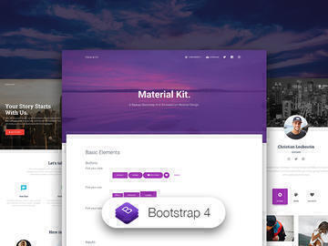
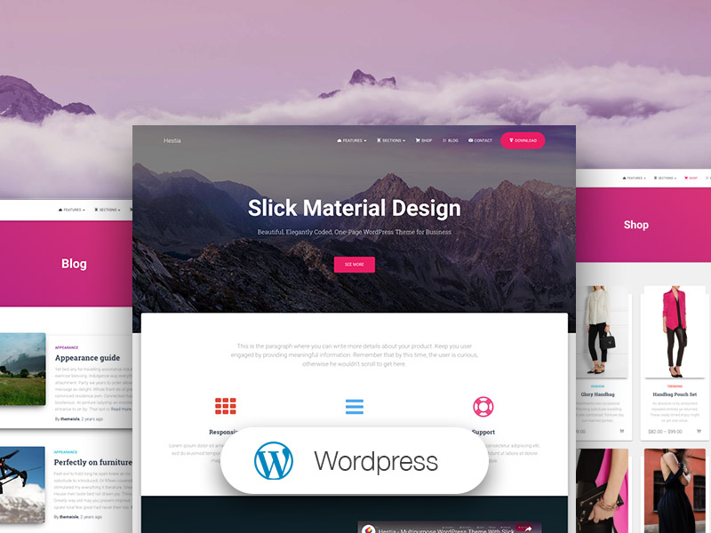
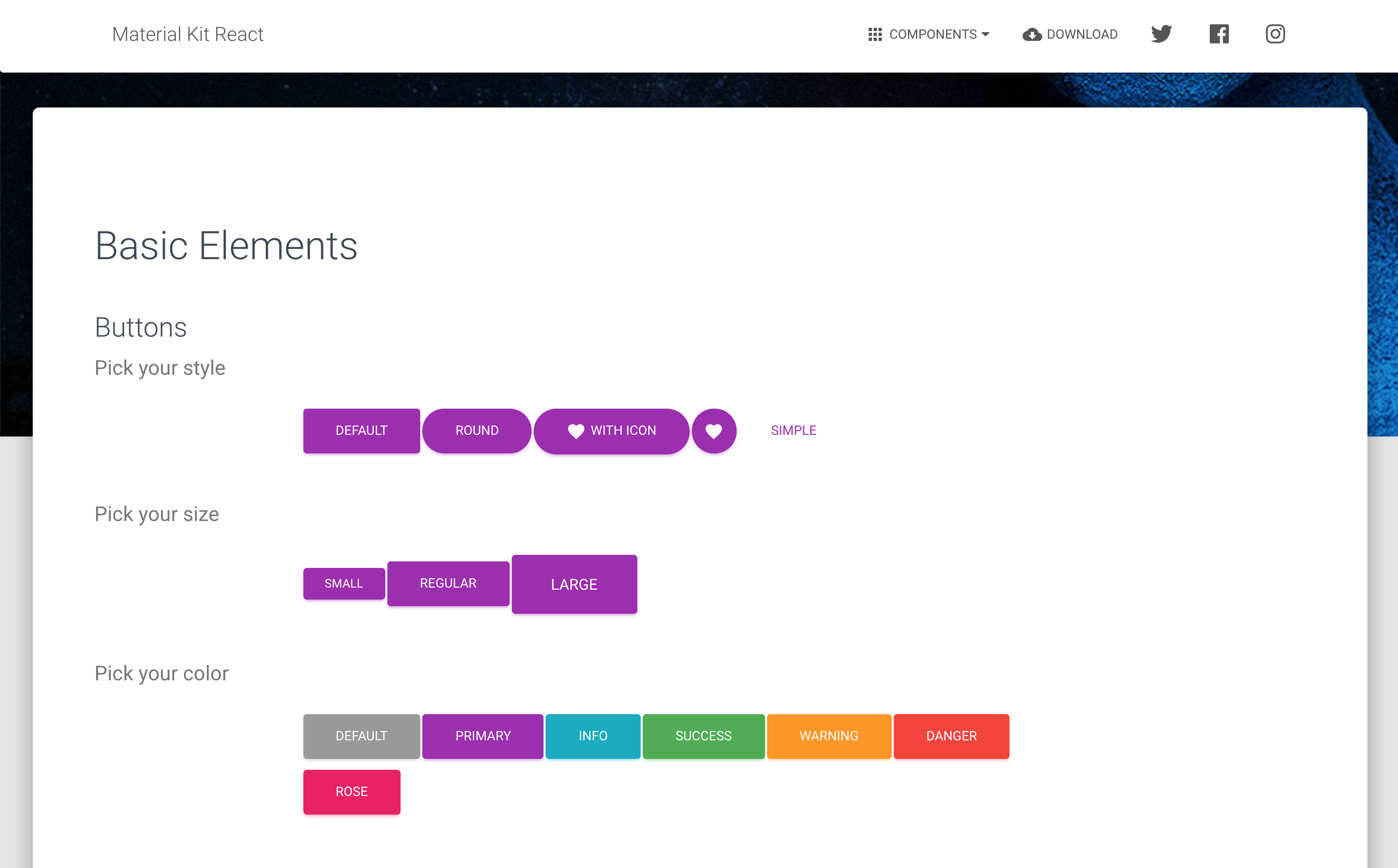
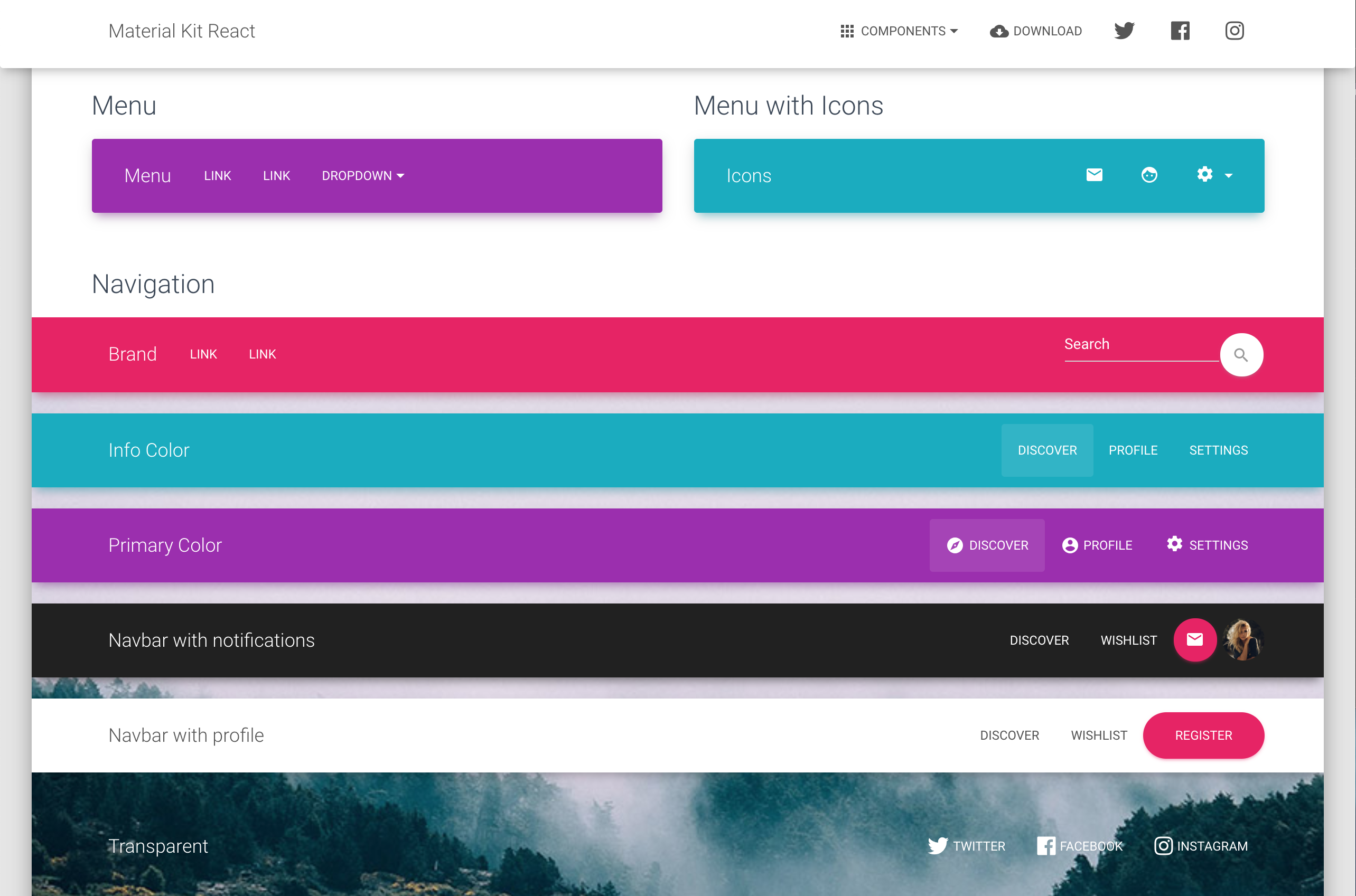
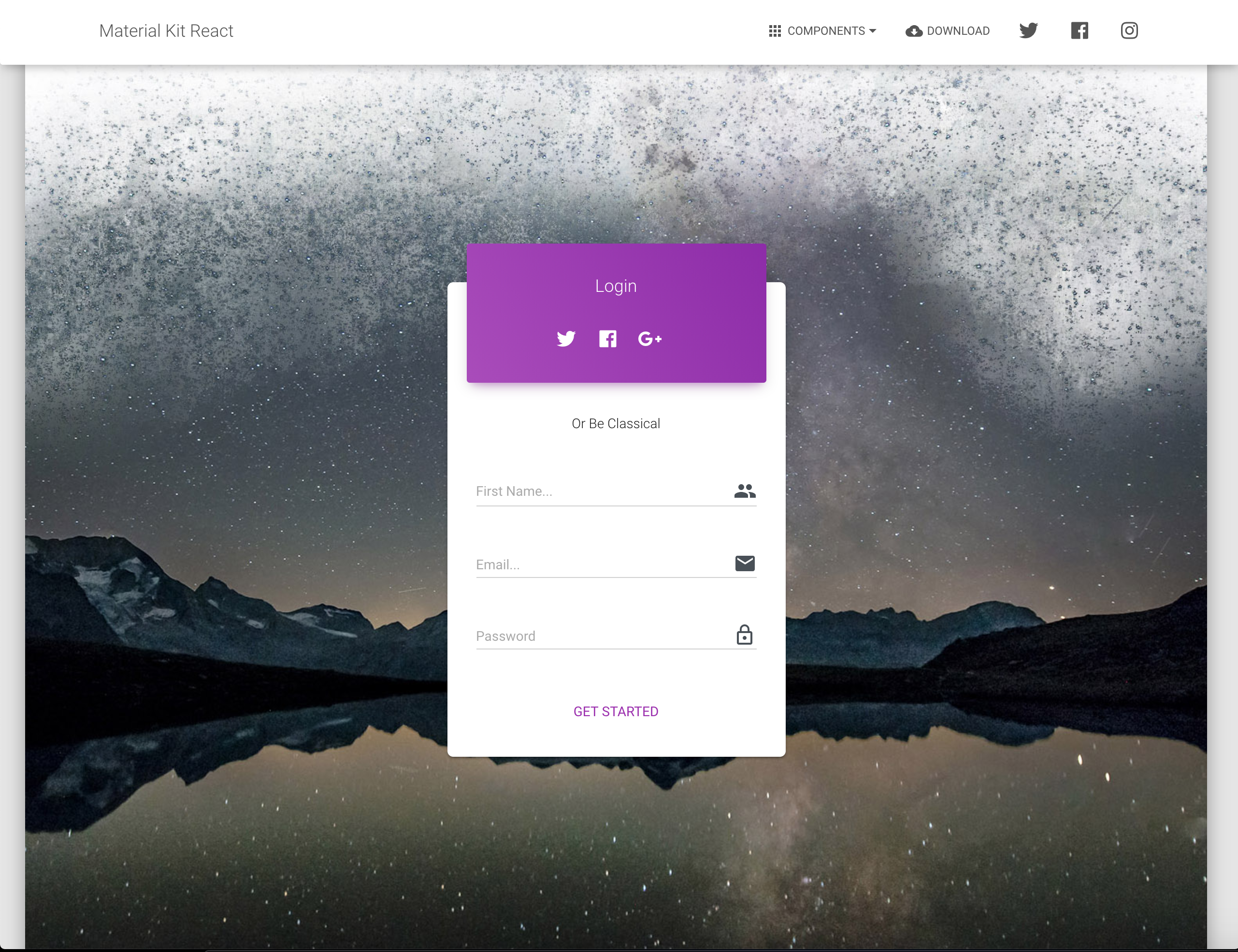
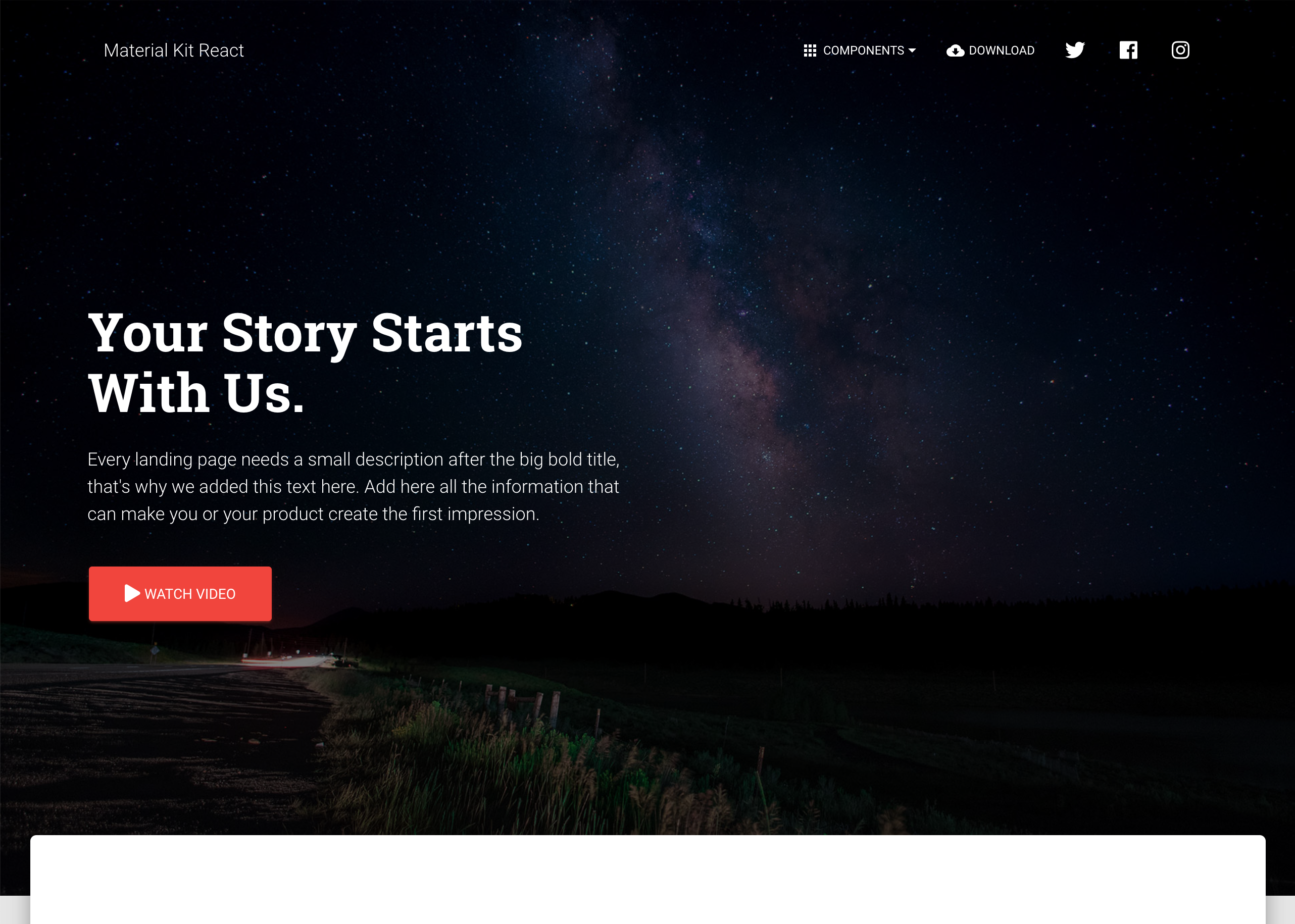
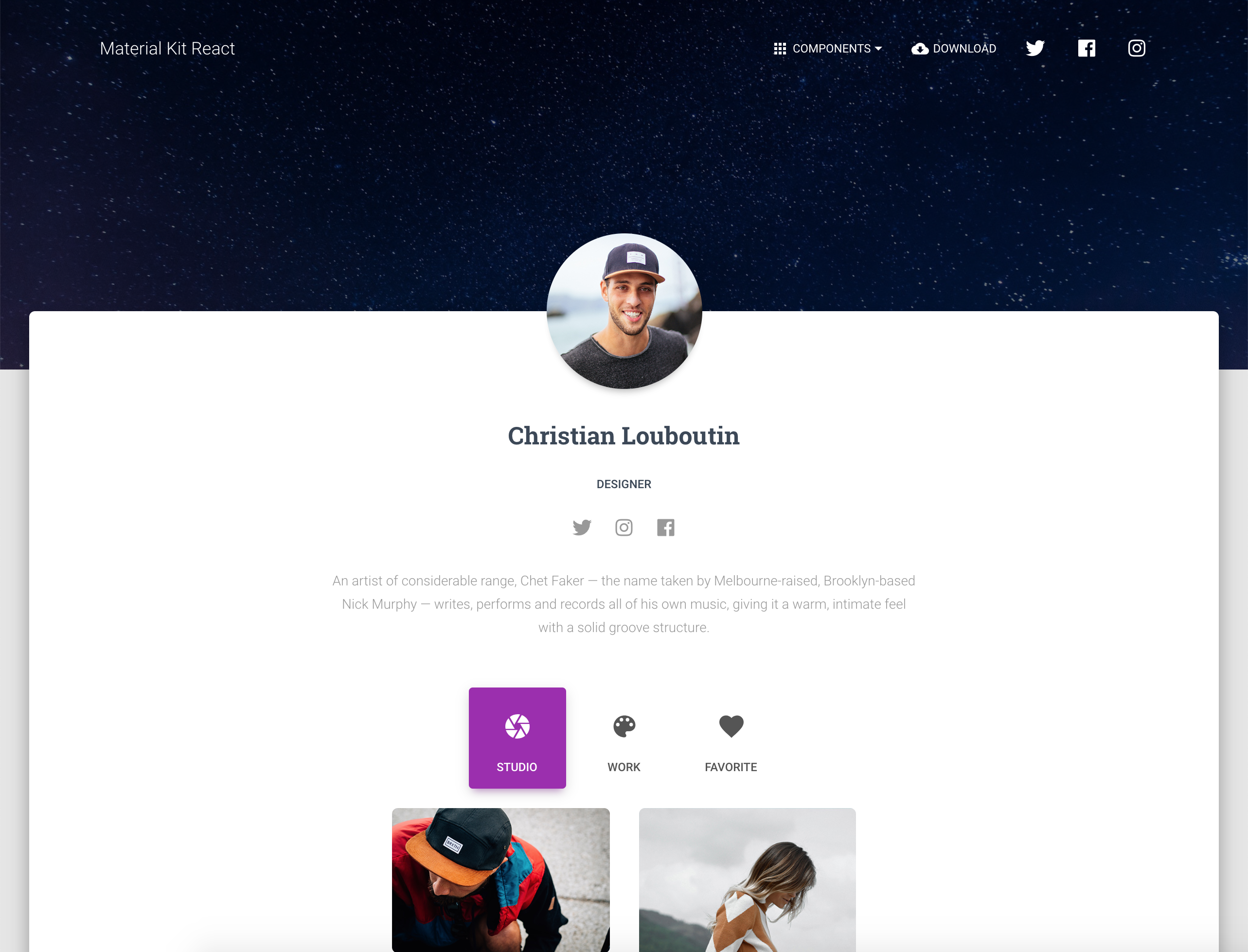
Material Kit React is a Free Material-UI Kit with a fresh, new design inspired by Google's material design and is was developed using create-react-app. You asked for it, so we built it. It's a great pleasure to introduce to you the material concepts in an easy to use and beautiful set of components. Along with the restyling of the Material-UI elements, you will find three fully-coded example pages, to help you design your next project.
Material Kit React makes use of light, surface and movement. It uses a deliberate color choice, edge-to-edge imagery and large scale typography. The general layout resembles sheets of paper following multiple different layers, so that the depth and order is obvious. The navigation stays mainly on the left and the actions on the right.
This new design has elements that have been the result of research regarding ink and paper and the way objects and materials interact in real life. The result is a beautiful and consistent set of elements that can get you started with your next project. Material Kit React is a great tool if you are looking to create a web presence for your Android application and need to be consistent, leaving the impression of visually similar elements. It is also a great resource in its own right, looking gorgeous and helping you build your web pages.
Material Kit React was built with the help of create-react-app and it uses a framework built by our friends from Material-UI, who did an amazing job creating the backbone for the material effects, animations, ripples and transitions. Big thanks to this team for the effort and forward thinking they put into it.
| HTML | React | Vue |
|---|---|---|
 |  |  |
| React Native | Figma | WordPress |
|---|---|---|
 |  |  |
| Buttons | Inputs | Navbars |
|---|---|---|
 |  |  |
| Login Page | Landing Page | Profile Page |
|---|---|---|
 |  |  |
npm i material-kit-reactbower install material-kit-react.git clone https://github.com/creativetimofficial/material-kit-react.git.The documentation for the Material Kit React is hosted at our website.
Within the download you'll find the following directories and files:
material-kit-react
.
├── CHANGELOG.md
├── ISSUE_TEMPLATE.md
├── LICENSE.md
├── README.md
├── bower.json
├── gulpfile.js
├── jsconfig.json
├── package.json
├── Documentation
│   ├── assets
│   │   ├── css
│   │   ├── img
│   │   │   └── faces
│   │   └── js
│   └── tutorial-components.html
├── public
│   ├── favicon.ico
│   ├── index.html
│   └── manifest.json
└── src
    ├── index.js
    ├── logo.svg
    ├── assets
    │   ├── css
    │   │   └── material-kit-react.css.map
    │   ├── img
    │   │   ├── examples
    │   │   └── faces
    │   ├── jss
    │   │   ├── material-kit-react
    │   │   │   ├── components
    │   │   │   └── views
    │   │   │       ├── componentsSections
    │   │   │       ├── landingPageSections
    │   │   └── material-kit-react.js
    │   └── scss
    │       ├── core
    │       │   ├── mixins
    │       │   └── variables
    │       ├── plugins
    │       └── material-kit-react.scss
    ├── components
    │   ├── Badge
    │   │   └── Badge.js
    │   ├── Card
    │   │   ├── Card.js
    │   │   ├── CardBody.js
    │   │   ├── CardFooter.js
    │   │   └── CardHeader.js
    │   ├── Clearfix
    │   │   └── Clearfix.js
    │   ├── CustomButtons
    │   │   └── Button.js
    │   ├── CustomDropdown
    │   │   └── CustomDropdown.js
    │   ├── CustomInput
    │   │   └── CustomInput.js
    │   ├── CustomLinearProgress
    │   │   └── CustomLinearProgress.js
    │   ├── CustomTabs
    │   │   └── CustomTabs.js
    │   ├── Footer
    │   │   └── Footer.js
    │   ├── Grid
    │   │   ├── GridContainer.js
    │   │   └── GridItem.js
    │   ├── Header
    │   │   ├── Header.js
    │   │   └── HeaderLinks.js
    │   ├── InfoArea
    │   │   └── InfoArea.js
    │   ├── NavPills
    │   │   └── NavPills.js
    │   ├── Pagination
    │   │   └── Pagination.js
    │   ├── Parallax
    │   │   └── Parallax.js
    │   ├── Snackbar
    │   │   └── SnackbarContent.js
    │   └── Typography
    │       ├── Danger.js
    │       ├── Info.js
    │       ├── Muted.js
    │       ├── Primary.js
    │       ├── Quote.js
    │       ├── Small.js
    │       ├── Success.js
    │       └── Warning.js
    └── views
        ├── Components
        │   ├── Components.js
        │   └── Sections
        │       ├── SectionBasics.js
        │       ├── SectionCarousel.js
        │       ├── SectionCompletedExamples.js
        │       ├── SectionDownload.js
        │       ├── SectionExamples.js
        │       ├── SectionJavascript.js
        │       ├── SectionLogin.js
        │       ├── SectionNavbars.js
        │       ├── SectionNotifications.js
        │       ├── SectionPills.js
        │       ├── SectionTabs.js
        │       └── SectionTypography.js
        ├── LandingPage
        │   ├── LandingPage.js
        │   └── Sections
        │       ├── ProductSection.js
        │       ├── TeamSection.js
        │       └── WorkSection.js
        ├── LoginPage
        │   └── LoginPage.js
        └── ProfilePage
            └── ProfilePage.js
At present, we officially aim to support the last two versions of the following browsers:


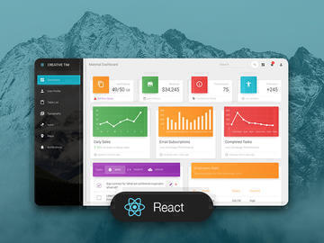
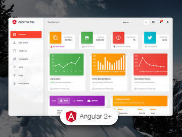
| HTML | React | Vue | Angular |
|---|---|---|---|
 |  |  |  |
| HTML Dark | Vuetify |
|---|---|
 |  |
We use GitHub Issues as the official bug tracker for the Material Kit. Here are some advices for our users that want to report an issue:
Copyright 2021 Creative Tim (https://www.creative-tim.com/)
Licensed under MIT (https://github.com/creativetimofficial/material-kit-react/blob/main/LICENSE.md)
Twitter: https://twitter.com/CreativeTim
Facebook: https://www.facebook.com/CreativeTim
Dribbble: https://dribbble.com/creativetim
FAQs
Material Kit React. Coded by Creative Tim
The npm package material-kit-react receives a total of 34 weekly downloads. As such, material-kit-react popularity was classified as not popular.
We found that material-kit-react demonstrated a not healthy version release cadence and project activity because the last version was released a year ago. It has 3 open source maintainers collaborating on the project.
Did you know?

Socket for GitHub automatically highlights issues in each pull request and monitors the health of all your open source dependencies. Discover the contents of your packages and block harmful activity before you install or update your dependencies.

Security News
Deno 2.2 enhances Node.js compatibility, improves dependency management, adds OpenTelemetry support, and expands linting and task automation for developers.

Security News
React's CRA deprecation announcement sparked community criticism over framework recommendations, leading to quick updates acknowledging build tools like Vite as valid alternatives.

Security News
Ransomware payment rates hit an all-time low in 2024 as law enforcement crackdowns, stronger defenses, and shifting policies make attacks riskier and less profitable.