<media-chrome>
Your media player's dancing suit. :man_dancing:
Fully customizable media player controls using web components (native custom elements).
From Mux and the creator of Video.js.
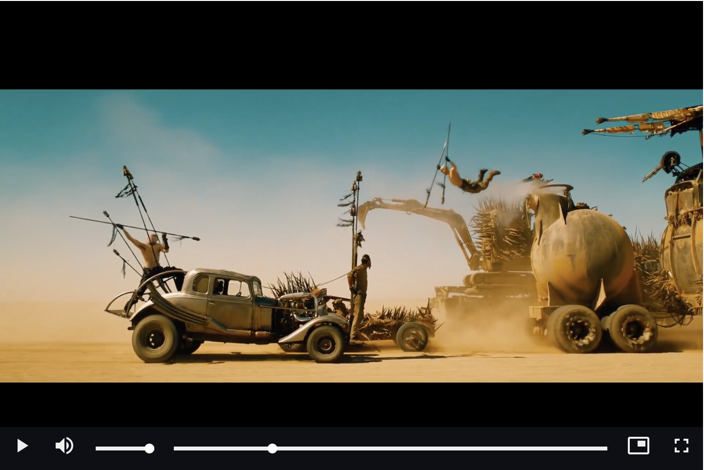
Video Example
<script type="module" src="https://unpkg.com/media-chrome@0.2"></script>

<media-controller>
  <video
    slot="media"
    src="https://stream.mux.com/DS00Spx1CV902MCtPj5WknGlR102V5HFkDe/high.mp4"
    crossorigin
  >
    <track label="thumbnails" default kind="metadata" src="https://image.mux.com/DS00Spx1CV902MCtPj5WknGlR102V5HFkDe/storyboard.vtt">
  </video>
  <media-control-bar>
    <media-play-button></media-play-button>
    <media-mute-button></media-mute-button>
    <media-volume-range></media-volume-range>
    <media-time-range></media-time-range>
    <media-pip-button></media-pip-button>
    <media-fullscreen-button></media-fullscreen-button>
  </media-control-bar>
</media-controller>
Audio Example
<script type="module" src="https://unpkg.com/media-chrome@0.2"></script>

<media-controller audio>
  <audio
    slot="media"
    src="https://file-examples-com.github.io/uploads/2017/11/file_example_MP3_700KB.mp3"
  ></audio>
  <media-control-bar>
    <media-play-button></media-play-button>
    <media-time-display show-duration></media-time-display>
    <media-time-range></media-time-range>
    <media-playback-rate-button></media-playback-rate-button>
    <media-mute-button></media-mute-button>
    <media-volume-range></media-volume-range>
  </media-control-bar>
</media-controller>

Advanced Usage
For a more in depth discussion of working with <media-controller/>, including more complex controls layouts, check out the docs.
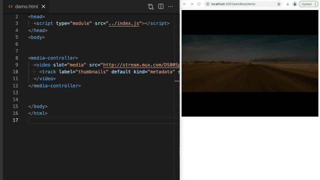
Quick Demo
Adding controls to a video element
Just HTML. No javascripting required.
Using/installing
<media-chrome> is only packaged as a javascript module (es6), which is supported by all evergreen browsers and Node v12+. The package includes all of the existing media controls.
Option 1: Hosted
Load the module in the <head> of your HTML page. Note the type="module", that's important.
Modules are always loaded asynchronously by the browser, so it's ok to load them in the head :thumbsup:, and best for registering web components quickly.
<script type="module" src="https://unpkg.com/media-chrome@0.2"></script>
Option 2: Bundled via npm
npm install media-chrome --save
Include in your app javascript (e.g. src/App.js)
import 'media-chrome';
This will register the custom elements with the browser so they can be used as HTML.
Using in your HTML
The <media-controller> is the star of the show. It handles the communication between control elements and the media. Start by wrapping your media element with a <media-controller>, and adding slot="media" to your video or audio tag, or other compatible player.
<media-controller>
  <video slot="media" src="https://stream.mux.com/DS00Spx1CV902MCtPj5WknGlR102V5HFkDe/high.mp4"></video>
</media-controller>
After that, each control element can be used independently. When using outside of a <media-controller> element, a control needs to be told which media controller it's associated with via the media-controller attribute or property.
<media-controller id="myController">
  <video slot="media" src="https://stream.mux.com/DS00Spx1CV902MCtPj5WknGlR102V5HFkDe/high.mp4"></video>
  <media-play-button></media-play-button>
</media-controller>

<media-play-button media-controller="myController"></media-play-button>
Customizing the controls
Use HTML to add or remove any of the controls. Then you can use CSS to style the controls as you would other HTML elements.
<media-controller>
  <video
    slot="media"
    src="https://stream.mux.com/DS00Spx1CV902MCtPj5WknGlR102V5HFkDe/high.mp4"
  ></video>
  <media-control-bar>
    <media-play-button></media-play-button>
    <media-mute-button></media-mute-button>
    <media-volume-range></media-volume-range>
    <media-time-range></media-time-range>
    <media-pip-button></media-pip-button>
    <media-fullscreen-button></media-fullscreen-button>
  </media-control-bar>
</media-controller>
Included elements
| Element | Description |
|---|
<media-controller> | Wraps controls and the media element, and handles communication between them. (docs) |
<media-control-bar> | Optional controls container to help align the controls in the standard fashion. |
<media-play-button> | Toggle media playback |
<media-mute-button> | Toggle the sound. The icon responds to volume changes and acts as part of the typical volume control. |
<media-volume-range> | Change the volume of the sound. |
<media-time-range> | See how far the playhead is through the media duration, and seek to new times. |
<media-time-display> | Show the time of the playhead.
Options:
<media-time-display remaining> Show as remaining time
<media-time-display show-duration> Also show the duration after a slash. Ex: 1:00 / 2:00 |
<media-duration-display> | Show the duration of the media |
<media-fullscreen-button> | Toggle fullscreen viewing |
<media-pip-button> | Toggle picture-in-picture mode of the video |
<media-playback-rate-button> | Change the speed of playback |
<media-seek-backward-button> | Jump back 30 seconds in the media |
<media-seek-forward-button> | Jump ahead 30 seconds in the media |
<media-captions-button> | Show/disable captions (if no captions are available, will fallback to subtitles by default unless no-subtitles-fallback attribute is set) |
| More to come | Requests and contributions welcome |
Extras are not shipped with the core library, but can be imported as-needed by importing the element from the dist direcotry, for example:
import 'media-chrome/dist/extras/media-clip-selector'
<script type="module" src="https://unpkg.com/media-chrome@0.2/dist/extras/media-clip-selector"></script>
| Element | Description |
|---|
<media-clip-selector> | Create selector handles that allow a user to select a sub-section of the media element. |
Compatible players
Media Chrome will work with any HTML element that exposes the same API as HTML Media Elements (<video> and <audio>).
Some "players" add on to existing video and audio elements, so nothing more is needed to work with Media Chrome. Other players need an additional custom element to translate the player's API to match the HTMLMediaElement's API.
Be sure to include the slot="media" attribute in the player's tag.
<media-controller>
  <youtube-video
    slot="media"
    src="https://www.youtube.com/watch?v=rubNgGj3pYo"
  >
  </youtube-video>
</media-controller>
Why?
More often than not web designers and developers just use the default media player controls, even when creating a beautiful custom design theme. It's hard not to.
- Web browsers have built-in media controls that can't easily be customized and look different in every browser.
- Social sites like Youtube, Vimeo, and SoundCloud only let you customize small details of the player, like primary button color.
- Media controls are complex and hard to build from scratch. Open source players like Video.js and JW Player help, but require you to learn proprietary JS APIs, and can be difficult to use with popular Javascript frameworks.
It should be easier... <media-chrome> is an attempt at solving that.
Why now?
Web components. @heff spoke about the potential of web components for video at Demuxed 2015, and again in 2020. They allow us to extend the browser's base HTML functionality, meaning we can now build media player controls as simple HTML tags that:
- Can be used like any native HTML tag in HTML, Javascript, and CSS (unleash your designer)
- Are compatible by default with Javascript frameworks (React, Angular, Svelte)
- Can be used across players when using multiple in the same site, e.g Youtube &
<video>. (Could even be used by players as their own built-in controls)
Other demos
Use media-clip-selector to select segments of a video
media-clip-selector is a built-in component that can build a UI for selecting portions of your media.
Listen for the update event on the element to get the selected start and end timestamps. Full example in examples/clip-selector.html.


