MediumEditor

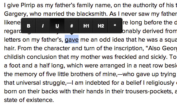
This is a clone of medium.com inline editor toolbar.
MediumEditor has been written using vanilla JavaScript, no additional frameworks required.
Browser Support

 |
|  |
|  |
|  --- | --- | --- | --- | --- |
Latest ✔ | Latest ✔ | IE 9+ ✔ | Latest ✔ |


Basic usage

demo: http://daviferreira.github.io/medium-editor/
Installation
Via bower:
Run in your console: bower install medium-editor
Manual installation:
Download the latest release and attach medium editor's stylesheets to your page:
<link rel="stylesheet" href="css/medium-editor.css">
<link rel="stylesheet" href="css/themes/default.css">
The next step is to reference the editor's script
<script src="js/medium-editor.js"></script>
Usage
You can now instantiate a new MediumEditor object:
<script>var editor = new MediumEditor('.editable');</script>
The above code will transform all the elements with the .editable class into HTML5 editable contents and add the medium editor toolbar to them.
You can also pass a list of HTML elements:
var elements = document.querySelectorAll('.editable'),
    editor = new MediumEditor(elements);
MediumEditor also supports textarea. If you provide a textarea element, the script
will create a new div with contentEditable=true, hide the textarea and link
the textarea value to the div HTML content.
Initialization options
Core options
- allowMultiParagraphSelection: enables the toolbar when selecting multiple paragraphs/block elements. Default: true
- delay: time in milliseconds to show the toolbar or anchor tag preview. Default: 0
- disableAnchorPreview: enables/disables the anchor preview element, which appears when hovering links and allows the user to edit the link when clicking. If toolbar is diabled (via disableToolbar or
data-disable-toolbar attribute) the anchor preview is always disabled so this option will be ignored. Default: false - disableReturn: enables/disables the use of the return-key. You can also set specific element behavior by using setting a data-disable-return attribute. Default: false
- disableDoubleReturn: allows/disallows two (or more) empty new lines. You can also set specific element behavior by using setting a data-disable-double-return attribute. Default: false
- disableEditing: enables/disables adding the contenteditable behavior. Useful for using the toolbar with customized buttons/actions. You can also set specific element behavior by using setting a data-disable-editing attribute. Default: false
- disablePlaceholders: enables/disables support for placeholder, including DOM element creation and attaching event handlers. When disabled, medium-editor will ignore the placeholder option and not show placeholder text. Default: false
- elementsContainer: specifies a DOM node to contain MediumEditor's toolbar and anchor preview elements. Default: document.body
- extensions: extension to use (see Custom Buttons and Extensions) for more. Default: {}
- firstHeader: HTML tag to be used as first header. Default: h3
- imageDragging: Allows image drag and drop into the editor. Default: true
- placeholder: Defines the default placeholder for empty contenteditables when disablePlaceholders is not set to true. You can overwrite it by setting a data-placeholder attribute on your elements. Default: 'Type your text'
- secondHeader: HTML tag to be used as second header. Default: h4
- spellcheck: Enable/disable native contentEditable automatic spellcheck. Default: true
- standardizeSelectionStart: Standardizes how the beginning of a range is decided between browsers whenever the selected text is analyzed for updating toolbar buttons status
Toolbar options
- activeButtonClass: CSS class added to active buttons in the toolbar. Default: 'medium-editor-button-active'
- buttons: the set of buttons to display on the toolbar. Default:
['bold', 'italic', 'underline', 'anchor', 'header1', 'header2', 'quote'] - buttonLabels: type of labels on the buttons. Values: 'fontawesome',
{'bold': '<b>b</b>', 'italic': '<i>i</i>'}. Default: false - diffLeft: value in pixels to be added to the X axis positioning of the toolbar. Default: 0
- diffTop: value in pixels to be added to the Y axis positioning of the toolbar. Default: -10
- disableToolbar: enables/disables the toolbar, adding only the contenteditable behavior. You can also set specific element behavior by using setting a
data-disable-toolbar attribute. Default: false - firstButtonClass: CSS class added to the first button in the toolbar. Default: 'medium-editor-button-first'
- lastButtonClass: CSS class added to the last button in the toolbar. Default: 'medium-editor-button-last'
- onShowToolbar: optional callback that will be called each time the toolbar is actually shown for this instance of medium-editor.
- onHideToolbar: optional callback that will be called each time the toolbar is actually hidden for this instance of medium-editor.
- staticToolbar: enable/disable the toolbar always displaying in the same location relative to the medium-editor element. Default: false
- stickyToolbar: enable/disable the toolbar "sticking" to the medium-editor element when the page is being scrolled. Default: false
- toolbarAlign:
left|center|right - when using the staticToolbar option, this aligns the static toolbar relative to the medium-editor element. Default: center - updateOnEmptySelection: update the state of the toolbar buttons even when the selection is collapse (there is no selection, just a cursor). Default: false
Anchor form options
- anchorButton: enables/disables displaying a checkbox for whether the user wants the link to be displayed as a "button". If checkbox is checked, the created link will have anchorButtonClass added to the class list. Default: false
- anchorButtonClass: class to add to anchor tags, when anchorButton is set to true. Default: btn
- anchorTarget: enables/disables displaying a "Open in new window" checkbox, which when checked changes the
target attribute of the created link. Default: false - anchorInputCheckboxLabel: text to be shown in the checkbox enabled via the anchorTarget option. Default: Open in new window
- anchorInputPlaceholder: text to be shown as placeholder of the anchor input. Default: Paste or type a link
- anchorPreviewHideDelay: time in milliseconds to show the anchor tag preview after the mouse has left the anchor tag. Default: 500
- checkLinkFormat: enables/disables check for common URL protocols on anchor links. Default: false
- targetBlank: enables/disables target="_blank" for anchor tags. Default: false
Paste Options
Options for paste are passed as an object that is a member of the outer options object. Example:
var editor = new MediumEditor('.editable', {
buttons: ['bold', 'italic', 'quote'],
paste: {
forcePlainText: true,
cleanPastedHTML: false,
cleanReplacements: [],
cleanAttrs: ['class', 'style', 'dir'],
cleanTags: ['meta']
}
});
- forcePlainText: Forces pasting as plain text. Default: true
- cleanPastedHTML: cleans pasted content from different sources, like google docs etc. Default: false
- cleanReplacements: custom pairs (2 element arrays) of RegExp and replacement text to use during paste when forcePlainText or cleanPastedHTML are
true OR when calling cleanPaste(text) helper method. Default: [] - cleanAttrs: list of element attributes to remove during paste when cleanPastedHTML is
true or when calling cleanPaste(text) or pasteHTML(html,options) helper methods. Default: ['class', 'style', 'dir'] - cleanTags: list of element tag names to remove during paste when cleanPastedHTML is
true or when calling cleanPaste(text) or pasteHTML(html,options) helper methods. Default: ['meta']
Options Example:
var editor = new MediumEditor('.editable', {
    anchorInputPlaceholder: 'Type a link',
    buttons: ['bold', 'italic', 'quote'],
    diffLeft: 25,
    diffTop: 10,
    firstHeader: 'h1',
    secondHeader: 'h2',
    delay: 1000,
    targetBlank: true,
    paste: {
        cleanPastedHTML: true,
        cleanAttrs: ['style', 'dir'],
        cleanTags: ['label', 'meta']
    }
});
Medium Editor, by default, will show only the buttons listed above to avoid a huge toolbar. There are a few extra buttons you can use:
- superscript
- subscript
- strikethrough
- unorderedlist
- orderedlist
- pre
- justifyLeft
- justifyFull
- justifyCenter
- justifyRight
- image (this simply converts selected text to an image tag)
- indent (moves the selected text up one level)
- outdent (moves the selected text down one level)
- removeFormat (clears inline style formatting, preserves blocks)
Themes
Check out the Wiki page for a list of available themes: https://github.com/daviferreira/medium-editor/wiki/Themes
API
Core Methods
- .destroy(): tears down the editor if already setup, removing all DOM elements and event handlers
- .setup(): rebuilds the editor if it has already been destroyed, recreating DOM elements and attaching event handlers
- .serialize(): returns a JSON object with elements contents
- .execAction(action, opts): executes an built-in action via
document.execCommand - .createLink(opts): creates a link via the native
document.execCommand('createLink') command - .subscribe(event, listener): attaches a listener to a custom medium-editor event
- .unsubscribe(event, listener): detaches a listener from a custom medium-editor event
- .saveSelection(): internally store the set of selected text
- .restoreSelection(): restore the selection to what was selected when
saveSelection() was called - .selectAllContents(): expands the selection to contain all text within the focused contenteditable
- .stopSelectionUpdates(): stop the toolbar from updating to reflect the state of the selected text
- .startSelectionUpdates(): put the toolbar back into its normal updating state
- .cleanPaste(text): convert text to plaintext and replace current selection with result
- .pasteHTML(html, options): replace the current selection with html
Helper Methods
- .on(target, event, listener, useCapture): attach a listener to a DOM event which will be detached when MediumEditor is deactivated
- .off(target, event, listener, useCapture): detach a listener to a DOM event that was attached via
on() - .delay(fn): delay any function from being executed by the amount of time passed as the
delay option - .getSelectionParentElement(range): get the parent contenteditable element that contains the current selection
- .getExtensionByName(name): get a reference to an extension with the specified name
- .selectElement(element): change selection to be a specific element and update the toolbar to reflect the selection
- .exportSelection(): return a data representation of the selected text, which can be applied via
importSelection() - .importSelection(selectionState): restore the selection using a data representation of previously selected text (ie value returned by
exportSelection())
Capturing DOM changes
For observing any changes on contentEditable
$('.editable').on('input', function() {
});
This is handy when you need to capture modifications to the contenteditable element that occur outside of key up's scope (like clicking on toolbar buttons).
input is supported by Chrome, Firefox, and other modern browsers (However, it is not supported in IE 9-11). If you want to read more or support older browsers, check Listening to events of a contenteditable HTML element and Detect changes in the DOM
Extensions & Plugins
Check the documentation in order to learn how to develop extensions for MediumEditor.
A list of existing extensions and plugins, such as Images and Media embeds, Tables and Markdown can be found here.
Development
MediumEditor development tasks are managed by Grunt. To install all the necessary packages, just invoke:
npm install
To run all the test and build the dist files for testing on demo pages, just invoke:
grunt
These are the other available grunt tasks:
- js: runs jslint and jasmine tests and creates minified and concatenated versions of the script;
- css: runs autoprefixer and csslint
- test: runs jasmine tests, jslint and csslint
- watch: watch for modifications on script/scss files
- spec: runs a task against a specified file
The source files are located inside the src directory. Be sure to make changes to these files and not files in the dist directory.
Contributing
Kill some bugs :)
- Fork it
- Create your feature branch (
git checkout -b my-new-feature) - Test your changes to the best of your ability.
- Update the documentation to reflect your changes if they add or changes current functionality.
- Commit your changes (
git commit -am 'Added some feature') - Push to the branch (
git push origin my-new-feature) - Create new Pull Request
Looking for something simple for a first contribution? Try fixing an easy first bug!
Contributors
https://github.com/daviferreira/medium-editor/graphs/contributors
License
MIT: https://github.com/daviferreira/medium-editor/blob/master/LICENSE

 |
|  |
|  |
|  --- | --- | --- | --- | --- |
Latest ✔ | Latest ✔ | IE 9+ ✔ | Latest ✔ |


