Mixmotion Player


An immersive music player with Mixcloud integration and dynamic visual effects

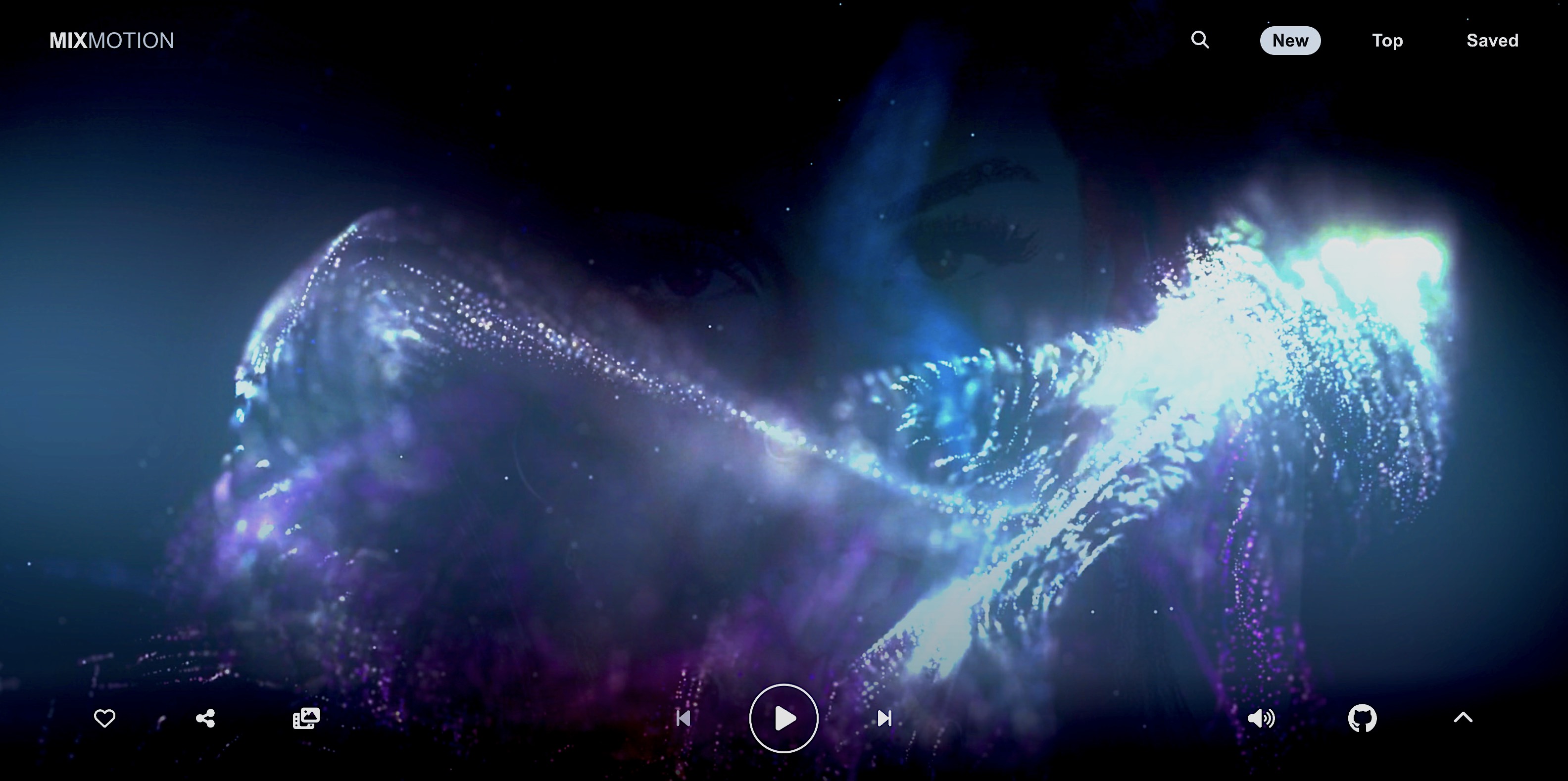
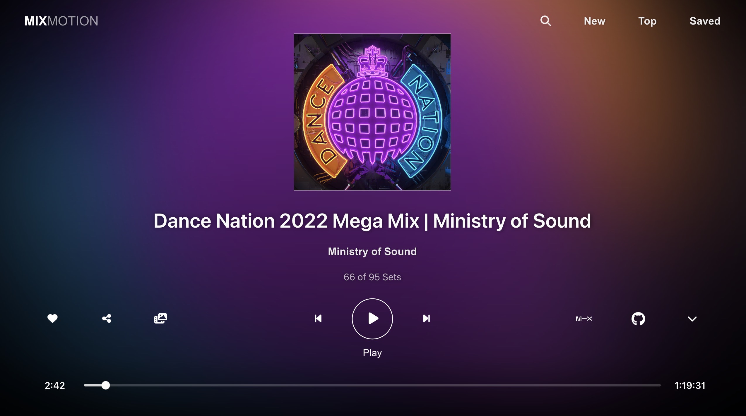
Click the image to try out the app
How to use
For casual users who just want to discover some new music with fullscreen visuals, hit the image above or link below to launch the Mixmotion web app on your mobile, desktop or TV device.
https://lewhunt.github.io/mixmotion
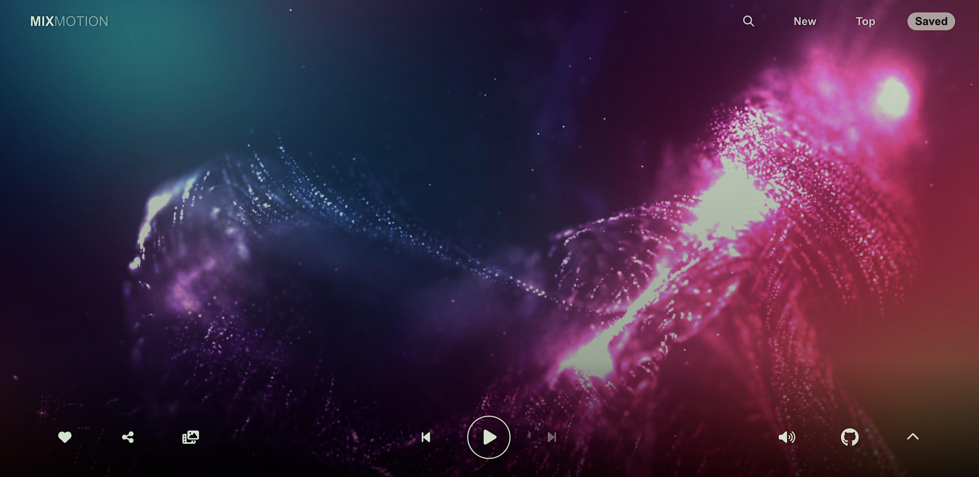
On playing a set, you'll enter playback mode with dynamic background effects appearing after a few seconds of user inactivity. Below is a quick video of the app transitioning between playback modes:
https://github.com/lewhunt/mixmotion/assets/9886284/95a2116f-5e4c-47fc-af65-6e65a53a0048
More screenshots and videos at the end of this doc.
Installation
Developers can also install Mixmotion Player as an open source component to use in React apps. Quickest install method is via the npm i command below or via cdn. Alternatively, integrate it manually by grabbing the lib folder in this repo along with the associated dependencies.
Install via npm package (recommended):
npm install mixmotion-player
Or install & import directly via CDN (see demo in CodePen)
import { MixmotionPlayer } from 'https://esm.sh/mixmotion-player/dist/mixmotion-player.js';
Basic Usage
Import the player and render MixmotionPlayer in your own app with a Mixcloud URL. It will use default settings for the other non declared props.
import { useEffect, useState } from "react";
import { MixmotionPlayer } from "mixmotion-player";

function Demo() {
  const [url, setUrl] = useState("");

  useEffect(() => {
    setUrl("https://www.mixcloud.com/discover/trance/?order=latest");
  }, []);

  return <MixmotionPlayer url={url} />;
}

export default Demo;
Advanced Usage
The advanced demo and official web app illustrate how the component can be customised further. Props are specified for custom buttons, video backgrounds and local data (saved items). A complete list of props are detailed further down this page.
<MixmotionPlayer
  url={url}
  showsData={getSavedData}
  customButtons={customButtons}
  backdropVideoList={backdropVideoList}
  enableBackdropVideo={true}
></MixmotionPlayer>
Why Another Music Player?
There are plenty of web players and widgets already available from the likes of Soundcloud and Mixcloud that you can integrate into your app.
Mixmotion offers something a bit different; an immersive, full-screen experience with unique visual effects, still providing free access to Mixcloud's vast music catalogue.
What Sets It Apart?
- Mixcloud Integration: Simple yet versatile access to Mixcloud content that goes beyond their official widget. Access playlists, user sets, genres, tags and individual shows, with the ability to privately save favourites via local storage and share mixes.
- Dynamic Visuals: Artwork combined with canvas effects and video motion backgrounds generate a captivating blend of imagery in a rich, immersive music player.
- Broad Device Support: Designed for mobile, desktop and TV devices. Touch, cursor and arrow-key navigation help make the user experience smooth across platforms.
- Future Considerations: Integration with local file paths, audio streams and other music services like Soundcloud. Real-time audio visualizations and beat detection are also being considered.
How Does It Work?
Under the hood, the component is built on top of the official Mixcloud API and Mixcloud Widget. It also utilises another custom component of mine - Dynamic Backdrop - to create the blended mix of transforms, canvas animations and video backgrounds.
Built with React TypeScript, it's packaged using Vite to generate an installable npm component library.
Props
| Prop | Description | Default |
|---|
url | The Mixcloud URL of the content to play
◦ Most URLs are supported such as playlists, users, genres, tags and individual shows/sets
◦ This can be a full URL or a partial Mixcloud key | null |
showsData | An array of locally stored shows data that can be used instead of a URL.
◦ The app utilises this for local-storage saved shows. | null |
backdropVideoList | A string array of background video URLs which appear in a random sequence during playback mode when there is no user activity | null |
enableBackdropVideo | Set to true to show the above background videos when there is no user activity.
◦ The video toggle button in the UI (and local storage flag) will override this | false |
enableUserLink | Set to true to turn the user/artist sub-title into a react-router link. (used in the deployed app) | false |
collapsed | Set to true to minimise the player metadata and controls, in order to make space for other content.
◦ Used in the app for home and search page content. | false |
activityTimeout | Override the timeout period of user inactivity, which then triggers an 'innactive mode' during playback to show full dynamic visuals
◦ Used in the app to provide longer timeout periods in home and search pages. | 4000 |
showWidget | Display the official Mixcloud widget at bottom of page - with its own controls and progress bar - instead of the custom progress bar.
◦ The official widget does not support arrow-key navigation for TV devices. | false |
width | Override the width of the player.
◦ Note: full-screen is the intended user experience, with content layered over
◦ You may need to modify the CSS if you override width | 100% |
height | Override the height of the player.
◦ Note: full-screen is the intended user experience, with content layered over
◦ You may need to modify the CSS if you override height | 100% |
customButtons | Specify a collection of custom buttons for the player UI
◦ A set of default buttons will be used if none are specified. | null |
autoplay | Set to false to disable the attempt to auto-play content | true |
withExclusives | Set to true to include exclusive content from the Mixcloud API.
◦ Note: exclusive content is unlikely to play without further development to support Mixcloud user sign-in authentication | false |
listIndex | Set the initial media index number if you have multiple shows/sets in the requested URL or local showData array | 0 |
style | add inline CSS styles to the player | null |
Callback Props
Callback props get fired on various player events, so you can take further actions when they occur:
| Prop | Description |
|---|
onReady | Called when media is loaded and ready to play |
onPlay | Called when media starts or resumes playing after pausing or buffering |
onPause | Called when media is paused |
onBuffering | Called when media starts buffering |
onEnded | Called when media finishes playing
  |
onError | Called when an error occurs whilst attempting to play media |
Custom Buttons
As illustrated in the advanced demo, the player can be overridden with custom buttons. There is a selection of pre-built action types with their own icons and behaviours or you can add your own with the "custom" action type.
import { MixmotionPlayer, ButtonProps } from "mixmotion-player";
import { faBars } from "@fortawesome/free-solid-svg-icons";

const customButtons: ButtonProps[] = [
  { action: "save", align: "right" },
  { action: "previous", align: "center" },
  { action: "playpause", align: "center" },
  { action: "next", align: "center" },
  {
    action: "custom",
    align: "right",
    label: "Queue",
    faIcon: faBars,
    onPress: () => {
      console.log("my custom button pressed");
    },
  },
];

function Demo() {
  return <MixmotionPlayer url={url} customButtons={customButtons} />;
}
| Button Props | Description |
|---|
action | Choose from custom or one of the pre-built actions: collapse, github, mixcloud, mute, next, playpause, previous, save, videos |
align | Alignment of the button. Choose from left,center, right |
label | A hint text label to appear below the current button in focus. Pre-built button actions use relevent labels. |
faIcon | A font-awesome icon. Pre-built button actions use relevent icons. |
onPress | Called when a button is pressed. Pre-built button actions have their own behaviours. |
onRelease | Called when a button is released. Currently unused. |
isSelectedFill | Allows support of toggle behaviour (in the form of a button fill) when set to true. |
disable | Prevents button action when set to true. |
useSavedItems Hook
This custom hook is used to update and retrieve shows that are favourited/liked by the user. The below snippet from the advanced demo illustrates how to load the player with local saved data.
import { MixmotionPlayer,
  useSavedItems,
  ShowsDataType
} from "./lib/MixmotionPlayer";

function Demo() {
  const { getSavedItems } = useSavedItems();

  const getSavedData = useMemo(() => {
    const savedItems = getSavedItems();
    if (savedItems.length)
      return {
        label: "Saved Sets",
        shows: savedItems.reverse(),
      } as ShowsDataType;
  }, [getSavedItems]);

  return (
    <MixmotionPlayer
      showsData={getSavedData}
    />
  );
}
useStore Hook
For more control you can import the useStore custom hook to globally access player state. View the inner components like MixmotionPlayerUI for examples of use. The below snippet shows basic usage to get current show title and playing state:
import { MixmotionPlayer, useStore } from "mixmotion-player";
const playing = useStore((s) => s.playing);
const title = useStore((s) => s.title);
console.log("playing: state ", playing);
console.log("Current title: ", title);
<MixmotionPlayer ... />;
App Screenshots and Videos
 |  |
|---|
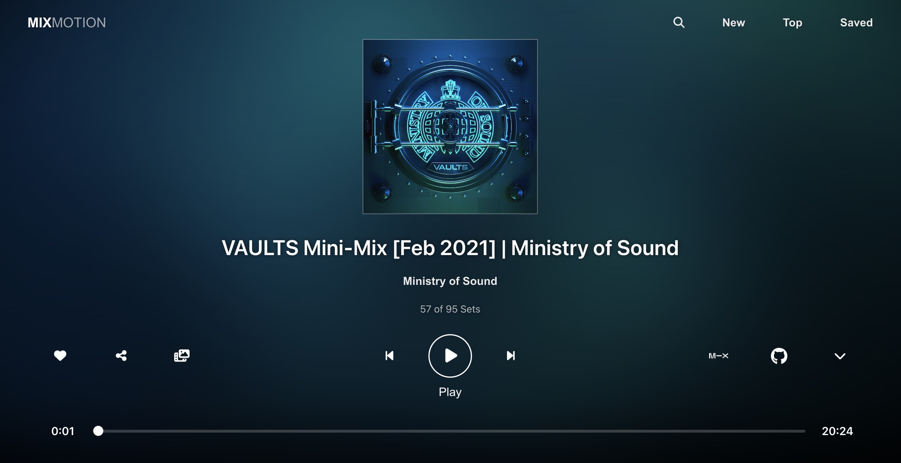
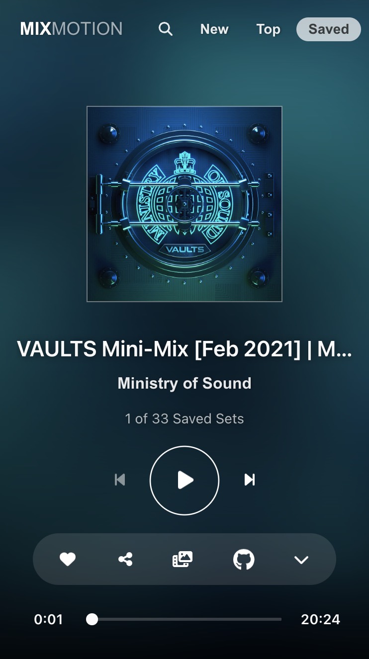
| Player UI on Desktop | on Mobile |

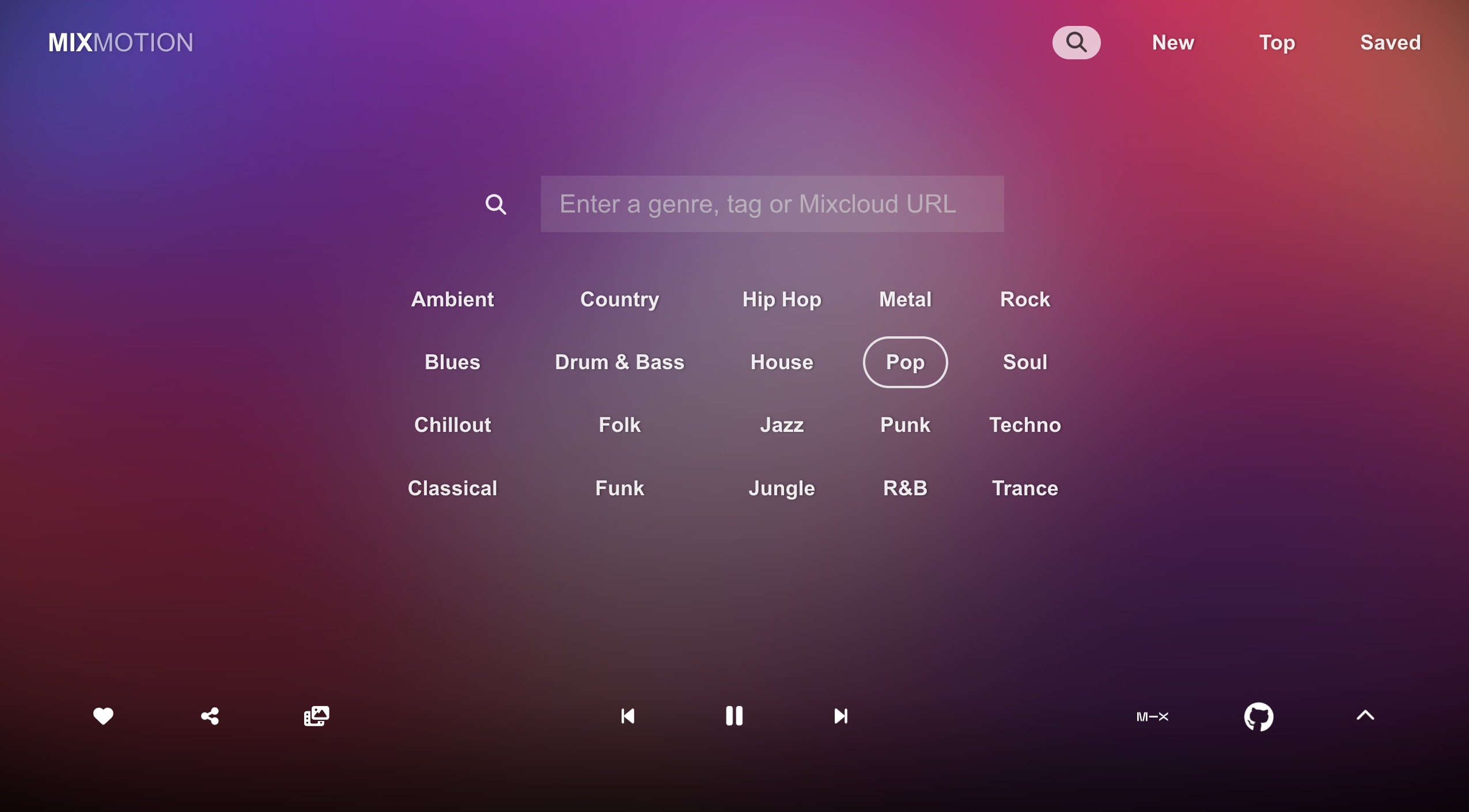
Search Page

Playback Mode
https://github.com/lewhunt/mixmotion/assets/9886284/fe234146-28f5-49ca-8786-d2efde7f7476
Playback Mode (example 1)
https://github.com/lewhunt/mixmotion/assets/9886284/3eac30ea-ae4b-4916-9615-3cc38ff6b213
Playback Mode (example 2)
https://github.com/lewhunt/mixmotion/assets/9886284/ff9fdb0d-ef02-4f04-914d-e8ce6a91fdcb
Playback Mode (example 3)

Click to view video promo on YouTube
Support
:speech_balloon: Fire over a comment if you have any feedback, requests or issues :bug:
:star: Smash us a Github star if you like the app or component :pray:
:link: Share your favourite sets in the app to support the creators :raised_hands:
https://lewhunt.github.io/mixmotion


