Product
Socket for Jira Is Now Available
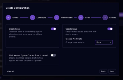
Socket for Jira lets teams turn alerts into Jira tickets with manual creation, automated ticketing rules, and two-way sync.
mq-sass is a Sass library to help you manage your responsive breakpoints and easily generate media queries.
npm install mq-sass
yarn get mq-sass
bower install css-mq-sass
Also available as a Ruby gem to use within your Rails application—see below for more information.
Or to manually install it, download and unzip the source files, then copy the files from the stylesheets/mq-sass directory into your project.
_mq-sass.scss file into your project.@import "mq-sass";
If you're using gulp, Grunt, Compass, or alike, include mq-sass:
// gulp-sass gulpfile.js
.pipe(sass({
  includePaths: ['node_modules/mq-sass/stylesheets']
}))

// grunt-sass Gruntfile.js
options: {
  includePaths: ['node_modules/mq-sass/stylesheets']
},
# Compass config.rb
add_import_path "node_modules/mq-sass/stylesheets"
gem 'mq-sass'
bundle install.@import*// application.scss
@import "mq-sass";
* More information on why Sass’s native @import + why you should ditch Sprockets directives altogether.
$mq-breakpoints: (
  iphone  : 320px,
  iphone6 : 375px,
  iphone6p: 414px,
  small   : 480px,
  medium  : 640px,
  ipad    : 768px,
  large   : 1024px,
);

$mq-ems    : false;
$mq-em-base: 16px;

$mq-only: "only screen";
mq($breakpoint, $minmax, $widthheight) Mixin@include mq($breakpoint, $minmax, $widthheight) { // $minmax and $widthheight are optional
// Sass goes here
}
$breakpoint$breakpoint, accepts pre-defined values from the $mq-breakpoints(); map, which is set by default as above in Settings.Example:
@include mq(small) {
  color: white;
}
/* Resulting CSS */
@media only screen and (min-width: 480px) {
  color: white;
}
You can also customize your own breakpoints.
$mq-breakpoints: (
  s : 600px,
  m : 800px,
  l : 1000px,
  xl: 1200px,
);

@include mq(xl) {
  color: blue;
}
$breakpoint also accepts other pre-defined values:Example:
@include mq(portrait) {
  color: white;
}

@include mq(retina) {
  color: red;
}
/* Resulting CSS */
@media only screen and (orientation: portrait) {
  color: white;
}

@media only screen and (-webkit-min-device-pixel-ratio: 2), only screen and (min-resolution: 2dppx) {
  color: red;
}
$breakpoint accepts custom values in px.Example:
@include mq(700px) {
  color: white;
}
/* Resulting CSS */
@media only screen and (min-width: 700px) {
  color: white;
}
Note: You can also use unitless pixel values: @include mq(700) {}
$minmaxBy default, media queries are mobile first (min-width).
$minmax accepts values min or max, which will result in min-width: or max-width: respectively. If left blank, it falls back to the default, min.
Example:
@include mq(ipad) {
  color: white;
}

@include mq(600px, max) {
  color: cyan;
}
/* Resulting CSS */
@media only screen and (min-width: 768px) {
  color: white;
}

@media only screen and (max-width: 600px) {
  color: cyan;
}
$widthheightBy default, media queries that are generated are (min/max-width).
$widthheight accepts values width or height, which results in min/max-width: or min/max-height: respectively. If left blank, it falls back to the default, width.
Example:
@include mq(small, min, height) {
  color: cyan;
}

@include mq(600px, max, height) {
  color: pink;
}
/* Resulting CSS */
@media only screen and (min-height: 480px) {
  color: cyan;
}

@media only screen and (max-height: 600px) {
  color: pink;
}
To have media queries in ems, set $mq-ems: true;. The default em base is 16px. You can change it by setting $mq-em-base to the pixel value of your choosing.
Examples:
$mq-ems: true;

@include mq(600px) {
  color: white;
}
/* Resulting CSS */
@media only screen and (min-width: 37.5em) {
  color: white;
}
$mq-ems    : true;
$mq-em-base: 20px;

@include mq(600px) {
  color: cyan;
}
/* Resulting CSS */
@media only screen and (min-width: 30em) {
  color: cyan;
}
By default the media is specified for only screen. For some reason if you'd like to change it or remove it completely, you can do so by changing the setting $mq-media:
$mq-media: "screen";
/* Resulting CSS */
@media screen and (min-width...) {}
$mq-media: ""; // or false
/* Resulting CSS */
@media (min-width...) {}
mq-get($breakpoint, $ems) functionReturns the value of the breakpoint in pixels (by default) or ems.
.example {
  max-width: mq-get(small);
}
$breakpoint$breakpoint accepts only pre-defined keys from the $mq-breakpoints(); map.
$mq-breakpoints: (
  small : 480px,
  medium: 640px,
);

.example {
  max-width: mq-get(small);
}
.example2 {
  max-width: mq-get(medium);
}
/* Resulting CSS */
.example {
  max-width: 480px;
}
.example2 {
  max-width: 640px;
}
$ems$ems is a boolean (false or true, false by default) and dictates whether or not the return is in pixels or ems.
.example {
  max-width: mq-get(small);
}
.example-ems {
  max-width: mq-get(small, true);
}
/* Resulting CSS */
.example {
  max-width: 480px;
}
.example2 {
  max-width: 30em;
}
The MIT License
Copyright © 2014–2016 Jonathan Suh (@jonsuh)
Permission is hereby granted, free of charge, to any person obtaining a copy of this software and associated documentation files (the “Software”), to deal in the Software without restriction, including without limitation the rights to use, copy, modify, merge, publish, distribute, sublicense, and/or sell copies of the Software, and to permit persons to whom the Software is furnished to do so, subject to the following conditions:
The above copyright notice and this permission notice shall be included in all copies or substantial portions of the Software.
THE SOFTWARE IS PROVIDED “AS IS”, WITHOUT WARRANTY OF ANY KIND, EXPRESS OR IMPLIED, INCLUDING BUT NOT LIMITED TO THE WARRANTIES OF MERCHANTABILITY, FITNESS FOR A PARTICULAR PURPOSE AND NONINFRINGEMENT. IN NO EVENT SHALL THE AUTHORS OR COPYRIGHT HOLDERS BE LIABLE FOR ANY CLAIM, DAMAGES OR OTHER LIABILITY, WHETHER IN AN ACTION OF CONTRACT, TORT OR OTHERWISE, ARISING FROM, OUT OF OR IN CONNECTION WITH THE SOFTWARE OR THE USE OR OTHER DEALINGS IN THE SOFTWARE.
FAQs
Sass library to manage responsive breakpoints and generate to media queries
The npm package mq-sass receives a total of 363 weekly downloads. As such, mq-sass popularity was classified as not popular.
We found that mq-sass demonstrated a not healthy version release cadence and project activity because the last version was released a year ago. It has 1 open source maintainer collaborating on the project.
Did you know?

Socket for GitHub automatically highlights issues in each pull request and monitors the health of all your open source dependencies. Discover the contents of your packages and block harmful activity before you install or update your dependencies.

Product
Socket for Jira lets teams turn alerts into Jira tickets with manual creation, automated ticketing rules, and two-way sync.

Company News
Socket won two 2026 Reppy Awards from RepVue, ranking in the top 5% of all sales orgs. AE Alexandra Lister shares what it's like to grow a sales career here.

Security News
NIST will stop enriching most CVEs under a new risk-based model, narrowing the NVD's scope as vulnerability submissions continue to surge.