Research
Security News
Malicious npm Packages Inject SSH Backdoors via Typosquatted Libraries
Socket’s threat research team has detected six malicious npm packages typosquatting popular libraries to insert SSH backdoors.
mui-feedback-dialog-connected
Advanced tools
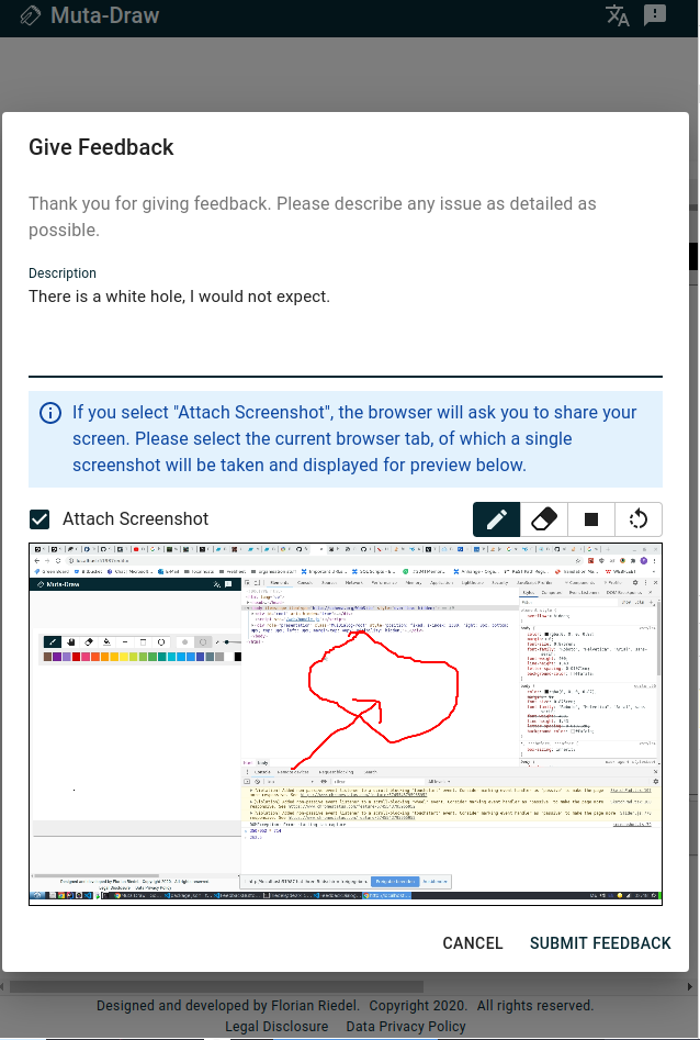
A customizeable React feedback form with optional screenshot via screen capture and canvas editor based on material-ui.
A React feedback form with optional screenshot via screen capture and canvas editor based on material-ui.
This library wraps the mui-feedback-dialog and handles the encryption and submission to your feedback channel of the recieved feedback. If you already have your own infrastructure and want to handle your feedback yourself, use the un-opinionated mui-feedback-dialog.
You also need to include @material-ui/core, @material-ui/icons, react, and react-dom. IF you have not already done so, you can install them with:
npm install --save @material-ui/core @material-ui/icons react react-dom
Then you can install this library with:
npm install --save mui-feedback-dialog-connected
import { FeedbackDialog } from 'mui-feedback-dialog-connected'


const FeedbackButton: React.FunctionComponent<{ mobile?: boolean }> = () => {
    const [dialogVisible, setDialogVisible] = useState(false)

    return <>
        <IconButton onClick={() => setDialogVisible(true)}>
            <FeedbackIcon />
        </IconButton>
        <FeedbackDialog open={dialogVisible} onClose={() => setDialogVisible(false)} tenantId='123' />
    </>
}
FeedbackDialog takes 5 props:
open [boolean]: whether the dialog is shown or notonClose [function]: callback to close the dialogonSubmit [function]: callback on submit with the feedback object:{
description: 'Some description.',
email: 'some@email.com',
screenshot: 'base64-encoded screenshot in webp format'
}
noScreenshot [boolean]: whether the option to show a screenshot is shown at all.className [string]: className applied to the dialog component.text [object]: possibility to overwrite the default strings:

FAQs
A customizeable React feedback form with optional screenshot via screen capture and canvas editor based on material-ui.
The npm package mui-feedback-dialog-connected receives a total of 12 weekly downloads. As such, mui-feedback-dialog-connected popularity was classified as not popular.
We found that mui-feedback-dialog-connected demonstrated a not healthy version release cadence and project activity because the last version was released a year ago. It has 1 open source maintainer collaborating on the project.
Did you know?

Socket for GitHub automatically highlights issues in each pull request and monitors the health of all your open source dependencies. Discover the contents of your packages and block harmful activity before you install or update your dependencies.

Research
Security News
Socket’s threat research team has detected six malicious npm packages typosquatting popular libraries to insert SSH backdoors.

Security News
MITRE's 2024 CWE Top 25 highlights critical software vulnerabilities like XSS, SQL Injection, and CSRF, reflecting shifts due to a refined ranking methodology.

Security News
In this segment of the Risky Business podcast, Feross Aboukhadijeh and Patrick Gray discuss the challenges of tracking malware discovered in open source softare.