
Security News
cURL Project and Go Security Teams Reject CVSS as Broken
cURL and Go security teams are publicly rejecting CVSS as flawed for assessing vulnerabilities and are calling for more accurate, context-aware approaches.
mui-layout
Advanced tools


A set of components that allows you to build dynamic and responsive layout based on Material-UI
This project based on React Material-UI, so you have to install @material-ui/core @material-ui/styles
// yarn
yarn add mui-layout @material-ui/core @material-ui/styles @material-ui/icons

// npm
npm install mui-layout @material-ui/core @material-ui/styles @material-ui/icons
see demo here Storybook Demo
// this example use icon from material-ui/icons, you can use your own!
import React from 'react';
import { ThemeProvider } from '@material-ui/styles';
import { createMuiTheme } from '@material-ui/core/styles';
import ChevronLeft from '@material-ui/icons/ChevronLeft';
import ChevronRight from '@material-ui/icons/ChevronRight';
import MenuRounded from '@material-ui/icons/MenuRounded';

import {
 Root,
 Header,
 Nav,
 Content,
 Footer,
 presets,
} from 'mui-layout';

const baseTheme = createMuiTheme(); // or use your own theme;
const config = presets.createStandardLayout();

const App = () => (
  <ThemeProvider theme={baseTheme}>
   <Root config={config}>
     <Header
       renderMenuIcon={open => (open ? <ChevronLeft /> : <MenuRounded />)}
     >
       header
     </Header>
     <Nav
       renderIcon={collapsed =>
         collapsed ? <ChevronRight /> : <ChevronLeft />
       }
     >
       nav
     </Nav>
     <Content>
       content
     </Content>
     <Footer>
       footer
     </Footer>
   </Root>
  </ThemeProvider>
)

export default App;
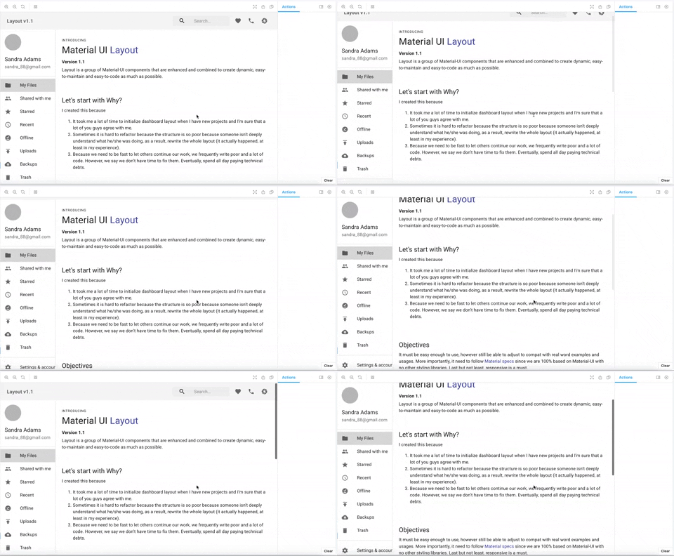
Collapsible Nav
Header Magnet
Auto Collapsed
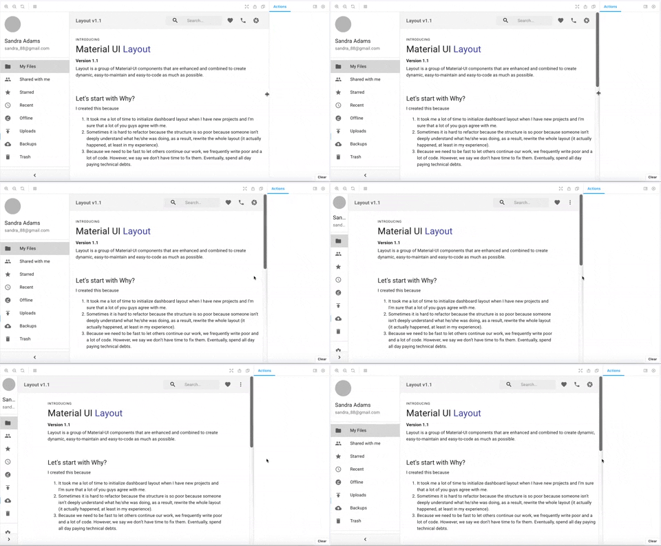
Responsive Config
const extendedConfigs2 = {
  ...defaultConfig,

  // navVariant is 'temporary' in mobile and tablet, 'permanent' in desktop and greater
  navVariant: {
    xs: 'temporary',
    md: 'permanent',
  },
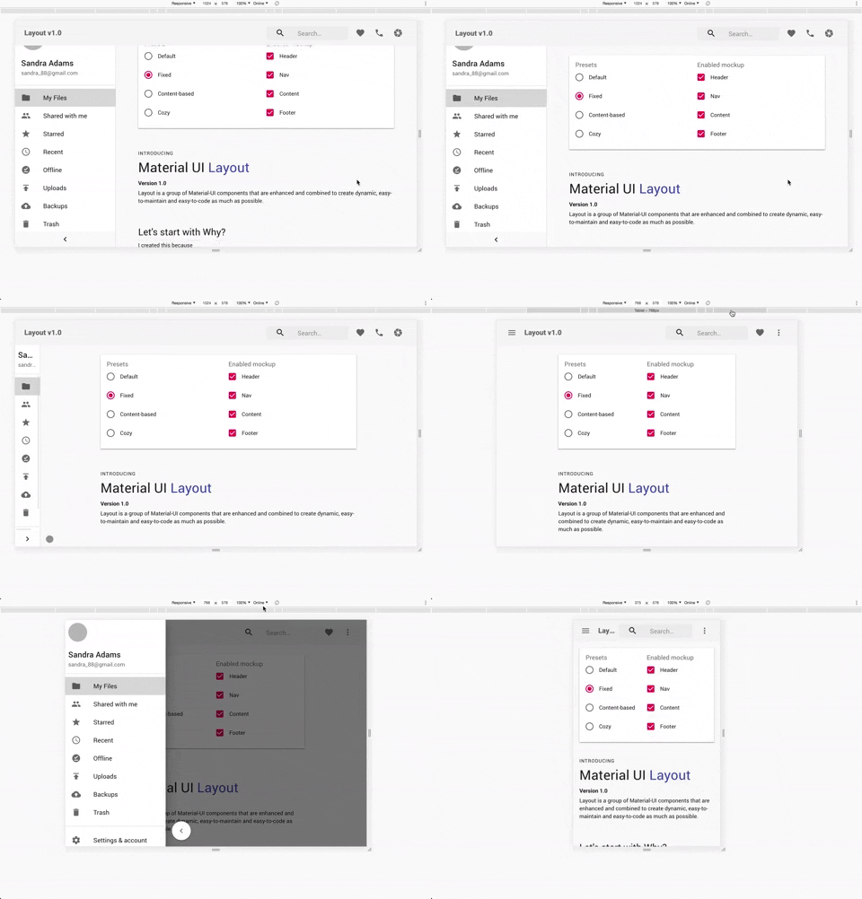
Standard
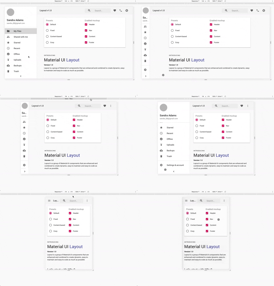
Fixed
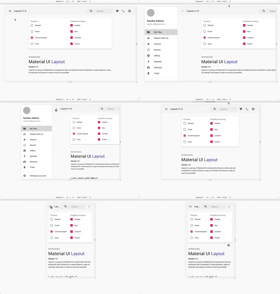
Content Based
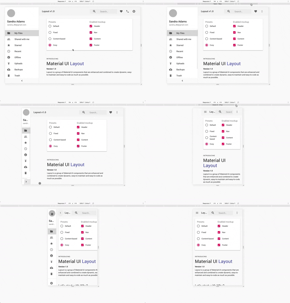
Cozy
They are basically material-ui components that are combined to make things easier.
AppBar, Toolbar, Drawer
use @material-ui/styles to style components
use react-hooks
Pull requests are welcome. For major changes, please open an issue first to discuss what you would like to change.
Please make sure to update tests as appropriate.
FAQs
Instantly build dynamic and responsive layout based on React Material-UI
The npm package mui-layout receives a total of 496 weekly downloads. As such, mui-layout popularity was classified as not popular.
We found that mui-layout demonstrated a not healthy version release cadence and project activity because the last version was released a year ago. It has 1 open source maintainer collaborating on the project.
Did you know?

Socket for GitHub automatically highlights issues in each pull request and monitors the health of all your open source dependencies. Discover the contents of your packages and block harmful activity before you install or update your dependencies.

Security News
cURL and Go security teams are publicly rejecting CVSS as flawed for assessing vulnerabilities and are calling for more accurate, context-aware approaches.

Security News
Bun 1.2 enhances its JavaScript runtime with 90% Node.js compatibility, built-in S3 and Postgres support, HTML Imports, and faster, cloud-first performance.

Security News
Biden's executive order pushes for AI-driven cybersecurity, software supply chain transparency, and stronger protections for federal and open source systems.