Security News
PyPI’s New Archival Feature Closes a Major Security Gap
PyPI now allows maintainers to archive projects, improving security and helping users make informed decisions about their dependencies.
ng-multiselect-dropdown9
Advanced tools
Angular multiselect dropdown component for web applications. Easy to integrate and use. It can be bind to any custom data source.

npm install ng-multiselect-dropdown
And then include it in your module (see app.module.ts):
import { NgMultiSelect9DropDownModule } from 'ng-multiselect-dropdown';
// ...

@NgModule({
  imports: [
    NgMultiSelect9DropDownModule.forRoot()
    // ...
  ]
  // ...
})
export class AppModule {}
import { Component, OnInit } from '@angular/core';
import { IDropdownSettings } from 'ng-multiselect-dropdown';

export class AppComponent implements OnInit {
  dropdownList = [];
  selectedItems = [];
  dropdownSettings = {};
  ngOnInit() {
    this.dropdownList = [
      { item_id: 1, item_text: 'Mumbai' },
      { item_id: 2, item_text: 'Bangaluru' },
      { item_id: 3, item_text: 'Pune' },
      { item_id: 4, item_text: 'Navsari' },
      { item_id: 5, item_text: 'New Delhi' }
    ];
    this.selectedItems = [
      { item_id: 3, item_text: 'Pune' },
      { item_id: 4, item_text: 'Navsari' }
    ];
    this.dropdownSettings:IDropdownSettings = {
      singleSelection: false,
      idField: 'item_id',
      textField: 'item_text',
      selectAllText: 'Select All',
      unSelectAllText: 'UnSelect All',
      itemsShowLimit: 3,
      allowSearchFilter: true
    };
  }
  onItemSelect(item: any) {
    console.log(item);
  }
  onSelectAll(items: any) {
    console.log(items);
  }
}
<ng-multiselect-dropdown
  [placeholder]="'custom placeholder'"
  [data]="dropdownList"
  [(ngModel)]="selectedItems"
  [settings]="dropdownSettings"
  (onSelect)="onItemSelect($event)"
  (onSelectAll)="onSelectAll($event)"
>
</ng-multiselect-dropdown>
| Setting | Type | Description | Default Value |
|---|---|---|---|
| singleSelection | Boolean | Mode of this component. If set true user can select more than one option. | false |
| placeholder | String | Text to be show in the dropdown, when no items are selected. | 'Select' |
| disabled | Boolean | Disable the dropdown | false |
| data | Array | Array of items from which to select. Should be an array of objects with id and text properties. You can also use custom properties. In that case you need to map idField and textField properties. As convenience, you may also pass an array of strings, in which case the same string is used for both the ID and the text(no mapping is required) | n/a |
| idField | String | map id field in case of custom array of object | 'id' |
| textField | String | map text field in case of custom array of object | 'text' |
| enableCheckAll | Boolean | Enable the option to select all items in list | false |
| selectAllText | String | Text to display as the label of select all option | Select All |
| unSelectAllText | String | Text to display as the label of unSelect option | UnSelect All |
| allowSearchFilter | Boolean | Enable filter option for the list. | false |
| searchPlaceholderText | String | custom search placeholder | Search |
| clearSearchFilter | Boolean | clear search filter on dropdown close | true |
| maxHeight | Number | Set maximum height of the dropdown list in px. | 197 |
| itemsShowLimit | Number | Limit the number of items to show in the input field. If not set will show all selected. | All |
| limitSelection | Number | Limit the selection of number of items from the dropdown list. Once the limit is reached, all unselected items gets disabled. | none |
| searchPlaceholderText | String | Custom text for the search placeholder text. Default value would be 'Search' | 'Search' |
| noDataAvailablePlaceholderText | String | Custom text when no data is available. | 'No data available' |
| closeDropDownOnSelection | Boolean | Closes the dropdown when item is selected. applicable only in cas of single selection | false |
| defaultOpen | Boolean | open state of dropdown | false |
| allowRemoteDataSearch | Boolean | allow search remote api if no data is present. | false |
onSelect - Return the selected item when an item is checked.
Example : (onSelect)="onItemSelect($event)"onSelectAll - Return the all items.
Example : (onSelectAll)="onSelectAll($event)".onDeSelect - Return the unselected item when an item is unchecked.
Example : (onDeSelect)="onItemDeSelect($event)"onFilterChange - Return the key press.
Example : (onFilterChange)="onFilterChange($event)"onDropDownClose-
Example : (onDropDownClose)="onDropDownClose()"npm installng serve for a dev serverhttp://localhost:4200/Run yarn build:lib to build the library and generate an NPM package. The build artifacts will be stored in the dist-lib/ folder.
Run yarn test to execute the unit tests.
This project was generated with Angular CLI version 1.7.1.
Contributions are welcome, please open an issue and preferrably file a pull request.
Please share sample code using codesandbox.com or stackblitz.com to help me re-produce the issue.
MIT License.
Thanks goes to these wonderful people (emoji key):
Tom Saleeba 💻 | Simon Pinfold 💻 | Sushil Suthar 💻 | Sachin Grover 💻 | Mike Roberts 💻 | David Sosa 💻 |
This project follows the all-contributors specification. Contributions of any kind welcome!
FAQs
Angular Multi-Select Dropdown
The npm package ng-multiselect-dropdown9 receives a total of 13 weekly downloads. As such, ng-multiselect-dropdown9 popularity was classified as not popular.
We found that ng-multiselect-dropdown9 demonstrated a not healthy version release cadence and project activity because the last version was released a year ago. It has 1 open source maintainer collaborating on the project.
Did you know?

Socket for GitHub automatically highlights issues in each pull request and monitors the health of all your open source dependencies. Discover the contents of your packages and block harmful activity before you install or update your dependencies.

Security News
PyPI now allows maintainers to archive projects, improving security and helping users make informed decisions about their dependencies.

Research
Security News
Malicious npm package postcss-optimizer delivers BeaverTail malware, targeting developer systems; similarities to past campaigns suggest a North Korean connection.

Security News
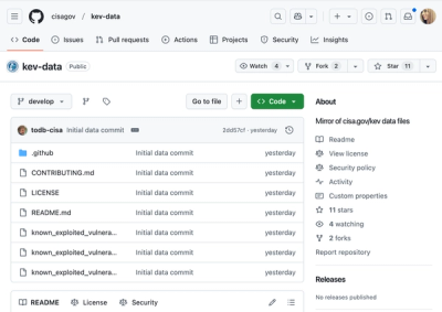
CISA's KEV data is now on GitHub, offering easier access, API integration, commit history tracking, and automated updates for security teams and researchers.