
Security News
PyPI’s New Archival Feature Closes a Major Security Gap
PyPI now allows maintainers to archive projects, improving security and helping users make informed decisions about their dependencies.
By Sarah Gooding - Jan 30, 2025
ngx-daterangepicker-material
Advanced tools
Angular 9 and 10 date range picker (with material design theme)
Angular 2+ Date range picker.

This Angular Material plugin is compatible with Angular 2+ and is Ivy compatible. It leverages dayjs to handle date manipulation and parsing. The base for this plugin was originally the Bootstrap Date Range Picker, but its dependencies on jQuery, Bootstrap and dayjs.js were removed.

Demo: https://fetrarij.github.io/ngx-daterangepicker-material/
| Angular | ngx-daterangepicker-material |
|---|---|
| >=12.0.0 | v6.x.x |
| <=11.0.0 | v5.x.x |
| >=9.0.0 | v4.x.x |
| <9.0.0 | v2.x.x |
Install the plugin from npm:
npm install ngx-daterangepicker-material --save .
import NgxDaterangepickerMd in your module:
...
import { FormsModule } from '@angular/forms';
import { NgxDaterangepickerMd } from 'ngx-daterangepicker-material';
import { App } from './app';

@NgModule({
    imports: [
        ... ,
        FormsModule,
        NgxDaterangepickerMd.forRoot()
    ],
    declarations: [App],
    bootstrap:    [App]
})
export class AppModule {}
Html:
<input type="text" ngxDaterangepickerMd [(ngModel)]="selected" class="form-control"/>
Typescript:
selected: {startDate: Dayjs, endDate: Dayjs};
Html:
<input type="text" matInput
    ngxDaterangepickerMd
    [locale]="{applyLabel: 'ok', format: 'DD-MM-YYYY'}"
    startKey="start"
    endKey="end"
    [(ngModel)]="selected"
    name="daterange"/>
Typescript:
selected: {start: Dayjs, end: Dayjs};
You can play with our online demo here and browse our demo code here.
You can use the component directly in your templates, which will set its inline mode to true, in which case the calendar won't hide after date/range selection. You can then use the events: rangeClicked or datesUpdated or choosedDate to get its selection state.
<ngx-daterangepicker-material (choosedDate)="choosedDate($event)">
</ngx-daterangepicker-material>
These options are booleans
(function) A function that is passed each date in the calendars before they are displayed, and may return a string or array of CSS class names to apply to that date's calendar cell
(function) A function that is passed each date in the two calendars before they are displayed, and may return true or false to indicate whether that date should be available for selection or not.
(function) A function that is passed each date in the two calendars before they are displayed, and may return a text to be displayed as a tooltip.
To set the minimal and maximal date, these options are either a dayjs date or string in ISO format
To set max number of the date we can choose
the locale options is an object with:
{
    format: 'MM/DD/YYYY', // could be 'YYYY-MM-DDTHH:mm:ss.SSSSZ'
    displayFormat: 'MM/DD/YYYY', // default is format value
    direction: 'ltr', // could be rtl
    weekLabel: 'W',
    separator: ' To ', // default is ' - '
    cancelLabel: 'Cancel', // detault is 'Cancel'
    applyLabel: 'Okay', // detault is 'Apply'
    clearLabel: 'Clear', // detault is 'Clear'
    customRangeLabel: 'Custom range',
    daysOfWeek: dayjs.weekdaysMin(),
    monthNames: dayjs.monthsShort(),
    firstDay: 1 // first day is monday
}
Check here for setting the global locale
Theses 2 options are for the key you want for the value, default are startDate and endDate, it means the value we have from ngModel are: {startDate: Date, endDate: Date} by default;
Specifiyng startKey and endKey would have different model:
example:
<input type="text" ngxDaterangepickerMd startKey="start" endKey="end" [(ngModel)]="model">
the model we got would be: {start: Date, end: Date}
(object) Set predefined date ranges the user can select from. Each key is the label for the range, and its value an array with two dates representing the bounds of the range. As an example:
<input type="text" ngxDaterangepickerMd startKey="start" endKey="end" [ranges]="ranges" [(ngModel)]="model">
ranges: any = {
    'Today': [dayjs(), dayjs()],
    'Yesterday': [dayjs().subtract(1, 'days'), dayjs().subtract(1, 'days')],
    'Last 7 Days': [dayjs().subtract(6, 'days'), dayjs()],
    'Last 30 Days': [dayjs().subtract(29, 'days'), dayjs()],
    'This Month': [dayjs().startOf('month'), dayjs().endOf('month')],
    'Last Month': [dayjs().subtract(1, 'month').startOf('month'), dayjs().subtract(1, 'month').endOf('month')]
  }
You can use bellow options when using the ranges. The default are false.
| Attribut | Type | Description |
|---|---|---|
| alwaysShowCalendars | boolean | set to true if you want to display the ranges with the calendar |
| keepCalendarOpeningWithRange | boolean | set to true if you want the calendar won't be closed after choosing a range |
| showRangeLabelOnInput | boolean | set to true if you want to display the range label on input |
| customRangeDirection | boolean | set to true if you want to allow selection range from end date first |
| lockStartDate | boolean | set to true if you want to lock start date and change only the end date |
It is possible to open datepicker from outside. You should create an input with attached datepicker directive and a button with "ngx-daterangepicker-action" class (to prevent triggering of clickOutside).
    <input
      ngxDaterangepickerMd
      [closeOnAutoApply]="true"
      [autoApply]="true"
      [singleDatePicker]="true"
      [linkedCalendars]="true"
      [(ngModel)]="selected"
      (datesUpdated)="datesUpdated($event)"
      class="datepicker-calendar-icon">

    <a class="ngx-daterangepicker-action" (click)="openDatepicker()">
      Open
    </a>
  ...
    @ViewChild(DaterangepickerDirective, { static: false }) pickerDirective: DaterangepickerDirective;
  ...
  ...
  openDatepicker() {
    this.pickerDirective.open();
  }
You have to set the attribute timePicker to true if you want to enable the timepicker.
You can use theses options:
| Attribut | Type | Description |
|---|---|---|
| timePicker24Hour | boolean | set to true if you want to set the timepicker to 24h instead of having AM and PM |
| timePickerIncrement | number | set the value increment of the minutes (eg: for 12 there would be 0mn, 15mn, 30mn, 45mn,) |
| timePickerSeconds | boolean | set true if you want do display second's select |
| Attribut | Type | Description |
|---|---|---|
| firstMonthDayClass | string | add a custom class for all first day of the month |
| lastMonthDayClass | string | add a custom class for all last day of the month |
| emptyWeekRowClass | string | add a custom class in a row with a date in a week not in the current month |
| emptyWeekColumnClass | string | add a custom class for all date in a week not in the current month |
| lastDayOfPreviousMonthClass | string | add a custom class for the last day of the previous month |
| firstDayOfNextMonthClass | string | add a custom class for the first day of the next month |
| Attribut | Possible values | Description |
|---|---|---|
| opens | left, center, right | position the calendar from the input element |
| drops | up, down | position the calendar to the up or down of the calendar |
Fired when clicked on range, and send an object with range label and dates value, eg:
{label: 'This Month', dates: [Dayjs, Dayjs]}
Fires when the date model is updated, like applying (if you have activated the apply button), or when selecting a range or date without the apply button, and sends an object containing start and end dates, eg:
{startDate: Dayjs, endDate: Dayjs}
Fired when clicked on the clear button
For setting the global locale, pass this object to NgxDaterangepickerMd.forRoot().
eg:
@NgModule({
    imports: [
        ... ,
        FormsModule,
        NgxDaterangepickerMd.forRoot({
            separator: ' - ',
            applyLabel: 'Okay',
        })
    ],
    declarations: [App],
    bootstrap:    [App]
})
Install local dependencies: npm install.
Run npm start to start a development server on a port 4200.
Open http//:localhost:4200 on your browser.
Run npm test or ng test to run tests.
MIT
FAQs
Angular 9 and 10 date range picker (with material design theme)
The npm package ngx-daterangepicker-material receives a total of 28,892 weekly downloads. As such, ngx-daterangepicker-material popularity was classified as popular.
We found that ngx-daterangepicker-material demonstrated a not healthy version release cadence and project activity because the last version was released a year ago. It has 1 open source maintainer collaborating on the project.
Did you know?

Socket for GitHub automatically highlights issues in each pull request and monitors the health of all your open source dependencies. Discover the contents of your packages and block harmful activity before you install or update your dependencies.
Security News
PyPI now allows maintainers to archive projects, improving security and helping users make informed decisions about their dependencies.

Research
Security News
Malicious npm package postcss-optimizer delivers BeaverTail malware, targeting developer systems; similarities to past campaigns suggest a North Korean connection.
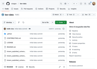
Security News
CISA's KEV data is now on GitHub, offering easier access, API integration, commit history tracking, and automated updates for security teams and researchers.