Security News
Deno 2.2 Improves Dependency Management and Expands Node.js Compatibility
Deno 2.2 enhances Node.js compatibility, improves dependency management, adds OpenTelemetry support, and expands linting and task automation for developers.
ngx-skeleton-loader
Advanced tools
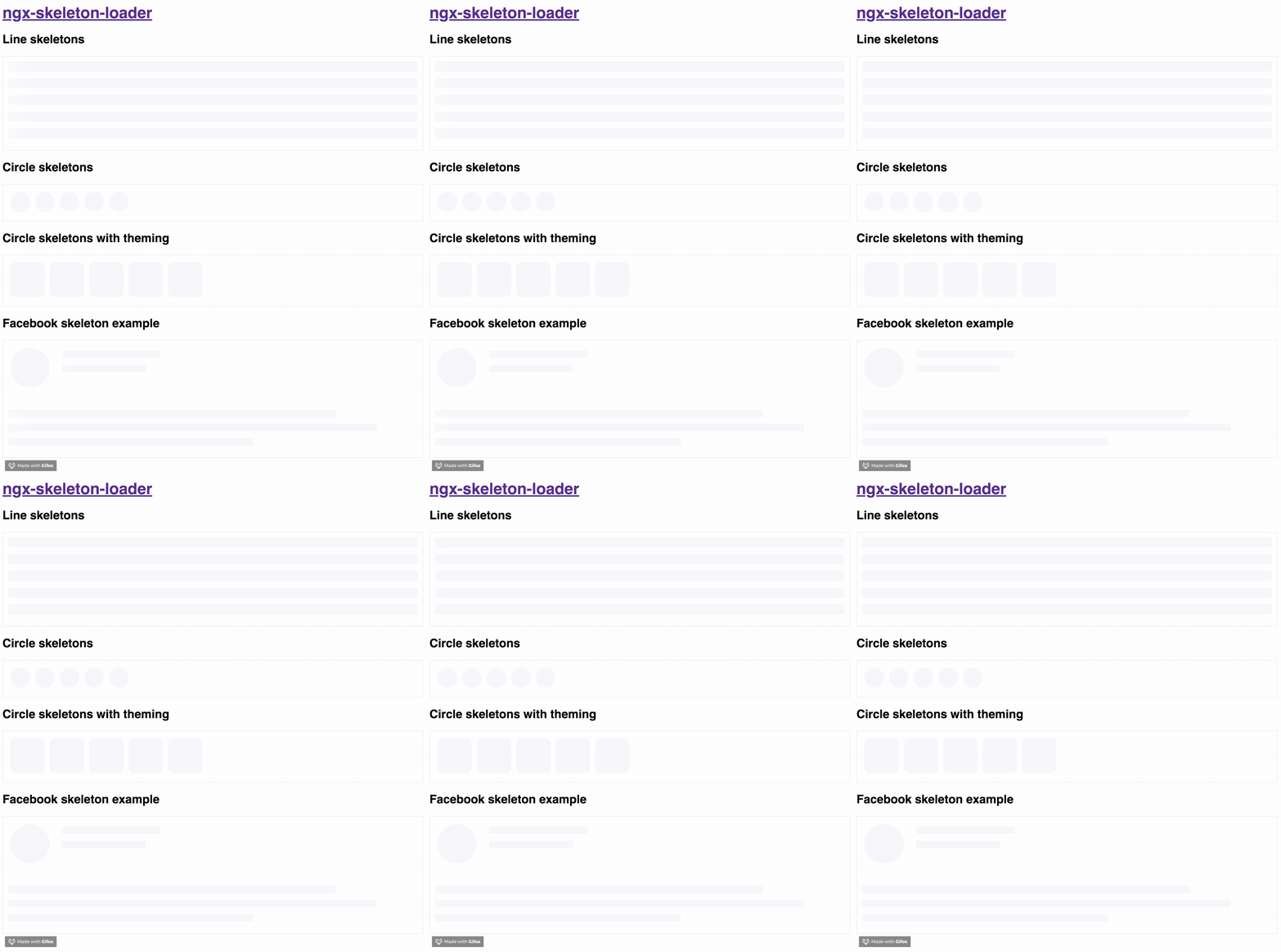
Make beautiful, animated loading skeletons that automatically adapt to your Angular apps

The idea of this component is make the process transparent and easier. So the main point is integrate this component with other tooling process, such as:
It's totally transparent for you and you can integrate easier in your application, improving your user experience 🎉
Try out our demos on Stackblitz!
You can get it on NPM installing ngx-skeleton-loader module as a project dependency.
npm install ngx-skeleton-loader --save
You'll need to add NgxSkeletonLoaderModule to your application module. So that, the <ngx-skeleton-loader> components will be accessible in your application.
...
import { NgxSkeletonLoaderModule } from 'ngx-skeleton-loader';
...

@NgModule({
  declarations: [
    YourAppComponent
  ],
  imports: [
    ...
    NgxSkeletonLoaderModule,
    ...
  ],
  providers: [],
  bootstrap: [YourAppComponent]
})

export class YourAppComponent {}
After that, you can use the ngx-skeleton-loader components in your templates, passing the configuration data into the component itself.
ngx-skeleton-loader: Handle the skeleton animation and the skeleton styles of your app;<div class="item">
<ngx-skeleton-loader count="5" appearance="circle"></ngx-skeleton-loader>
</div>
You can also define which CSS animation you want to use - even not use any, if it's the case - in your skeleton loader by passing the options in your component via [animation] attribute.
false: it will disable the animation;progress - default: it will use it progress as animation;progress-dark: it will use it progress-dark as animation. Recommended if your color schema is darken;pulse: it will use pulse as animation;
progressis the default animation, used as the single one previously. If you don't pass the animation attribute, it defaults toprogress.
<!--
If you need to change all the background wrapper
you need to apply the style changes on the
`ngx-skeleton-loader` component wrapper
-->
<div class="item">
  <!-- Disables the animation -->
  <ngx-skeleton-loader animation="false"></ngx-skeleton-loader>
  <!-- Uses `progress` as animation -->
  <ngx-skeleton-loader animation="progress"></ngx-skeleton-loader>
  <ngx-skeleton-loader></ngx-skeleton-loader>
  <!-- Uses `pulse` as animation -->
  <ngx-skeleton-loader animation="pulse"></ngx-skeleton-loader>
</div>
You can check the code details in the Stackblitz Live Demo Link
You can also define different styles for the skeleton loader by passing an object with the css styles - in dashed case - into the component via [theme] attribute.
<!--
If you need to change all the background wrapper
you need to apply the style changes on the
`ngx-skeleton-loader` component wrapper
-->

<div style="background: #FF0001; padding: 10px;">
  <ngx-skeleton-loader
    count="5"
    [theme]="{
      'border-radius': '5px',
      height: '50px',
      'background-color': '#992929',
      border: '1px solid white'
    }"
  ></ngx-skeleton-loader>
</div>
Also, you can use CSS to add theme styles into your component. However, there are some implications:
:host in your stylesheet, which means you are aware of any possible problem :host can create for your app at that level since it's based on :host DOM style scoping<ngx-skeleton-loader> internal classes. It means that class naming changes on module's side will be breaking changes for your application as well.As an example, your Component file is like this
import { Component } from "@angular/core";

@Component({
  selector: "my-ngx-skeleton-loader-with-theming",
  templateUrl: "./my-ngx-skeleton-loader-with-theming.component.html",
  styleUrls: ["./my-ngx-skeleton-loader-with-theming.component.css"],
})
export class MyNGXSkeletonLoaderWithThemingComponent {
  /* ... code goes here*/
}
And your componennt HTML code is
<!--
file: my-ngx-skeleton-loader-with-theming.component.html

As an example, it's not using themes via [theme] attributes.
-->

<ngx-skeleton-loader
    count="5"
    animation="pulse"
  ></ngx-skeleton-loader>
You can apply theme changes in our stylesheet. At the end it will be
/* file: `my-ngx-skeleton-loader-with-theming.component.css`
 *
 * You can find more details about `:host` at
 * Angular Component Style Docs https://angular.io/guide/component-styles#host
 */
:host >>> ngx-skeleton-loader .loader {
  border-radius: 5px;
  height: 50px;
  background-color: #992929;
  border: 1px solid white;
}
You should change the styles on the skeleton wrapper element in case you need to change the background color. You can check the code details in the Stackblitz Live Demo Link or check it out a content load simulation in this Stackblitz Live Demo Link
npm start and access the link http://localhost:4200 in your browsernpm test for run tests. In case you want to test using watch, please use npm run tddthis project is using np package to publish, which makes things straightforward. EX: np <patch|minor|major> --contents=dist/ngx-skeleton-loader
For more details, please check np package on npmjs.com
For any type of contribution, please follow the instructions in CONTRIBUTING.md and read CODE_OF_CONDUCT.md files.
Wilson Mendes (willmendesneto)
[2.4.4][] - 2020-08-21
npm run dev:ssr and access http://localhost:4200/index.html and the page will run using angular universal 💪.prettierrc file with some of the code styling rulesFAQs
Make beautiful, animated loading skeletons that automatically adapt to your Angular apps
The npm package ngx-skeleton-loader receives a total of 102,295 weekly downloads. As such, ngx-skeleton-loader popularity was classified as popular.
We found that ngx-skeleton-loader demonstrated a healthy version release cadence and project activity because the last version was released less than a year ago. It has 0 open source maintainers collaborating on the project.
Did you know?

Socket for GitHub automatically highlights issues in each pull request and monitors the health of all your open source dependencies. Discover the contents of your packages and block harmful activity before you install or update your dependencies.

Security News
Deno 2.2 enhances Node.js compatibility, improves dependency management, adds OpenTelemetry support, and expands linting and task automation for developers.

Security News
React's CRA deprecation announcement sparked community criticism over framework recommendations, leading to quick updates acknowledging build tools like Vite as valid alternatives.

Security News
Ransomware payment rates hit an all-time low in 2024 as law enforcement crackdowns, stronger defenses, and shifting policies make attacks riskier and less profitable.