Icon
- category: UI
- chinese: 图标
- type: UI组件
Nuke UI


设计思路
Icon 组件 是对 Image 组件的一个封装,预置了4个尺寸的图片,方便我们在开发中使用方形的图片。
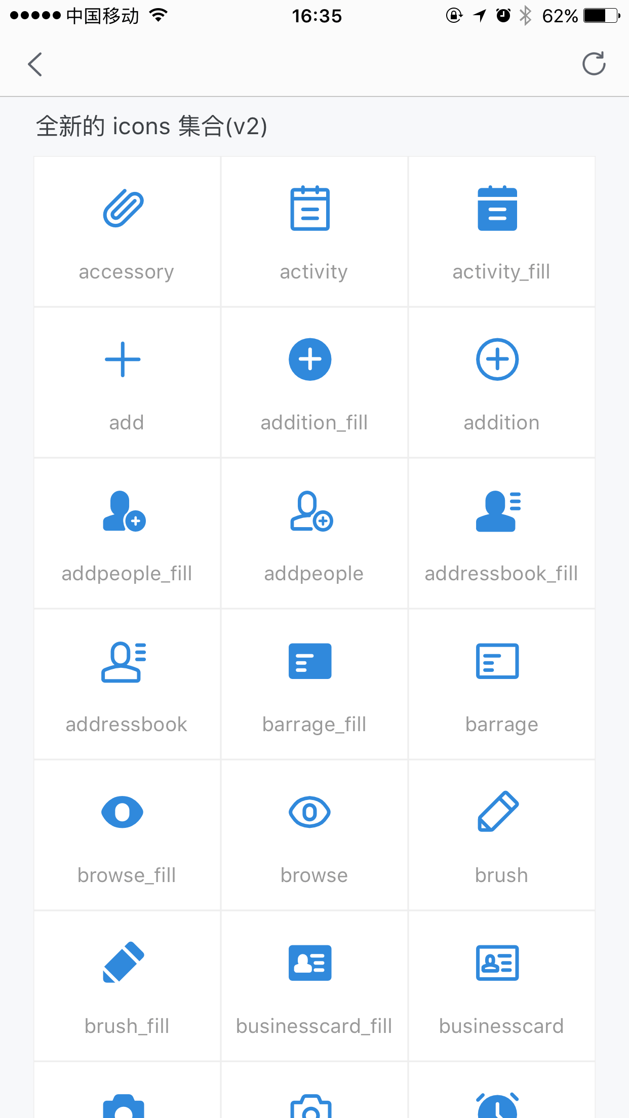
考虑到使用便捷性,还额外加入了 Iconfont 图标的支持,内置的 icon 库是:iconfont.cn 上的千牛官方库,所有支持的 icon 以及对应的 name 值,可以扫码看 demo 。
API
| 参数 | 说明 | 类型 | 默认值 |
|---|
| type | 新增 type 字段,标识是 iconfont 还是图片,可选 image iconfont | string | 'image' |
| size | type= image 时有效,定义了 icon 的尺寸:'xs', 'small', 'medium', 'large' | string | 'medium' |
| onPress | 当传入name时失效,Press事件 | Function | 无 |
| src | 图片链接地址或 iconfont url | string | 无 |
| name | iconfont name 值 | string | 无 |
| version | 如果使用新版千牛官方图标,则需传入v2 | string | default |
demo 参考

扫码预览(手淘、千牛、天猫等)

使用方法
// 切换到你的 rax 项目中
tnpm i nuke-icon --save
// 参考如下 demo 您可能还需要安装
// tnpm i nuke-view nuke-text nuke-layout nuke-page --save
import {createElement, Component,render } from 'rax';
import View from 'nuke-view';
import Text from 'nuke-text';
import Icon from 'nuke-icon';
import { MultiRow } from 'nuke-layout';
import Page from 'nuke-page';
const ICONS = {
v2:["accessory","activity","activity_fill","add","addition_fill","addition","addpeople_fill","addpeople","addressbook_fill","addressbook","barrage_fill","barrage","browse_fill","browse","brush","brush_fill","businesscard_fill","businesscard","camera_fill","camera","clock_fill","clock","close","collection_fill","collection","computer_fill","computer","coordinates_fill","coordinates","coupons_fill","coupons","createtask_fill","createtask","customerservice_fill","customerservice","delete_fill","delete","document","document_fill","dynamic_fill","dynamic","editor","eit","emoji_fill","emoji","empty","empty_fill","enter","enterinto","enterinto_fill","feedback_fill","feedback","flag_fill","flag","flashlight","flashlight_fill","flip","flip_fill","fullscreen","group","group_fill","headlines_fill","headlines","homepage_fill","homepage","integral_fill","integral","interactive_fill","interactive","keyboard","label","label_fill","like_fill","like","live_fill","live","lock_fill","lock","mail","mail_fill","manage_fill","manage","message","message_fill","mine","mine_fill","mobilephone_fill","mobilephone","more","narrow","offline_fill","offline","order_fill","order","other","people_fill","people","picture_fill","picture","play","play_fill","playon_fill","playon","praise_fill","praise","prompt_fill","prompt","qrcode_fill","qrcode","redpacket_fill","redpacket","refresh","remind_fill","remind","return","right","scan","select_fill","select","send","service_fill","service","setup_fill","setup","share_fill","share","shielding_fill","shielding","smallscreen_fill","smallscreen","stealth_fill","stealth","success_fill","success","suspend","switch","systemprompt_fill","systemprompt","tailor","task","task_fill","tasklist_fill","tasklist","text","time_fill","time","translation_fill","translation","trash","trash_fill","undo","unlock_fill","unlock","video","video_fill","warning_fill","warning","workbench_fill","workbench","search","searchfill","qianniu","publishgoods_fill","shop_fill","transaction_fill","packup","unfold","wangwang","financial_fill","marketing_fill","shake","decoration_fill","decoration_fill","decoration_fill"]
}
let App = class NukeDemoIndex extends Component {
constructor() {
super();
}
renderGridCellV2 = (item,index) => {
return <View style={styles.iconCell}>
<Icon version="v2" style={[styles.icon,styles.new]} name={item} />
<Text style={styles.iconShowCode}>{item}</Text>
</View>
}
render() {
return (
<Page title="Icon">
<Page.Intro main="全新的 icons 集合(v2)"></Page.Intro>
<View style={styles.lineWithMargin}><MultiRow dataSource={ICONS['v2']} rows={3} renderRow={this.renderGridCellV2} /></View>
</Page>
);
}
}
const styles={
icon:{
fontSize:40,
marginBottom:20,
marginRight:'10rem'
},
iconCell:{
justifyContent:'center',
height:'180rem',
alignItems:'center',
borderWidth:'1rem',
borderColor:'#eeeeee',
borderStyle:'solid',
},
new:{
fontSize:68,
color:'#3089dc'
},
listLine:{
marginLeft:'40rem',
marginRight:'40rem',
padding:'20rem',
flexDirection:'row',
backgroundColor:'#ffffff'
},
lineWithMargin:{
marginLeft:'40rem',
marginRight:'40rem',
backgroundColor:'#ffffff'
},
iconShowCode:{
fontSize: 24,
color:'#999999',
}
}
render(<App/>);
其他


