Parvus
Overlays sucks, don't use them. But if you must use one, use Parvus. Parvus tries to be an accessible, open-source image lightbox with no dependencies.
Open in CodePen
Table of contents
Installation
Download
- CSS:
dist/css/parvus.min.css minified, ordist/css/parvus.css un-minified
- JavaScript:
dist/js/parvus.min.js minified, ordist/js/parvus.js un-minified
Link the .css and .js files to your HTML file. The HTML code may look like this:
<!DOCTYPE html>
<html lang="en">
<head>
<meta charset="UTF-8">
<meta name="viewport" content="width=device-width, initial-scale=1">
<title>Page title</title>
<link href="path/to/parvus.min.css" rel="stylesheet">
</head>
<body>
<script src="path/to/parvus.min.js"></script>
</body>
</html>
Package managers
You can install Parvus through npm or yarn like any other dependency:
npm install parvus
or
yarn add parvus
Then you can import Parvus in your JavaScript codebase:
import Parvus from 'parvus'
Remember to include the corresponding SCSS or CSS file.
Usage
The standard way of using Parvus is a linked thumbnail image with the class lightbox to a larger image.
<a href="path/to/image.jpg" class="lightbox">
  <img src="path/to/thumbnail.jpg" alt="">
</a>
Initialize the script by running:
const prvs = new Parvus()
Captions
Add a data-caption attribute if you want to show a caption under the image.
<a href="path/to/image.jpg" class="lightbox" data-caption="I'm a caption">
  <img src="path/to/thumbnail.jpg" alt="">
</a>
Instead of data-caption, you can also set the option captionsSelector to set the captions from the innerHTML of an element.
<a href="path/to/image.jpg" class="lightbox">
  <figure class="figure">
    <img src="path/to/thumbnail.jpg" alt="">

    <figcaption class="figure__caption">
      <p>I'm a caption</p>
    </figcaption>
  </figure>
</a>
const prvs = new Parvus({
  captionsSelector: '.figure__caption',
})
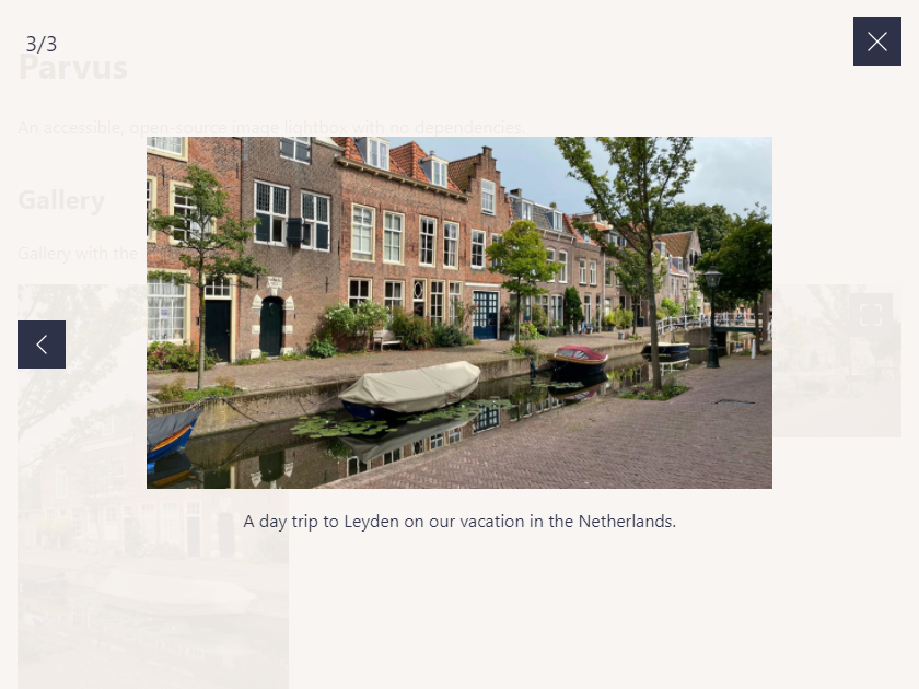
Gallery
If you have a group of related images that you would like to combine into a set, add a data-group attribute:
<a href="path/to/image.jpg" class="lightbox" data-group="Berlin">
  <img src="path/to/thumbnail.jpg" alt="">
</a>

<a href="path/to/image_2.jpg" class="lightbox" data-group="Berlin">
  <img src="path/to/thumbnail_2.jpg" alt="">
</a>

//...

<a href="path/to/image_8.jpg" class="lightbox" data-group="Kassel">
  <img src="path/to/thumbnail_8.jpg" alt="">
</a>
Instead of data-group, you can also set the option gallerySelector to combine all images with a selector class within this selector into a group.
<div class="gallery">
  <a href="path/to/image.jpg" class="lightbox">
    <img src="path/to/thumbnail.jpg" alt="">
  </a>

  <a href="path/to/image_2.jpg" class="lightbox">
    <img src="path/to/thumbnail_2.jpg" alt="">
  </a>

  // ...
</div>
const prvs = new Parvus({
  gallerySelector: '.gallery',
})
scrset
<a href="path/to/image.jpg" class="lightbox" data-srcset="path/to/large.jpg 1200w, path/to/medium.jpg 1000w, path/to/small.jpg 700w">
  <img src="path/to/thumbnail.jpg" alt="">
</a>
Localization
import de from 'parvus/src/l10n/de.js'

const prvs = new Parvus({
  l10n: de
})
Options
You can pass an object with custom options as an argument.
const prvs = new Parvus({
docClose: false
})
The following options are available:
{
selector: '.lightbox',
gallerySelector: null,
captions: true,
captionsSelector: 'self',
captionsAttribute: 'data-caption',
docClose: true,
scrollClose: false,
swipeClose: true,
threshold: 100,
backFocus: true,
transitionDuration: 300,
transitionTimingFunction: 'cubic-bezier(0.2, 0, 0.2, 1)',
lightboxIndicatorIcon: '<svg xmlns="http://www.w3.org/2000/svg" viewBox="0 0 24 24" aria-hidden="true" focusable="false"><path d="M8 3H5a2 2 0 00-2 2v3m18 0V5a2 2 0 00-2-2h-3m0 18h3a2 2 0 002-2v-3M3 16v3a2 2 0 002 2h3"/></svg>',
previousButtonIcon: '<svg xmlns="http://www.w3.org/2000/svg" viewBox="0 0 24 24" aria-hidden="true" focusable="false"><path stroke="none" d="M0 0h24v24H0z"/><polyline points="15 6 9 12 15 18" /></svg>',
nextButtonIcon: '<svg xmlns="http://www.w3.org/2000/svg" viewBox="0 0 24 24" aria-hidden="true" focusable="false"><path stroke="none" d="M0 0h24v24H0z"/><polyline points="9 6 15 12 9 18" /></svg>',
closeButtonIcon: '<svg xmlns="http://www.w3.org/2000/svg" viewBox="0 0 24 24" aria-hidden="true" focusable="false"><path d="M18 6L6 18M6 6l12 12"/></svg>',
l10n: en,
fileTypes: /\.(png|jpe?g|webp|avif|svg)(\?.*)?$/i
}
API
| Function | Description |
|---|
open(element) | Open element (DOM element) |
close() | Close Parvus |
previous() | Show previous image |
next() | Show next image |
select(index) | Select a slide with index (Integer), zero-based index of the slide to select |
add(element) | Add element (DOM element) |
remove(element) | Remove element (DOM element) |
destroy() | Destroy Parvus |
isOpen() | Check if Parvus is open |
currentIndex() | Return the current slide index |
Events
Bind events with the .on() and .off() methods.
const prvs = new Parvus()
const listener = function listener () {
console.log('eventName happened')
}
prvs.on(eventName, listener)
prvs.off(eventName, listener)
| eventName | Description |
|---|
open | Triggered after Parvus has been opened |
select | Triggered when a slide is selected |
close | Triggered after Parvus has been closed |
destroy | Triggered after Parvus has been destroyed |
Except for the destroy event, you can get the current source element:
prvs.on('open', function (event) {
  console.log(event.detail.source);
})
Browser support
Parvus supports the following browser (all the latest versions):


