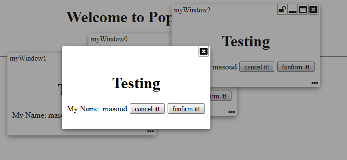
Have you ever wanted to have a lite weight modal popup, dialogue box, or free moving window? Well... I needed one. And here it is... a lite weight popup fully configurable with modal, dialog, and free workspace like window... all in one package!
This library provides Angular 4 components that enables you to have such things without relying on heavy "@angular/material" and just by adding PopupLiteModule into your AppModule.
NOTE: Starting with version 1.2.0 this library is compatible with Angular 6+.
Live Demo | Source code | Comments/Requests
Version 1.2.0
Updated libraries to become compatible with Angular 6+.
Version 1.1.2
Added option to add icon on left side of title if you plan to see an icon on the pop window.
Version 1.1.1
Added ability for the embeded component to reset the popup title. If your component implements popupTitle() method, you will have opprtunity to reset the title based on a particular state. Let's say, you have a login panel and want to flow through forgot password and registration fields. Then, it will make sense to change panel title when you are in a different flow.
Version 1.0.1
removed css attribute which was adding page height to the browser view port.
Version 1.0.0
Compiled with AOT option and resolved issues.
Version 0.0.1
MODULE:
PopupLiteModule
EXPORTS:
PopupLiteModule,
PopupLiteOptions,
PopupLiteContentComponent,
WindowLiteService,
PopupLiteComponent,
PopupLiteService
DEPENDENCIES:
"drag-enabled": "^0.2.4",
"font-awesome": "^4.7.0",
The following are available functionalities presented in this version:
Interfaces to use
export interface PopupLiteOptions {
	id?:string,
	overlay?: boolean,
	close?: boolean,
	closeOnOverlay?:boolean,
	minimize?: boolean,
	maximize?: boolean,
	resizable?: boolean,
	dragable?:boolean,
	centered?:boolean,
	fixed?:boolean,
	pinable?:boolean,
	header?: boolean,
  footer?: boolean,
  headerIcon?: string,
	idOnHeader?:boolean,

	maxHeight?:string,
	minWidth?:string,
	maxWidth?:string,
}
export interface PopupLiteContentComponent {
	data: any;
	id: string;
}

export interface WindowLiteService {
	openWindow(component: any, id: string, data?: any, options?: PopupLiteOptions): Observable<any>;
	openModal(component: any, id: string, data?: any, options?: PopupLiteOptions): Observable<any>;
	openDialog(component: any, id: string, data?: any, options?: PopupLiteOptions): Observable<any>;
}
Sample code
modalBox() {
    this.popService.openModal(TestModalComponent, "myModal"+this.counter++, {name: "masoud", status:"login"}, {iconHeader: 'fa fa-lock', idOnHeader: true}).subscribe(
      (success)=>{
        this.events.push(success);
      },
      (fail) => {
        this.events.push(fail);
      });
}

freeBox() {
    this.popService.openWindow(TestModalComponent, "myWindow"+this.counter++, {name: "masoud", status:"free"}).subscribe(
      (success)=>{
        this.events.push(success);
      },
      (fail) => {
        this.events.push(fail);
      });
}

dialogBox() {
    this.popService.openDialog(TestModalComponent, "myID"+this.counter++, {name: "masoud", status:"dialog"}).subscribe(
        (success)=>{
          this.events.push(success);
        },
        (fail) => {
          this.events.push(fail);
        });
    }
}
.............

import { Component } from '@angular/core';

import { PopupLiteService } from './popup-lite/injectables/popup-lite.service';
import { PopupLiteContentComponent } from './popup-lite/interfaces/popup-lite.interface';

@Component({
  selector: 'test',
  templateUrl: './test.component.html',
  styleUrls: ['./test.component.scss']
})
export class TestModalComponent implements PopupLiteContentComponent {

  data: any;
  id: string;
  pageTitle = "Component";

  constructor(private popService: PopupLiteService) {
  }

  popupTitle(id) {
    return this.data === 'login' ? 'Login ' : (this.data === 'free ' ? 'Free Goodies ' : 'Dialog ') + id;
  }
  cancel() {
    this.popService.cancel(this.id, {action: "cancel", data: this.data});
  }
  confirm() {
    this.popService.confirm(this.id, {action: "confirm", data: this.data});
  }
}
.............
<div style="text-align:center">
  <h1>Testing</h1>

  My Name:
  <span [innerHTML]="data.name"></span>
  <button (click)="cancel()">cancel it!</button>
  <button (click)="confirm()">fonfirm it!</button>
</div>


