Research
Security News
Malicious npm Packages Inject SSH Backdoors via Typosquatted Libraries
Socket’s threat research team has detected six malicious npm packages typosquatting popular libraries to insert SSH backdoors.
popup-lite
Advanced tools
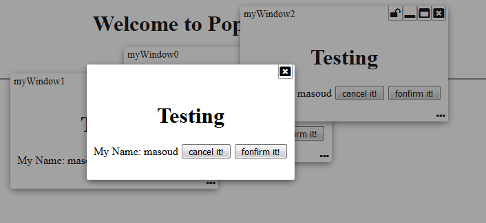
Have you ever wanted to have a lite weight modal popup, dialogue box, or free moving window? Well... I needed one. And here it is... a lite weight pop-up fully configurable with modal, dialog, and free workspace like window... all in one package!
Have you ever wanted to have a lite weight modal popup, dialogue box, or free moving window? Well... I needed one. And here it is... a lite weight pop-up fully configurable with modal, dialog, and free workspace like window... all in one package!
This library provides Angular 4 components that enables you to have such things without relying on heavy "@angular/material" and just by adding PopupLiteModule into your AppModule.
NOTE: If your project still is angular 2, 4, or 5; please luck-down your version reference to flexible table to 1.2.1 version by removing ^ from the version dependency in your package json. Otherwise for Angular 6+, please use 1.2.2 version or higher.
Live Demo | Source code | Comments/Requests
It was brought to my attention that some users have trouble using my components in their angular 6 environment. Since I had only updated few dependencies when moved to Angular 6, I am thinking dependencies are causing issues. So, for this release, I am updating all dependencies to what Angular 6 applications are expecting to have. Please let me know if this is fixing or not fixing any issues you are facing.
rolling to angular 6+ after fixing the dependency issue.
Temporary roll-back to angular 5. I forgot to luck-down the dependencies for angular 5 before upgrading to angular 6. this will cause problem if you are still using angular 5.
Updated libraries to become compatible with Angular 6+.
Added option to add icon on left side of title if you plan to see an icon on the pop window.
Added ability for the embedded component to reset the pop-up title. If your component implements popupTitle() method, you will have opportunity to reset the title based on a particular state. Let's say, you have a login panel and want to flow through forgot password and registration fields. Then, it will make sense to change panel title when you are in a different flow.
removed css attribute which was adding page height to the browser view port.
Compiled with AOT option and resolved issues.
MODULE:
PopupLiteModule
EXPORTS:
PopupLiteModule,
PopupLiteOptions,
PopupLiteContentComponent,
WindowLiteService,
PopupLiteComponent,
PopupLiteService
DEPENDENCIES:
"drag-enabled": "^0.2.4",
"font-awesome": "^4.7.0",
The following are available functionalities presented in this version:
Interfaces to use
export interface PopupLiteOptions {
	id?:string,
	overlay?: boolean,
	close?: boolean,
	closeOnOverlay?:boolean,
	minimize?: boolean,
	maximize?: boolean,
	resizable?: boolean,
	dragable?:boolean,
	centered?:boolean,
	fixed?:boolean,
	pinable?:boolean,
	header?: boolean,
  footer?: boolean,
  headerIcon?: string,
	idOnHeader?:boolean,

	maxHeight?:string,
	minWidth?:string,
	maxWidth?:string,
}
export interface PopupLiteContentComponent {
	data: any;
	id: string;
}

export interface WindowLiteService {
	openWindow(component: any, id: string, data?: any, options?: PopupLiteOptions): Observable<any>;
	openModal(component: any, id: string, data?: any, options?: PopupLiteOptions): Observable<any>;
	openDialog(component: any, id: string, data?: any, options?: PopupLiteOptions): Observable<any>;
}
Sample code
modalBox() {
    this.popService.openModal(TestModalComponent, "myModal"+this.counter++, {name: "masoud", status:"login"}, {iconHeader: 'fa fa-lock', idOnHeader: true}).subscribe(
      (success)=>{
        this.events.push(success);
      },
      (fail) => {
        this.events.push(fail);
      });
}

freeBox() {
    this.popService.openWindow(TestModalComponent, "myWindow"+this.counter++, {name: "masoud", status:"free"}).subscribe(
      (success)=>{
        this.events.push(success);
      },
      (fail) => {
        this.events.push(fail);
      });
}

dialogBox() {
    this.popService.openDialog(TestModalComponent, "myID"+this.counter++, {name: "masoud", status:"dialog"}).subscribe(
        (success)=>{
          this.events.push(success);
        },
        (fail) => {
          this.events.push(fail);
        });
    }
}
.............

import { Component } from '@angular/core';

import { PopupLiteService } from './popup-lite/injectables/popup-lite.service';
import { PopupLiteContentComponent } from './popup-lite/interfaces/popup-lite.interface';

@Component({
  selector: 'test',
  templateUrl: './test.component.html',
  styleUrls: ['./test.component.scss']
})
export class TestModalComponent implements PopupLiteContentComponent {

  data: any;
  id: string;
  pageTitle = "Component";

  constructor(private popService: PopupLiteService) {
  }

  popupTitle(id) {
    return this.data === 'login' ? 'Login ' : (this.data === 'free ' ? 'Free Goodies ' : 'Dialogue ') + id;
  }
  cancel() {
    this.popService.cancel(this.id, {action: "cancel", data: this.data});
  }
  confirm() {
    this.popService.confirm(this.id, {action: "confirm", data: this.data});
  }
}
.............
<div style="text-align:center">
  <h1>Testing</h1>

  My Name:
  <span [innerHTML]="data.name"></span>
  <button (click)="cancel()">cancel it!</button>
  <button (click)="confirm()">confirm it!</button>
</div>

FAQs
Have you ever wanted to have a lite weight modal popup, dialogue box, or free moving window? Well... I needed one. And here it is... a lite weight pop-up fully configurable with modal, dialog, and free workspace like window... all in one package!
The npm package popup-lite receives a total of 2 weekly downloads. As such, popup-lite popularity was classified as not popular.
We found that popup-lite demonstrated a not healthy version release cadence and project activity because the last version was released a year ago. It has 1 open source maintainer collaborating on the project.
Did you know?

Socket for GitHub automatically highlights issues in each pull request and monitors the health of all your open source dependencies. Discover the contents of your packages and block harmful activity before you install or update your dependencies.

Research
Security News
Socket’s threat research team has detected six malicious npm packages typosquatting popular libraries to insert SSH backdoors.

Security News
MITRE's 2024 CWE Top 25 highlights critical software vulnerabilities like XSS, SQL Injection, and CSRF, reflecting shifts due to a refined ranking methodology.

Security News
In this segment of the Risky Business podcast, Feross Aboukhadijeh and Patrick Gray discuss the challenges of tracking malware discovered in open source softare.