What is postcss-clamp?
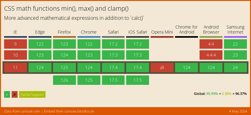
The postcss-clamp package is a PostCSS plugin that allows you to use the CSS 'clamp()' function for responsive typography and layout. It enables you to define a minimum value, preferred value, and a maximum value for font sizes, widths, margins, and other properties, which will be interpolated based on the viewport size.
What are postcss-clamp's main functionalities?
Responsive Typography
This feature allows you to set a scalable font size for headings that adjusts between a minimum of 2rem and a maximum of 3rem based on the viewport width, using 5vw as the preferred size.
h1 { font-size: clamp(2rem, 5vw, 3rem); }
Fluid Spacing
With this feature, you can create fluid spacing that adjusts between a minimum of 1rem and a maximum of 2rem, with 2.5vw as the preferred value based on the viewport width.
p { margin: clamp(1rem, 2.5vw, 2rem); }
Adaptive Widths
This feature enables you to set a container width that adapts between a minimum of 300px and a maximum of 800px, with 50% of the viewport width as the preferred value.
.container { width: clamp(300px, 50%, 800px); }
Other packages similar to postcss-clamp
postcss-responsive-type
This package is similar to postcss-clamp as it also allows for responsive typography. However, it focuses specifically on font sizes and uses a different approach, where it automatically calculates and injects media queries for font sizes instead of using the CSS clamp() function.
postcss-pxtorem
postcss-pxtorem is a plugin that converts pixel units to rem units for responsive design, but it does not offer the same fluid scaling capabilities as postcss-clamp. It's more focused on maintaining consistent scaling across devices based on the root font size.
postcss-fluid
postcss-fluid provides a way to interpolate between two values based on the viewport width, similar to postcss-clamp. However, it uses custom properties and linear interpolation rather than the native CSS clamp() function.
PostCSS Clamp


PostCSS plugin to transform clamp() to combination of min/max.
This plugin transform this css:
.foo {
  width: clamp(10px, 4em, 80px);
}
into this:
.foo {
  width: max(10px, min(4em, 80px));
}
Or with enabled options precalculate:
.foo {
width: clamp(10em, 4px, 10px);
}
.foo {
width: max(10em, 14px);
}

Instalation
$ npm install postcss postcss-clamp --save-dev
or
$ yarn add --dev postcss postcss-clamp
Usage
Use PostCSS Clamp as a PostCSS plugin:
const postcss = require('postcss');
const postcssClamp = require('postcss-clamp');
postcss([
postcssClamp()
]).process(YOUR_CSS );
PostCSS Clamp runs in all Node environments, with special instructions for:
See PostCSS docs for examples for your environment.
Options
precalculate
The precalculate option determines whether values with the same unit
should be precalculated. By default, these are not precalculation.
postcssColorHexAlpha({
  precalculate: true
});
The second and third value has the same unit (px):
.foo {
width: clamp(10em, 4px, 10px);
}
.foo {
width: max(10em, 14px);
}
Here all values have the same unit:
.foo {
width: clamp(10px, 4px, 10px);
}
.foo {
width: 24px;
}
LICENSE
See LICENSE


