Postel 🌑


Postel is a single component that you can easily extend into customized tooltips, dropdowns, flyovers –
any type of UI which would make sense to render outside of your regular React root node, floating
above all other content.
Postel is built on the idea of opening a generic set of props that allow wide customizability. With
that, we attempt to keep the API as simple as possible.
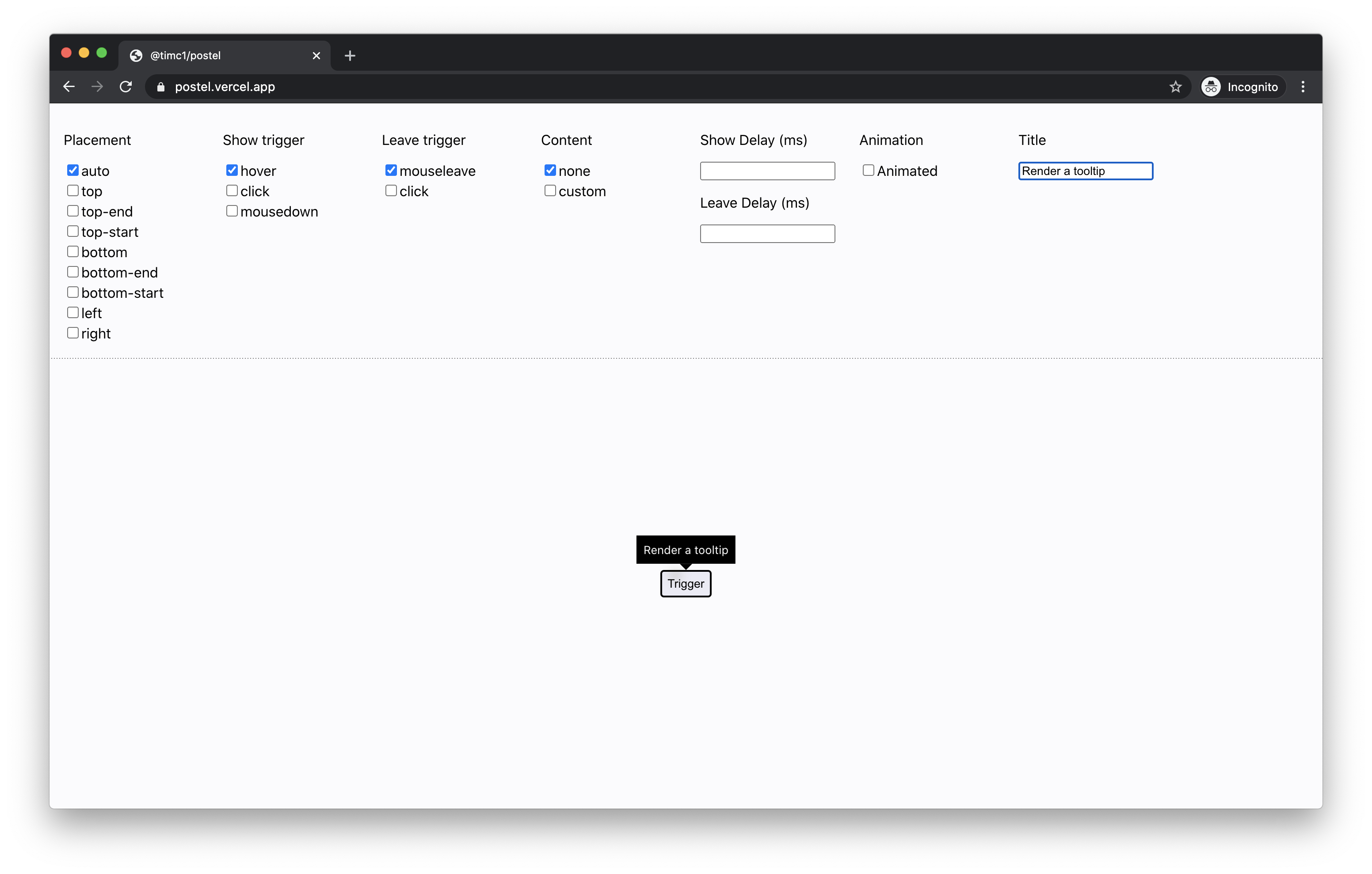
Tooltip
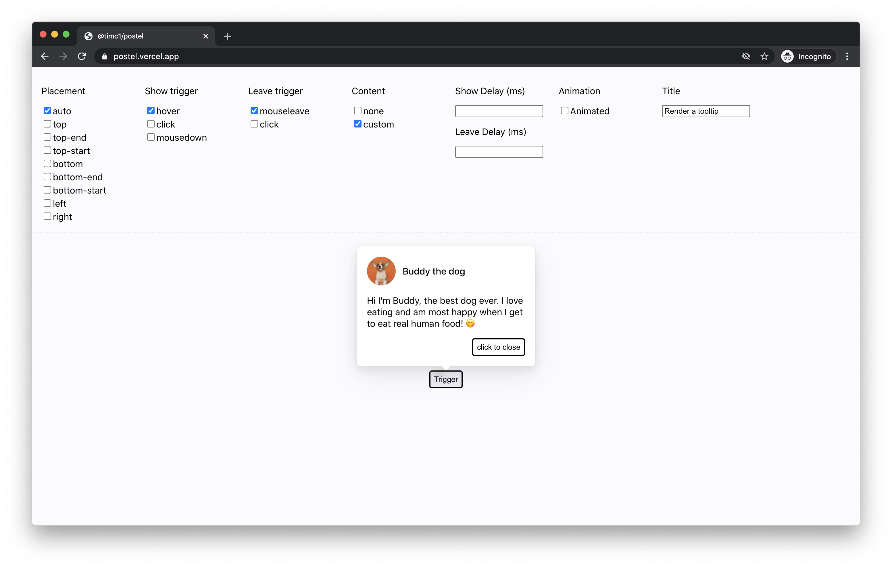
Custom content
Usage
The simplest usage of Postel is building something like a tooltip – just wrap it around the component that you want to trigger:
<Postel
title="Toggle menu"
content={
<div className="tooltip">
Tooltip content
</div>
}
caret={
<div className="caret" />
}
}}>
<button className="button">Trigger</button>
</Postel>
Props
children: React.ReactNode
A valid React child that Postel will attach listeners to.
title: string
A string to describe the purpose of what will be shown or hidden.
placement?: "auto" | "top" | "top-start" | "top-end" | "left" | "right" | "bottom" | "bottom-start" | "bottom-end"
The position that you want Postel to render your content relative to the children.
preferredAutoPlacement?: "top" | "top-start" | "top-end" | "left" | "right" | "bottom" | "bottom-start" | "bottom-end"
If your placement is set to auto, this is the preferred position that you would like auto to
default to.
trigger?: "hover" | "click" | "mousedown"
The type of action you want to apply to the children that will show your content.
triggerDelay?: number
The time in milliseconds that you want to delay showing the content after triggering to show.
hideTrigger?: "click" | "mouseleave"
The type of action you want to signal that the content should hide.
hideDelay?: number
The time in milliseconds that you want to delay hiding the content after triggering to hide.
transitionOutMs?: number
Important for adding leave animations – the amount of time in milliseconds you want your content to animate out before unmounting.
showTransparentUnderlay?: boolean
Add this if you want a hidden transparent underlay that will cover the entire screen to prevent clicks on UI outside of your content.
verticalOffset?: number
Add this if you want to vertically offset the content by n pxs.
horizontalOffset?: number
Add this if you want to horizontally offset the content by n pxs.
Contributing
Contributions are welcome! For requests or bugs, please create an issue here.
Installation
Postel uses yarn to manage dependencies. To install, simply run:
git clone git@github.com:timc1/postel.git
cd postel
yarn install
yarn start
Navigate to localhost:8080 and you should see a hot reloading interface to run the code against.


