

Security News
Oracle Drags Its Feet in the JavaScript Trademark Dispute
Oracle seeks to dismiss fraud claims in the JavaScript trademark dispute, delaying the case and avoiding questions about its right to the name.
By Sarah Gooding - Feb 07, 2025
primereact
Advanced tools
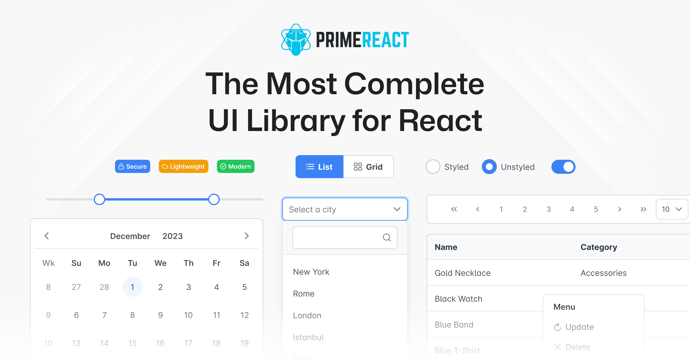
PrimeReact is an open source UI library for React featuring a rich set of 90+ components, a theme designer, various theme alternatives such as Material, Bootstrap, Tailwind, premium templates and professional support. In addition, it integrates with Prime
PrimeReact is a comprehensive collection of rich UI components for React. It provides a wide range of components that are designed to be highly customizable and easy to use, making it suitable for building modern, responsive web applications.
DataTable
The DataTable component is used to display data in a tabular format. It supports features like sorting, filtering, and pagination.
import React from 'react';
import { DataTable } from 'primereact/datatable';
import { Column } from 'primereact/column';
const MyDataTable = () => {
const data = [
{ id: 1, name: 'John', age: 30 },
{ id: 2, name: 'Jane', age: 25 }
];
return (
<DataTable value={data}>
<Column field="id" header="ID" />
<Column field="name" header="Name" />
<Column field="age" header="Age" />
</DataTable>
);
};
export default MyDataTable;Dialog
The Dialog component is used to display content in a modal window. It can be customized with headers, footers, and various other options.
import React, { useState } from 'react';
import { Dialog } from 'primereact/dialog';
import { Button } from 'primereact/button';

const MyDialog = () => {
  const [visible, setVisible] = useState(false);

  return (
    <div>
      <Button label="Show" icon="pi pi-external-link" onClick={() => setVisible(true)} />
      <Dialog header="Header" visible={visible} style={{ width: '50vw' }} onHide={() => setVisible(false)}>
        <p>Content</p>
      </Dialog>
    </div>
  );
};

export default MyDialog;
Chart
The Chart component is used to create various types of charts, such as bar, line, and pie charts. It is built on top of the popular Chart.js library.
import React from 'react';
import { Chart } from 'primereact/chart';

const MyChart = () => {
  const data = {
    labels: ['January', 'February', 'March', 'April', 'May'],
    datasets: [
      {
        label: 'My First dataset',
        backgroundColor: '#42A5F5',
        borderColor: '#1E88E5',
        data: [65, 59, 80, 81, 56]
      }
    ]
  };

  return <Chart type="bar" data={data} />;
};

export default MyChart;Material-UI is a popular React UI framework that implements Google's Material Design. It offers a wide range of components and customization options. Compared to PrimeReact, Material-UI has a more modern design aesthetic and is widely adopted in the React community.
Ant Design is a comprehensive UI framework for React that provides a large set of high-quality components. It is known for its robust design system and extensive documentation. Ant Design is similar to PrimeReact in terms of the breadth of components offered but has a different design philosophy.
Semantic UI React is the official React integration for Semantic UI. It provides a set of components that are easy to use and customize. While it offers fewer components compared to PrimeReact, it focuses on simplicity and ease of use.


PrimeReact is a rich set of open source UI Components for React. See PrimeReact homepage for live showcase and documentation.
PrimeReact is available at npm.
# Using npm
npm install primereact

# Using yarn
yarn add primereact

# Using pnpm
pnpm add primereact
Each component can be imported individually so that you only bundle what you use. Import path is available in the documentation of the corresponding component.
//import { ComponentName } from 'primereact/{componentname}';
import { Button } from 'primereact/button';

export default function MyComponent() {
  return (
    <Button label="PrimeReact" />
  )
}
PrimeReact has two theming modes; styled or unstyled.
Styled Mode
Styled mode is based on pre-skinned components with opinionated themes like Material, Bootstrap or PrimeOne themes. Theme is the required css file to be imported, visit the Themes section for the complete list of available themes to choose from.
// theme
import 'primereact/resources/themes/lara-light-cyan/theme.css';
Unstyled Mode
Unstyled mode is disabled by default for all components. Using the PrimeReact context, set unstyled as true to enable it globally. Visit the Unstyled mode documentation for more information and examples.
10.9.2 (2025-01-24)
Fixed Bugs:
FAQs
PrimeReact is an open source UI library for React featuring a rich set of 90+ components, a theme designer, various theme alternatives such as Material, Bootstrap, Tailwind, premium templates and professional support. In addition, it integrates with Prime
The npm package primereact receives a total of 104,762 weekly downloads. As such, primereact popularity was classified as popular.
We found that primereact demonstrated a healthy version release cadence and project activity because the last version was released less than a year ago. It has 0 open source maintainers collaborating on the project.
Did you know?

Socket for GitHub automatically highlights issues in each pull request and monitors the health of all your open source dependencies. Discover the contents of your packages and block harmful activity before you install or update your dependencies.
Security News
Oracle seeks to dismiss fraud claims in the JavaScript trademark dispute, delaying the case and avoiding questions about its right to the name.

Security News
The Linux Foundation is warning open source developers that compliance with global sanctions is mandatory, highlighting legal risks and restrictions on contributions.

Security News
Maven Central now validates Sigstore signatures, making it easier for developers to verify the provenance of Java packages.