Research
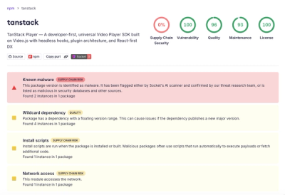
Malicious npm Package Brand-Squats TanStack to Exfiltrate Environment Variables
A brand-squatted TanStack npm package used postinstall scripts to steal .env files and exfiltrate developer secrets to an attacker-controlled endpoint.
import Input from 'rc-input';
import { render } from 'react-dom';
render(<Input placeholder="input" allowClear />, mountNode);
| Property | Type | Default | Description |
|---|---|---|---|
| prefixCls | string | rc-input | |
| className | string | '' | additional class name of input |
| style | React.CSSProperties | style properties of input | |
| affixWrapperClassName | string | - | className with 'rc-input-affix-wrapper' |
| groupClassName | string | - | className with 'rc-input-group-wrapper' |
| wrapperClassName | string | - | className with 'rc-input-wrapper' |
| addonAfter | ReactNode | - | The label text displayed after (on the right side of) the input field |
| addonBefore | ReactNode | - | The label text displayed before (on the left side of) the input field |
| allowClear | boolean | { clearIcon: ReactNode } | false | If allow to remove input content with clear icon |
| bordered | boolean | true | Whether has border style |
| defaultValue | string | - | The initial input content |
| disabled | boolean | false | Whether the input is disabled |
| id | string | - | The ID for input |
| maxLength | number | - | The max length |
| showCount | boolean | { formatter: ({ value: string, count: number, maxLength?: number }) => ReactNode } | false | Whether show text count |
| prefix | ReactNode | - | The prefix icon for the Input |
| suffix | ReactNode | - | The suffix icon for the Input |
| type | string | text | The type of input, see: MDN( use Input.TextArea instead of type="textarea") |
| value | string | - | The input content value |
| onChange | function(e) | - | Callback when user input |
| onPressEnter | function(e) | - | The callback function that is triggered when Enter key is pressed |
const inputRef = useRef(null);

useEffect(() => {
  inputRef.current.focus();// the input will get focus
  inputRef.current.blur();// the input will lose focus
  console.log(inputRef.current.input);// The origin input element
}, []);
// ....
<Input ref={inputRef} />
| Property | Type | Description |
|---|---|---|
| focus | (options?: InputFocusOptions) => void | The input get focus when called |
| blur | () => void | The input loses focus when called |
| input | HTMLInputElement | null | The origin input element |
npm install
npm start
rc-input is released under the MIT license.
FAQs
React input component
The npm package rc-input receives a total of 1,902,302 weekly downloads. As such, rc-input popularity was classified as popular.
We found that rc-input demonstrated a not healthy version release cadence and project activity because the last version was released a year ago. It has 3 open source maintainers collaborating on the project.
Did you know?

Socket for GitHub automatically highlights issues in each pull request and monitors the health of all your open source dependencies. Discover the contents of your packages and block harmful activity before you install or update your dependencies.

Research
A brand-squatted TanStack npm package used postinstall scripts to steal .env files and exfiltrate developer secrets to an attacker-controlled endpoint.

Research
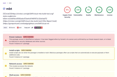
Compromised SAP CAP npm packages download and execute unverified binaries, creating urgent supply chain risk for affected developers and CI/CD environments.

Company News
Socket has acquired Secure Annex to expand extension security across browsers, IDEs, and AI tools.