
Security News
Cloudflare Adds Security.txt Setup Wizard
Cloudflare has launched a setup wizard allowing users to easily create and manage a security.txt file for vulnerability disclosure on their websites.
By Sarah Gooding - Sep 30, 2024
rc-progress
Advanced tools
The rc-progress npm package provides React components for displaying progress information. It supports both line and circle (or pie) progress bars, allowing for customizable colors, sizes, and other properties to visually represent progress in a React application.
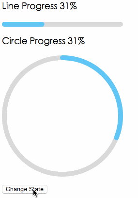
Line Progress
This feature allows you to create a linear progress bar. You can customize the percentage of completion, the stroke width, and the color of the progress bar.
import { Line } from 'rc-progress';
<Line percent="70" strokeWidth="4" strokeColor="#D3D3D3" />Circle Progress
This feature enables the creation of a circular progress bar. Similar to the line progress, you can customize the completion percentage, stroke width, and color.
import { Circle } from 'rc-progress';

<Circle percent="30" strokeWidth="4" strokeColor="#00FF00" />This package provides a circular progress bar component for React. It is similar to the Circle component of rc-progress but focuses solely on circular progress bars. It offers a different set of customization options and styles.
progressbar.js is a vanilla JavaScript library for creating both line and circle progress bars. It is not React-specific like rc-progress but can be integrated into React projects. It offers a wide range of customization options and animations.
nprogress is a lightweight JavaScript library for creating slim progress bars, typically used at the top of the page to indicate loading progress. Unlike rc-progress, it is not React-specific and does not offer circular progress bars, focusing instead on a minimalistic approach.
progress ui component for react


var Line = require('rc-progress').Line;
var Circle = require('rc-progress').Circle;
var React = require('react');
React.render(<div>
    <Line percent=“10” strokeWidth="4" strokeColor=“#D3D3D3” />
    <Circle percent=“10” strokeWidth="4" strokeColor=“#D3D3D3” />
  </div>, container);
| name | type | default | description |
|---|---|---|---|
| strokeWidth | Number | 1 | Width of the stroke. Unit is percentage of SVG canvas size. |
| strokeColor | String | #3FC7FA | Stroke color. |
| trailWidth | Number | 1 | Width of the trail stroke. Unit is percentage of SVG canvas size. Trail is always centered relative to actual progress path. If trailWidth are not defined, it same as strokeWidth. |
| trailColor | String | #D9D9D9 | Color for lighter trail stroke underneath the actual progress path. |
npm install
npm start
http://localhost:8000/examples/
online example: http://react-component.github.io/progress/build/examples/
http://localhost:8000/tests/runner.html?coverage
rc-progress is released under the MIT license.
FAQs
progress ui component for react
The npm package rc-progress receives a total of 1,161,097 weekly downloads. As such, rc-progress popularity was classified as popular.
We found that rc-progress demonstrated a healthy version release cadence and project activity because the last version was released less than a year ago. It has 7 open source maintainers collaborating on the project.
Did you know?

Socket for GitHub automatically highlights issues in each pull request and monitors the health of all your open source dependencies. Discover the contents of your packages and block harmful activity before you install or update your dependencies.
Security News
Cloudflare has launched a setup wizard allowing users to easily create and manage a security.txt file for vulnerability disclosure on their websites.

Security News
The Socket Research team breaks down a malicious npm package targeting the legitimate DOMPurify library. It uses obfuscated code to hide that it is exfiltrating browser and crypto wallet data.

Security News
ENISA’s 2024 report highlights the EU’s top cybersecurity threats, including rising DDoS attacks, ransomware, supply chain vulnerabilities, and weaponized AI.