Security News
Deno 2.2 Improves Dependency Management and Expands Node.js Compatibility
Deno 2.2 enhances Node.js compatibility, improves dependency management, adds OpenTelemetry support, and expands linting and task automation for developers.
react-arborist
Advanced tools
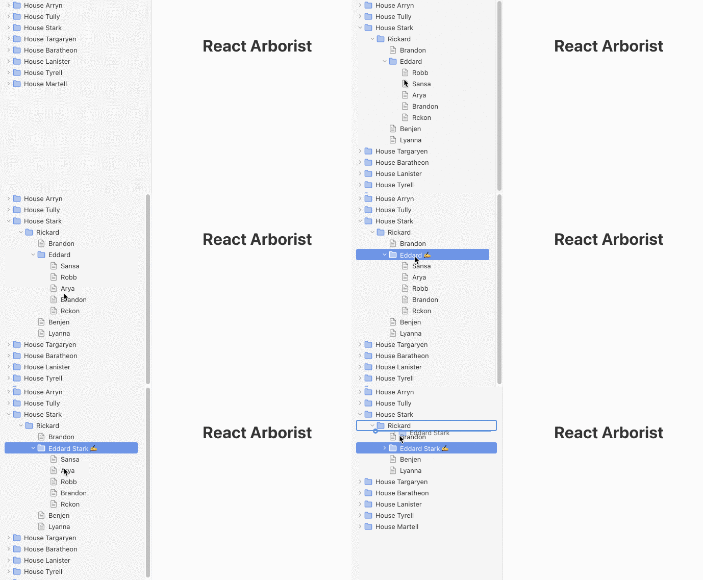
A full-featured tree component for React.
The tree is a ubiquitous UI component in software applications. There are already many libraries that provide this componet for React apps, but none were full-featured enough to stand on their own.
This libraries provides all the common features expected in a tree viewer. You can select one or many nodes to drag and drop into new positions, open and close folders, render an inline form for renaming, efficiently show thousands of items with virtualization, and provide your own node renderer to control the style.

yarn add react-arborist
npm install react-arborist
Render the tree data structure.
const data = {
  id: "The Root",
  children: [{id: "Node A"}, {id: "Node B"}]
}

function App() {
  return (
    <Tree
      data={data}
      width={300}
      height={500}
      indent={24}
    >
      {Node}
    </Tree>
  );
}

function Node({ node, props, indent, handlers }) {
  return (
    <div {...props}>
      <div style={{ paddingLeft: indent }}>{node.model.id}</div>
    </div>
  );
}
The data prop must be an object with an id property. Any child nodes must be put in the array property children.
Add a boolean property isOpen to any of the nodes to display it open or closed. If no property exists, it will default to false.
const data = {
  id: "The Root",
  isOpen: true,
  children: [...]
}
To toggle the isOpen field attach the handlers.toggleOpen callback to a event in your Node component, then add the onOpen/onClose handlers to the Tree component.
function MyApp() {
  const onOpen = (id) => {
    // Change the data however you want...
    setData(mutate(id, (n) => n.isOpen = true))
  }

  return <Tree
    onOpen={onOpen}
    onClose={onClose}
    ...
}

function Node({ props, handlers }) {
  return (
    <div {...props} onClick={handlers.toggleOpen}>
    // ...
    </div>
  );
}
FAQs
Unknown package
The npm package react-arborist receives a total of 31,287 weekly downloads. As such, react-arborist popularity was classified as popular.
We found that react-arborist demonstrated a healthy version release cadence and project activity because the last version was released less than a year ago. It has 0 open source maintainers collaborating on the project.
Did you know?

Socket for GitHub automatically highlights issues in each pull request and monitors the health of all your open source dependencies. Discover the contents of your packages and block harmful activity before you install or update your dependencies.

Security News
Deno 2.2 enhances Node.js compatibility, improves dependency management, adds OpenTelemetry support, and expands linting and task automation for developers.

Security News
React's CRA deprecation announcement sparked community criticism over framework recommendations, leading to quick updates acknowledging build tools like Vite as valid alternatives.

Security News
Ransomware payment rates hit an all-time low in 2024 as law enforcement crackdowns, stronger defenses, and shifting policies make attacks riskier and less profitable.