Research
Security News
Malicious npm Packages Inject SSH Backdoors via Typosquatted Libraries
Socket’s threat research team has detected six malicious npm packages typosquatting popular libraries to insert SSH backdoors.
react-avatar-edit
Advanced tools
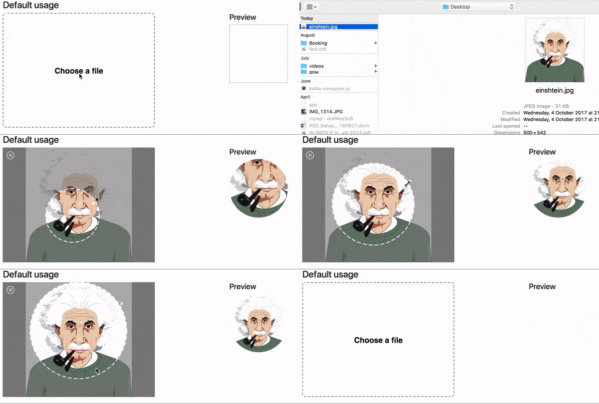
👤 Load, crop and preview avatar with ReactJS component

import React from 'react'
import ReactDOM from 'react-dom'
import Avatar from 'react-avatar-edit'
class App extends React.Component {
constructor(props) {
super(props)
const src = './example/einshtein.jpg'
this.state = {
preview: null,
src
}
this.onCrop = this.onCrop.bind(this)
this.onClose = this.onClose.bind(this)
}
onClose() {
this.setState({preview: null})
}
onCrop(preview) {
this.setState({preview})
}
render () {
return (
<div>
<Avatar
width={390}
height={295}
onCrop={this.onCrop}
onClose={this.onClose}
src={this.state.src}
/>
<img src={this.state.preview} alt="Preview" />
</div>
)
}
}
ReactDOM.render(<App /> , document.getElementById('root'))
| Prop | Type | Description |
|---|---|---|
| img | Image | The Image object to display |
| src | String/Base64 | The url ot base64 string to load (use urls from your domain to prevent security errors) |
| width | Number | The width of the editor |
| height | Number | The height of the editor (image will fit to this height) |
| cropRadius | Number | The crop area radius in px (default: 100) |
| cropColor | String | The crop border color (default: white) |
| lineWidth | Number | The crop border width (default: 4) |
| minCropRadius | Number | The min crop area radius in px (default: 30) |
| backgroundColor | Sting | The color of the image background (default: white) |
| closeIconColor | String | The close button color (default: white) |
| shadingColor | String | The shading color (default: grey) |
| shadingOpacity | Number | The shading area opacity (default: 0.6) |
| mimeTypes | String | The mime types used to filter loaded files (default: image/jpeg,image/png) |
| onImageLoad(image) | Function | Invoked when image based on src prop finish loading |
| onCrop(image) | Function | Invoked when user drag&drop event stop and return croped image in base64 sting |
| onFileLoad(file) | Function | Invoked when user upload file with internal file loader |
| onClose() | Function | Invoked when user clock on close editor button |
npm run startnpm run buildFAQs
ReactJS component to upload, crop, and preview avatars
The npm package react-avatar-edit receives a total of 7,107 weekly downloads. As such, react-avatar-edit popularity was classified as popular.
We found that react-avatar-edit demonstrated a not healthy version release cadence and project activity because the last version was released a year ago. It has 1 open source maintainer collaborating on the project.
Did you know?

Socket for GitHub automatically highlights issues in each pull request and monitors the health of all your open source dependencies. Discover the contents of your packages and block harmful activity before you install or update your dependencies.

Research
Security News
Socket’s threat research team has detected six malicious npm packages typosquatting popular libraries to insert SSH backdoors.

Security News
MITRE's 2024 CWE Top 25 highlights critical software vulnerabilities like XSS, SQL Injection, and CSRF, reflecting shifts due to a refined ranking methodology.

Security News
In this segment of the Risky Business podcast, Feross Aboukhadijeh and Patrick Gray discuss the challenges of tracking malware discovered in open source softare.