
Security News
Deno 2.6 + Socket: Supply Chain Defense In Your CLI
Deno 2.6 introduces deno audit with a new --socket flag that plugs directly into Socket to bring supply chain security checks into the Deno CLI.
By Sarah Gooding - Dec 12, 2025
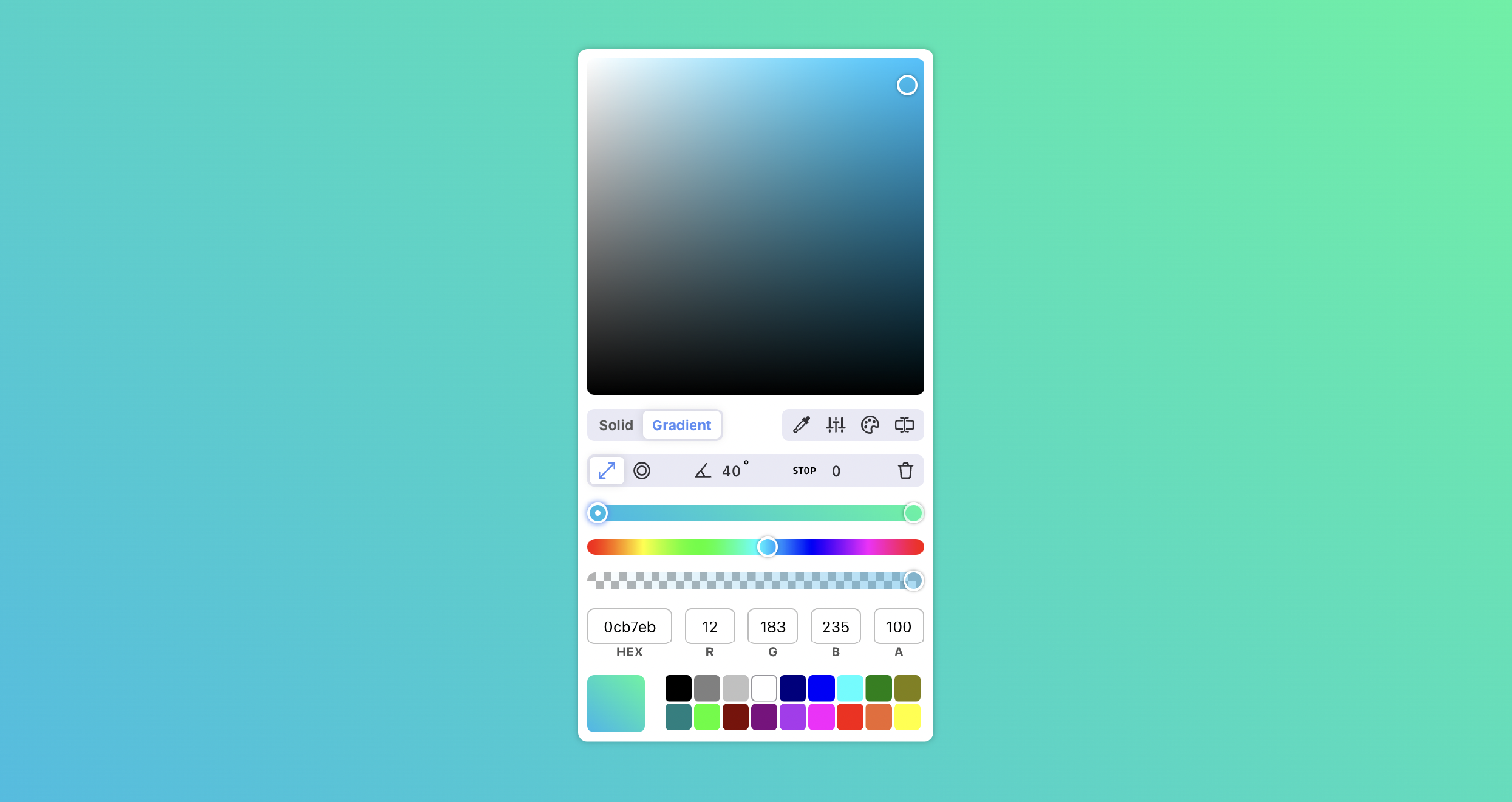
react-best-gradient-color-picker
Advanced tools


npm install react-best-gradient-color-picker
yarn add react-best-gradient-color-picker
See the picker in action here
Table of Contents
import React from 'react'
import ColorPicker from 'react-best-gradient-color-picker'

function MyApp() {
  const [color, setColor] = useState('rgba(255,255,255,1)');

  return <ColorPicker value={color} onChange={setColor} />
}
| Name | Type | Default | Description |
|---|---|---|---|
| value | string | 'rgba(175, 51, 242, 1)' | The starting color |
| width | int | 294 | (optional) The width of the picker |
| height | int | 294 | (optional) The height of the picker |
| hideInputs | boolean | false | (optional) hide the hex and rgba inputs |
| hideOpacity | boolean | false | (optional) hide the opacity bar |
| hideHue | boolean | false | (optional) hide the hue bar |
| hideControls | boolean | false | (optional) hide the entire top row of various control btns |
| hideColorTypeBtns | boolean | false | (optional) hide the solid/gradient buttons |
| hidePresets | boolean | false | (optional) hide the preset color options |
| hideEyeDrop | boolean | false | (optional) hide (and disable the eye dropper tool |
| hideAdvancedSliders | boolean | false | (optional) hide the additional sliders (saturation, luminence, brightness |
| hideColorGuide | boolean | false | (optional) hide the color guide, a tool that shows color pairings |
| hideInputType | boolean | false | (optional) hide the input type selector, looking the type |
| hideGradientType | boolean | false | (optional) hide the linear/circular gradient type toggle (only relevant in gradient mode) |
| hideGradientAngle | boolean | false | (optional) hide the gradient angle input (only relevant in gradient mode with a linear gradient) |
| hideGradientStop | boolean | false | (optional) hide the gradient point stop input (only relevant in gradient mode) |
| hideGradientControls | boolean | false | (optional) hide the all gradient controls (the bar that appears below top controls when in gradient mode) |
| hidePickerSquare | boolean | false | (optional) hide the main picker color swatch (the square that appears at the top) |
| showHexAlpha | boolean | false | (optional) add alpha (AA) channel to hex value which represents the opacity of the color |
| presets | array | ['rgba(0,0,0,1)', ...] | (optional) pass in custom preset options ['rgba()', 'rgba()', ..] |
| locales | object | { CONTROLS: { SOLID: 'Solid', GRADIENT: 'Gradient' }} | (optional) pass in custom locales |
| disableDarkMode | boolean | false | (optional) disable automatic dark mode style adjustments |
| disableLightMode | boolean | false | (optional) force the component to only use the dark mode styles |
| className | string | '' | (optional) a CSS class for the picker parent (see styling for more options) |
| idSuffix | string | '' | (optional) Adds a suffix to all the ids of the picker elements, useful when using multiple pickers on the same page |
| Name | Description |
|---|---|
| onChange | A function to update color value |
import React from 'react'
import ColorPicker, { useColorPicker } from 'react-best-gradient-color-picker'

function MyApp() {
  const [color, setColor] = useState('linear-gradient(90deg, rgba(96,93,93,1) 0%, rgba(255,255,255,1) 100%)');
  const { setSolid, setGradient } = useColorPicker(color, setColor);

  return(
    <div>
      <button onClick={setSolid}>Solid</button>
      <button onClick={setGradient}>Gradient</button>
      <ColorPicker value={color} onChange={setColor} />
    </div>
   )
}
| Name | Arguments | Description |
|---|---|---|
| handleChange | value (rgba string) | Most useful for setting color value of the selectedPoint without overwriting entire gradient string. Only pass this function a single color value, not a gradient |
| setLinear | Change the type of gradient to linear | |
| setRadial | Change the type of gradient to radial | |
| setDegrees | degrees (num, 0 - 360) | Change the degrees of a linear gradient |
| setSolid | (optional) new solid color (rgba string) | Change the pickers color mode from gradient to solid |
| setGradient | (optional) new gradient (CSS gradient) | Change the pickers color mode from solid to gradient |
| setR | value (num, 0 - 255) | Update the red value of the color |
| setG | value (num, 0 - 255) | Update the green value of the color |
| setB | value (num, 0 - 255) | Update the blue value of the color |
| setA | value (num, 0 - 100) | Update the opacity (alpha) of a color |
| setHue | value (num, 0 - 360) | Update the hue of a color |
| setSaturation | value (num, 0 - 100) | Update the saturation of a color |
| setLightness | value (num, 0 - 100) | Update the lightness of a color |
| valueToHSL | Get the current value in HSL | |
| valueToHSV | Get the current value in HSV | |
| valueToHex | Get the current value in HEX | |
| valueToCmyk | Get the current value in CMYK | |
| setSelectedPoint | index of point (num) | Update which individual color of a gradient is in focus |
| deletePoint | index of point (num) | Delete one of the gradients colors |
| addPoint | position of point (num, 0 - 100) | Add a new color to the gradient |
| setPointLeft | value (num, 0 - 100) | Update the position (left) of the currently selected gradient color |
| getGradientObject | get the gradients value parsed into a key/value object (see example below) |
| Name | Description |
|---|---|
| selectedPoint | returns index of which color point of a gradient is currently selected |
| isGradient | returns which mode the picker is in, solid or gradient |
| gradientType | which gradient type is currently selected, linear or radial |
| degrees | current degrees of a radial gradient |
| currentLeft | the position of the selected gradient color |
| rgbaArr | get the current rgba values in an array |
| hslArr | get the current hsl values in an array |
import React from 'react'
import ColorPicker, { useColorPicker } from 'react-best-gradient-color-picker'

function MyApp() {
  const [color, setColor] = useState('linear-gradient(90deg, rgba(96,93,93,1) 0%, rgba(255,255,255,1) 100%)');
  const { gradientType, setLinear, setRadial, addPoint, deletePoint, degrees, setDegrees, setPointLeft, currentLeft, selectedPoint } = useColorPicker(color, setColor);

  return(
    <div>
      <button onClick={setLinear}>Linear</button>
      <button onClick={setRadial}>Radial</button>
      {gradientType === 'linear-gradient' && <input value={degrees} onChange={(e) => setDegrees(e.target.value)} />}
      <input value={currentLeft} onChange={(e) => setPointLeft(e.target.value)} />
      <button onClick={() => addPoint(50)}>Add Color</button>
      <button onClick={() => deletePoint(selectedPoint)}>Delete Color</button>
      <ColorPicker value={color} onChange={setColor} hideControls={true} />
    </div>
   )
}
import React from 'react'
import ColorPicker, { useColorPicker } from 'react-best-gradient-color-picker'

function MyApp() {
  const [color, setColor] = useState('linear-gradient(90deg, rgba(96,93,93,1) 0%, rgba(255,255,255,1) 100%)');
  const { setR, setG, setB, setA, rgbaArr } = useColorPicker(color, setColor);

  return(
    <div>
      <input value={rgbaArr[0]} onChange={(e) => setR(e.target.value)} />
      <input value={rgbaArr[1]} onChange={(e) => setG(e.target.value)} />
      <input value={rgbaArr[2]} onChange={(e) => setB(e.target.value)} />
      <input value={rgbaArr[3]} onChange={(e) => setA(e.target.value)} />
      <ColorPicker value={color} onChange={setColor} hideInputs={true} />
    </div>
   )
}
import React from 'react'
import ColorPicker, { useColorPicker } from 'react-best-gradient-color-picker'

function MyApp() {
  const [color, setColor] = useState('linear-gradient(90deg, rgba(96,93,93,1) 0%, rgba(255,255,255,1) 100%)');
  const { valueToHSL, valueToHSV, valueToHex, valueToCmyk, rgbaArr, hslArr } = useColorPicker(color, setColor);

  const hslString = valueToHSL();
  const hsvString = valueToHSV();
  const hexString = valueToHex();
  const cmykString = valueToCmyk();
  const rgbaArray = rgbaArr;
  const hslArray = hslArr;

  return(
    <div>
      <ColorPicker value={color} onChange={setColor} />
    </div>
   )
}
import React from 'react'
import ColorPicker from 'react-best-gradient-color-picker'

const customPresets = [
  'rgba(34, 164, 65, 1)',
  'rgba(210, 18, 40, .5)',
  'rgba(90, 110, 232, 1)',
  'rgba(65, 89, 56, 1)',
  'rgba(98, 189, 243, 1)',
  'rgba(255, 210, 198, 1)',
  'rgba(94, 94, 94, 1)'
] //max 18 colors, you can pass in more but the array will be sliced to the first 18

function MyApp() {
  const [color, setColor] = useState('rgba(255,255,255,1');

  return <ColorPicker value={color} onChange={setColor} presets={customPresets} />
}
You may also want to provide the users recently used colors in lieu of preset options. This can be easily accomplished use the hook.
import React from 'react'
import ColorPicker, { useColorPicker } from 'react-best-gradient-color-picker'

function MyApp() {
  const [color, setColor] = useState('linear-gradient(90deg, rgba(96,93,93,1) 0%, rgba(255,255,255,1) 100%)');
  const { previousColors } = useColorPicker(color, setColor);

  return(
    <div>
      <ColorPicker value={color} onChange={setColor} presets={previousColors} />
    </div>
   )
}
You can pass custom locales via locales prop.
import React from 'react'
import ColorPicker, { useColorPicker } from 'react-best-gradient-color-picker'

function MyApp() {
  const customLocales = {
    CONTROLS: {
      SOLID: 'Obične',
      GRADIENT: 'Gradijent',
    },
  }
  return (
    <div>
      <ColorPicker locales={customLocales} />
    </div>
  )
}
The picker returns the new value as a css gradient string but you may need it parsed as an object. This can easily be accomplised by using the getGradientObject function returned by the useColorPicker hook like so:
import React from 'react'
import ColorPicker, { useColorPicker } from 'react-best-gradient-color-picker'

function MyApp() {
  const [color, setColor] = useState('linear-gradient(90deg, rgba(96,93,93,1) 0%, rgba(255,255,255,1) 100%)');
  const { getGradientObject } = useColorPicker(color, setColor);
  const gradientObject = getGradientObject();

  // example value
  // {
  //   "isGradient": true,
  //   "gradientType": "linear-gradient",
  //   "degrees": "40deg",
  //   "colors": [
  //       {
  //           "value": "rgba(27,107,235,1)",
  //           "left": 0
  //       },
  //       {
  //           "value": "rgba(25,245,157,1)",
  //           "left": 100
  //       }
  //     ]
  // }

  return(
    <div>
      <ColorPicker value={color} onChange={setColor} presets={previousColors} />
    </div>
   )
}
If you would like to not allow selection of solid colors disable the color type buttons and feed in the initial value as a gradient like below:
NOTE: the same can be done in reverse to only allow selection of solid colors
import React from 'react'
import ColorPicker, { useColorPicker } from 'react-best-gradient-color-picker'

function MyApp() {
  const [color, setColor] = useState('linear-gradient(90deg, rgba(96,93,93,1) 0%, rgba(255,255,255,1) 100%)');

  return(
    <div>
      <ColorPicker
        value={color}
        onChange={setColor}
        hideColorTypeBtns={true}
      />
    </div>
   )
}
Many of the pickers components have css classnames you can target to change styles. Below are some of the more common, others can be found using the elements inspector.
| Class | Description |
|---|---|
| rbgcp-control-btn-wrapper | grey area around the buttons |
| rbgcp-control-icon-btn | icon buttons |
| rbgcp-control-btn | text buttons |
| rbgcp-control-btn-selected | selected buttons, icon and text |
| rbgcp-color-model-dropdown | dropdown to select between color modes |
| rbgcp-control-input | inputs on the gradient control bar, angle and stop |
| rbgcp-input | color value inputs, hex, rgba etc |
This still works, although most functions are available through the useColorPicker hook, if there is something you need that is not available you could use the below methods to create your desired functionality.
The state of the picker is determined by parsing the value string. You can update props like colorType (solid/gradient), gradientType (linear/radial), gradientDegrees, hex, rgba, opacity and hue simply by updating the value you are passing into the component. Let's say you want to change the colorType from gradient to solid:
import React from 'react'
import ColorPicker from 'react-best-gradient-color-picker'

function MyApp() {
  const [color, setColor] = useState('linear-gradient(90deg, rgba(96,93,93,1) 0%, rgba(255,255,255,1) 100%)');

  const setSolid = () => {
    setColor('rgba(255,255,255,1)') //color could be any rgba value
  }

  return(
    <div>
      <button onClick={setSolid}>Solid</button>
      <ColorPicker value={color} onChange={setColor} />
    </div>
   )
}
The same can be done in inverse to change colorType from solid to gradient:
  const setGradient = () => {
    setColor('linear-gradient(90deg, rgba(96,93,93,1) 0%, rgba(255,255,255,1) 100%)')
  }
Example toggling gradientType
  const setLinear = () => {
    setColor('linear-gradient(90deg, rgba(96,93,93,1) 0%, rgba(255,255,255,1) 100%)')
  }

  const setRadial = () => {
    setColor('radial-gradient(circle, rgba(96,93,93,1) 0%, rgba(255,255,255,1) 100%)')
  }
Custom linear-gradient degrees input
import React from 'react'
import ColorPicker from 'react-best-gradient-color-picker'

function MyApp() {
  const [color, setColor] = useState('linear-gradient(90deg, rgba(96,93,93,1) 0%, rgba(255,255,255,1) 100%)');
  const degrees = parseInt(value?.split(',')[0]?.split('(')[1])

  const handleDegrees = (val) => {
    let num = parseInt(val)
    let nans = isNaN(num) ? 0 : num
    let min = Math.max(nans, 0)
    let max = Math.min(min, 360)
    const remaining = value.split(/,(.+)/)[1]
    setColor(`linear-gradient(${max}deg, ${remaining}`)
  }

  return(
    <div>
      <input value={degrees} onChange={(e) => handleDegrees(e.target.value)} />
      <ColorPicker value={color} onChange={setColor} />
    </div>
   )
}
Code released under the MIT license.
Very special thank you to Rafael Carício for his amazing work parsing gradient strings.
FAQs
An easy to use color/gradient picker for React.js
The npm package react-best-gradient-color-picker receives a total of 25,749 weekly downloads. As such, react-best-gradient-color-picker popularity was classified as popular.
We found that react-best-gradient-color-picker demonstrated a healthy version release cadence and project activity because the last version was released less than a year ago. It has 1 open source maintainer collaborating on the project.
Did you know?

Socket for GitHub automatically highlights issues in each pull request and monitors the health of all your open source dependencies. Discover the contents of your packages and block harmful activity before you install or update your dependencies.
Security News
Deno 2.6 introduces deno audit with a new --socket flag that plugs directly into Socket to bring supply chain security checks into the Deno CLI.

Security News
New DoS and source code exposure bugs in React Server Components and Next.js: what’s affected and how to update safely.

Security News
Socket CEO Feross Aboukhadijeh joins Software Engineering Daily to discuss modern software supply chain attacks and rising AI-driven security risks.