React Content Shimmer / Loader
Note : New Version Have Breaking Changes Please Refer the docs ... Happy Coding 😀
Content Shimmer to easily create placeholder loading, image loading, card loading, etc .., free to change the colors, speed, sizes, radius and shadow also have few deafult Loding Componets to use.


Features
- ⚙ Customizable: Feel free to change the colors, speed, sizes, radius and shadow;
- ▶ Plug and play: with many deafault component to use see the example below.
- 📝DIY: create your own custom loaders easily;
Install
npm i --save react-content-shimmer
Usage
import { ContentLoader } from 'react-content-shimmer'
const CustomLoader = () => {
  return (
   <Shimmer />
  )
}
Options
Prop name and type | Values | Description |
|---|
rows?: number
Defaults to 1 | - | It's use to create multiple loader at once in a page |
background?: string
Defaults to #eeeeee | - | It's is use to change the background of your ContentShimmer |
forground?: string
Defaults to #dddddd | - | It's is use to change the forground color of your ContentShimmer |
elevation?: number
Defaults to 0.08 | - | It's is use for background outset shadow to your ContentShimmer |
speed?: string
Defaults to fast | (slow - fast - xfast) | Controll Speed of animation |
rounded?: string
Defaults to 0px | - | Curve of your Loader Component in px , percentage (%)...
available for use in <ContentShimmer/> , <ProfileShimmer /> |
style?: object | - | Give extra styling you want accept all css properties
|
size?: {height? : number, Width? : number} | - | It's use to change the height and width your ContentShimmer
only props use while creating custom ContentShimmer <ContentShimmer /> |
radius?: string
Defaults to sm | (xs - sm - md - lg - xl) | Used as background of animation. |
variant?: string
Defaults to rounded | (default - rounded) | Shape for the define Style like
<SocialShimmer />, <CodeShimmer />,<BulletListShimmer /> |
Example
**Plug and play component**
1. Social Style
import { SocialShimmer } from 'react-content-shimmer'
const YourStyleName = () => {
  return (
    <SocialShimmer  />
  )
}
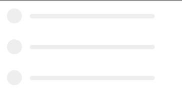
2. Bullet List Style
import { BulletListShimmer } from 'react-content-shimmer'
const YourStyleName = () => {
  return (
    <BulletListShimmer  />
  )
}
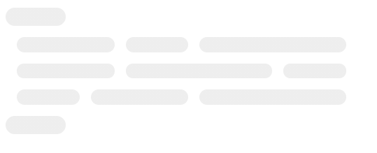
3. Code Style
import { CodeShimmer } from 'react-content-shimmer'
const YourStyleName = () => {
  return (
    <CodeShimmer  />
  )
}
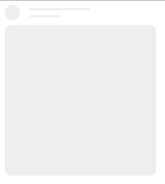
4. Profile Style
import { ProfileShimmer } from 'react-content-shimmer'
const YourStyleName = () => {
  return (
    <ProfileShimmer  />
  )
}

5. Custom Creation
Custom ContentShimmer workes more well with the css or bootstrap classes Create with this Css Tricks will works Awsome 😎 Live Working Example at the Top
import { ContentShimmer } from 'react-content-shimmer'
const YourStyleName = () => {
  return (
    <div className="p-2 d-flex align-items-center">
      <div>
        <div className="p-2 d-flex align-items-center">
          <ContentShimmer size={{ height: 80, width: 80 }} rounded="10%" />
          <div className="p-3">
            <ContentShimmer style={{ marginBottom: "1rem" }} size={{ height: 15, width: 200 }} />
            <ContentShimmer size={{ height: 15, width: 100 }} />
          </div>
        </div>
        <ContentShimmer style={{ marginTop: "1rem" }} rounded={"10px"} size={{ height: 15, width: 350 }} />
        <ContentShimmer style={{ marginTop: "1rem" }} rounded={"10px"} size={{ height: 15, width: 350 }} />
      </div>
    </div>
  )
}
Contact


License
MIT © Tirth886


