Research
Security News
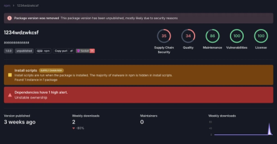
Threat Actor Exposes Playbook for Exploiting npm to Build Blockchain-Powered Botnets
A threat actor's playbook for exploiting the npm ecosystem was exposed on the dark web, detailing how to build a blockchain-powered botnet.
react-country-region-selector
Advanced tools
CountryDropdown and RegionDropdown React components for your forms.
A feature you often need in forms is a connected country and region dropdown, where the region field gets automatically updated when the user selects a country. Coding this is easy of course, but it's a royal pain having to track down all the raw country-region data. This script contains a pair of components to let you add this feature quickly and easily to your forms. It's the React version of this script.
It's pretty versatile:
<CountryDropdown />, <RegionDropdown>) that you can embed in your
DOM wherever you need. That sounded like a vulgar euphemism, but it wasn't, honest.Check out the github pages section for some examples + example JSX code.
Ah, modern web development: so many choices! Here's how to install it with the most common build tools:
npm install react-country-region-selector --save
bower install react-country-region-selector
Just use the dist/rcrs.min.js file.
Here are a few examples in a few different formats.
I figure people not using JSX will know how to remove the JSX from the code below, if not open a ticket and I'll write up a non-JSX example too.
import React from 'react';
import { CountryDropdown, RegionDropdown } from 'react-country-region-selector';


class Example extends React.Component {
  constructor (props) {
    super(props);
    this.state = { country: '', region: '' };
  }

  selectCountry (val) {
    this.setState({ country: val });
  }

  selectRegion (val) {
    this.setState({ region: val });
  }

  render () {
    const { country, region } = this.state;
    return (
      <div>
        <CountryDropdown
          value={country}
          onChange={(val) => this.selectCountry(val)} />
        <RegionDropdown
          country={country}
          value={region}
          onChange={(val) => this.selectRegion(val)} />
      </div>
    );
  }
}
// Up to you to include React + the react-country-region-selector (script tags, commonJS, whatever).
// That's a choice you need to make with your build setup.

var Example = React.createClass({
  getInitialState: function () {
    return {
      region: '',
      country: '',
    };
  },

  selectCountry: function (val) {
    this.setState({ country: val });
  },

  selectRegion: function (val) {
    this.setState({ region: val });
  },

  render () {
    return (
      <div>
        <CountryDropdown
          value={this.state.country}
          onChange={this.selectCountry} />
        <RegionDropdown
          country={this.state.country}
          value={this.state.region}
          onChange={this.selectRegion} />
      </div>
    );
  }
}
define([
  'react',
  'react-country-region-selector'
], function (React, rcrs) {

  var CountryDropdown = rcrs.CountryDropdown;
  var RegionDropdown = rcrs.CountryDropdown;

  var Example = React.createClass({
    getInitialState: function () {
      return {
        region: '',
        country: '',
      };
    },

    selectCountry: function (val) {
      this.setState({ country: val });
    },

    selectRegion: function (val) {
      this.setState({ region: val });
    },

    render () {
      return (
        <div>
          <CountryDropdown
            value={this.state.country}
            onChange={this.selectCountry} />
          <RegionDropdown
            country={this.state.country}
            value={this.state.region}
            onChange={this.selectRegion} />
        </div>
      );
    }
  }

  return Example;
});
<CountryDropdown />
| Parameter | Required? | Default | Type | Description |
|:---|:---:|:---|:---|
| value | Yes | "" | string | The currently selected country. This should either be the shortcode, or the full
country name depending on what you're using for your value attribute (see the valueType option). By default it's
the full country name.|
| onChange | Yes | - | function | Callback that gets called when the user selects a country. Use this to store the
value in whatever store you're using (or just the parent component state). |
| name | No | "rcrs-country" | string | The name attribute of the generated select box. |
| id | No | "" | string | The ID of the generated select box. Not added by default. |
| classes | No | "" | string | Any additional space-separated classes you want to add. |
| showDefaultOption | No | true | boolean | Whether you want to show a default option. |
| defaultOptionLabel | No | "Select Country" | string | The default option label. |
| labelType | No | "full" | string | Either "full" or "short". This governs whether you see country names or
country short codes in the dropdown. |
| valueType | No | "full" | string | Either "full" or "short". This controls the actual value attribute of
each <option> in the dropdown. Please note, if you set this to "short" you will need to let the corresponding
<RegionDropdown /> component know as well, by passing a countryValueType="short" attribute. |
| whitelist | No | [] | array | This setting lets you target specific countries to appear in the dropdown. Only
those specified here will appear. This should be an array of country shortcodes. See the
country-region-data repo for the data and the shortcodes. |
| blacklist | No | [] | array | Lets you target countries that should not appear in the dropdown. Should also
be an array of country shortcodes. |
<RegionDropdown />
| Parameter | Required? | Default | Type | Description |
|:---|:---:|:---|:---|
| countryValue | Yes | "" | string | The currently selected country. |
| value | Yes | "" | string | The currently selected region. |
| onChange | Yes | - | function | Callback that gets called when the user selects a region. Use this to store the
value in whatever store you're using (or just the parent component state). |
| name | No | "rcrs-region" | string | The name attribute of the generated select box. |
| id | No | "" | string | The ID of the generated select box. Not added by default. |
| classes | No | "" | string | Any additional space-separated classes you want to add. |
| blankOptionLabel | No | - | string | The label that appears in the region dropdown when the user hasn't selected
a country yet.|
| showDefaultOption | No | true | boolean | Whether you want to show a default option. This is what the user sees
in the region dropdown after selecting a country. It defaults to the defaultOptionLabel setting (see next). |
| defaultOptionLabel | No | Select Region | string | The default region option. |
| onChange | No | - | function | Called when the user selects a region. Use this to store the region value. |
| countryValueType | No | full | string | If you've changed the country dropdown valueType to short you will need to
set this value to short as well, so the component knows what's being passed in the country property. |
| labelType | No | "full" | string | Either "full" or "short". This governs whether you see region names or
region short codes in the dropdown. |
| valueType | No | "full" | string | Either "full" or "short". This controls the actual value attribute of
each <option> in the dropdown. |
| disableWhenEmpty | No | false | boolean | Disables the region field when the user hasn't selected a country. |
<head>, like so: <meta charset="UTF-8">gulp - regenerate everything.gulp --countries="UK,US" - generate a custom build of the script in the /lib and /dist folder containing only those
countries you specify here. This seriously reduces file size (60KB down to as small as 16KB), so if you can do it, do it.This repo uses the extremely handy react-component-gulp-tasks script for doing most of the gulp tasks (ES6, JSX conversion, UMD file creation, minifications, watchers, etc.). Big thanks to Jed Watson there.
1.0.0 - July 1, 2016 - initial version.MIT.
FAQs
CountryDropdown and RegionDropdown React components for your forms.
The npm package react-country-region-selector receives a total of 26,993 weekly downloads. As such, react-country-region-selector popularity was classified as popular.
We found that react-country-region-selector demonstrated a not healthy version release cadence and project activity because the last version was released a year ago. It has 1 open source maintainer collaborating on the project.
Did you know?

Socket for GitHub automatically highlights issues in each pull request and monitors the health of all your open source dependencies. Discover the contents of your packages and block harmful activity before you install or update your dependencies.

Research
Security News
A threat actor's playbook for exploiting the npm ecosystem was exposed on the dark web, detailing how to build a blockchain-powered botnet.

Security News
NVD’s backlog surpasses 20,000 CVEs as analysis slows and NIST announces new system updates to address ongoing delays.

Security News
Research
A malicious npm package disguised as a WhatsApp client is exploiting authentication flows with a remote kill switch to exfiltrate data and destroy files.