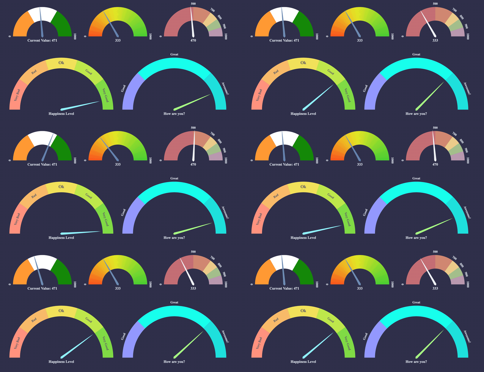
react-d3-speedometer
React library for showing speedometer like gauge using d3.


Note: v2.x is compatible with React v18. v1.x is compatible with React 17. Please use latest v0.x (v0.14.1 at the time of writing) if you are using React 16.

react-d3-speedometer
Getting Started:
Install with yarn or npm.
Yarn:
yarn add react-d3-speedometer
npm:
npm install --save react-d3-speedometer
And, use it like
import ReactSpeedometer from "react-d3-speedometer"
<ReactSpeedometer />
Slim Build:
There is a Slim build available without bundling d3. This project uses d3 micro bundles. If your project also uses d3 microbundles, you can opt for slim build. Necessary d3 dependencies required for slim build to work are - d3-array, d3-color, d3-ease, d3-format, d3-interpolate, d3-scale, d3-selection, d3-shape, d3-transition.
import ReactSpeedometer from "react-d3-speedometer/slim"
<ReactSpeedometer />
Live Examples
Configuration Options:
| prop | type | default | comments |
|---|
| value | Number | 0 | Make sure your value is between your minValue and maxValue |
| minValue | Number | 0 | |
| maxValue | Number | 1000 | |
| segments | Number | 5 | Number of segments in the speedometer. Please note, segments is calculated with d3-ticks which is an approximate count that is uniformly spaced between min and max. Please refer to d3-ticks and d3-array ticks for more detailed info. |
| maxSegmentLabels | Number | value from 'segments' prop | Limit the number of segment labels to displayed. This is useful for acheiving a gradient effect by giving arbitrary large number of segments and limiting the labels with this prop. See Live Example. Please note, maxSegmentLabels is calculated with d3-ticks which is an approximate count that is uniformly spaced between min and max. Please refer to d3-ticks and d3-array ticks for more detailed info. |
| forceRender | Boolean | false | After initial rendering/mounting, when props change, only the value is changed and animated to maintain smooth visualization. But, if you want to force rerender the whole component like change in segments, colors, dimensions etc, you can use this option to force rerender of the whole component on props change. |
| width | Number | 300 | diameter of the speedometer and the width of the svg element |
| height | Number | 300 | height of the svg element. Height of the speedometer is always half the width since it is a semi-circle. For fluid width, please refere to fluidWidth config |
| dimensionUnit | String | px | Default to px for width/height. Possible values - "em" , "ex" , "px" , "in" , "cm" , "mm" , "pt" , ,"pc" ... Please refer to specification for more details |
| fluidWidth | Boolean | false | If true takes the width of the parent component. See Live Example for more details |
| needleColor | String | steelblue | Should be a valid color code - colorname, hexadecimal name or rgb value. Should be a valid input for d3.interpolateHsl |
| startColor | String | #FF471A | Should be a valid color code - colorname, hexadecimal name or rgb value. Should be a valid input for d3.interpolateHsl |
| endColor | String | #33CC33 | Should be a valid color code - colorname, hexadecimal name or rgb value. Should be a valid input for d3.interpolateHsl |
| segmentColors | Array (of colors) | [] | Custom segment colors can be given with this option. Should be an array of valid color codes. If this option is given startColor and endColor options will be ignored. |
| needleTransition | String (JS) / Transition (TS) | easeQuadInOut | d3-easing-identifiers - easeLinear, easeQuadIn, easeQuadOut, easeQuadInOut, easeCubicIn, easeCubicOut, easeCubicInOut, easePolyIn, easePolyOut, easePolyInOut, easeSinIn, easeSinOut, easeSinInOut, easeExpIn, easeExpOut, easeExpInOut, easeCircleIn, easeCircleOut, easeCircleInOut, easeBounceIn, easeBounceOut, easeBounceInOut, easeBackIn, easeBackOut, easeBackInOut, easeElasticIn, easeElasticOut, easeElasticInOut, easeElastic. There is a helper Object/Type 'Transtion', which you can import like import { Transition } from 'react-d3-speedometer' and use it like Transition.easeElastic. This works for both JS and Typescript. For type(script) definitions, please refer here. |
| needleTransitionDuration | Number | 500 | Time in milliseconds. |
| needleHeightRatio | Float (between 0 and 1) | 0.9 | Control the height of the needle by giving a number/float between 0 and 1. Default height ratio is 0.9. |
| ringWidth | Number | 60 | Width of the speedometer ring. |
| textColor | String | #666 | Should be a valid color code - colorname, hexadecimal name or rgb value. Used for both showing the current value and the segment values |
| valueFormat | String | | should be a valid format for d3-format. By default, no formatter is used. You can use a valid d3 format identifier (for eg: d to convert float to integers), to format the values. Note: This formatter affects all the values (current value, segment values) displayed in the speedometer |
| currentValueText | String | ${value} | Should be provided a string which should have ${value} placeholder which will be replaced with current value. By default, current value is shown (formatted with valueFormat). For example, if current Value is 333 if you would like to show Current Value: 333, you should provide a string Current Value: ${value}. See Live Example |
| currentValuePlaceholderStyle | String | ${value} | Should be provided a placeholder string which will be replaced with current value in currentValueTextProp. For example: you can use ruby like interpolation by giving following props - <ReactSpeedometer currentValueText="Current Value: #{value}" currentValuePlaceholderStyle={"#{value}"} />. This is also helpful if you face no-template-curly-in-string eslint warnings and would like to use different placeholder for current value |
| customSegmentStops | Array | [] | Array of values starting at min value, and ending at max value. This configuration is useful if you would like to split the segments at custom points or have unequal segments at preferred values. If the values does not begin and end with min and max value respectively, an error will be thrown. This configuration will override segments prop, since total number of segments will be length - 1 of customSegmentProps. For example, [0, 50, 75, 100] value will have three segments - 0-50, 50-75, 75-100. See Live Example |
| customSegmentLabels | Array<CustomSegmentLabel> | [] | Takes an array of CustomSegmentLabel objects. Each object has following keys for custom rendering of labels - text, fontSize, color, position: OUTSIDE/INSIDE. For position, there is a helper CustomSegmentLabelPosition Object/Type which you can import like import { CustomSegmentLabelPosition } from 'react-d3-speedometer', and use it like CustomSegmentLabelPosition.Inside / CustomSegmentLabelPosition.Outside. This works for both JS and Typescript. For type(script) definitions, please refer here. |
| labelFontSize | String | 14px | Font size for segment labels/legends |
| valueTextFontSize | String | 16px | Font size for current value text |
| valueTextFontWeight | String | bold | Font weight for current value text. Any valid font weight identifier (500, bold etc) can be used. |
| paddingHorizontal | Number | 0 | Provides right/left space for the label text. Takes a number (without explicit unit, unit will be taken from dimensionUnit config which defaults to px). Helpful when using a bigger font size for label texts. |
| paddingVertical | Number | 0 | Provides top/bottom space for the current value label text below the needle. Takes a number (without explicit unit, unit will be taken from dimensionUnit config which defaults to px). Helpful when using a bigger font size for label texts. |
| svgAriaLabel | String | React d3 speedometer | SVG aria-label property for Accessibility purposes |
Examples
You can view Live Examples here
Default with no config - Live Example
<ReactSpeedometer />
<ReactSpeedometer
  maxValue={500}
  value={473}
  needleColor="red"
  startColor="green"
  segments={10}
  endColor="blue"
/>
<ReactSpeedometer
value={333}
segments={5}
segmentColors={[
"#bf616a",
"#d08770",
"#ebcb8b",
"#a3be8c",
"#b48ead",
]}
/>
<ReactSpeedometer
value={777}
currentValueText="Happiness Level"
customSegmentLabels={[
{
text: "Very Bad",
position: "INSIDE",
color: "#555",
},
{
text: "Bad",
position: "INSIDE",
color: "#555",
},
{
text: "Ok",
position: "INSIDE",
color: "#555",
fontSize: "19px",
},
{
text: "Good",
position: "INSIDE",
color: "#555",
},
{
text: "Very Good",
position: "INSIDE",
color: "#555",
},
]}
/>
<ReactSpeedometer
customSegmentStops={[0, 500, 750, 900, 1000]}
segmentColors={["firebrick", "tomato", "gold", "limegreen"]}
value={333}
/>
/>
<div style={{
width: "500px",
height: "300px",
background: "#EFEFEF"
}}>
<ReactSpeedometer
fluidWidth={true}
minValue={100}
maxValue={500}
value={473}
needleColor="steelblue"
/>
</div>
Needle Transition Example - Live Example
<ReactSpeedometer
  value={333}
  needleColor="steelblue"
  needleTransitionDuration={4000}
  needleTransition="easeElastic"
/>
Force Render component on props change - Live Example
<ReactSpeedometer
width={200}
height={200}
/>
<ReactSpeedometer
forceRender={true}
segments={15}
width={500}
height={500}
/>
Needle Height Configuration Example - Live Example
<ReactSpeedometer
  value={333}
  needleHeightRatio={0.7}
/>
You can give a value between 0 and 1 to control the needle height.
<ReactSpeedometer
  value={333}
  maxSegmentLabels={5}
  segments={1000}
/>
FAQ:
-
How to use with nextjs?
react-d3-speedometer uses lodash-es dependency for better tree shaking. For nextjs, please use next-transpile-modules, so that ES module exports from lodash-es package is properly transpiled. You can also nextjs dynamic imports - https://nextjs.org/docs/advanced-features/dynamic-import#with-no-ssr
Please refer to this issue for more details on how to make this library work with next.js - https://github.com/palerdot/react-d3-speedometer/issues/89
-
How to use with React 17?
Please use latest v1.x (v1.0.0 at the time of writing). v1.x is compatible with React 17.
-
How to use with React 16?
Please use latest v0.x (v0.14.x at the time of writing). v0.x is compatible with React 16.
Ports:
Todos:
Tests:
react-d3-speedometer comes with a test suite using enzyme.
npm test
Feature Updates:
-
[v1.0.0] React v17 support. d3 v6 support. Live Example
-
[v0.14.0] valueTextFontWeight config to control font weight of current value
-
[v0.10.0] Custom labels. Live Example
-
[v0.9.0] Typescript support
-
[v0.8.0] paddingHorizontal, paddingVertical configuration to control spacing around text. Live Example
-
[v0.7.0] Custom segment stops. Live Example
-
[v0.6.0] Custom segment colors. Live Example
Changelog:
View Changelog
Credits:
react-d3-speedometer was started as a react port of the following d3 snippet - http://bl.ocks.org/msqr/3202712. Component template was initially bootstrapped with React CDK. Also, many thanks to react and d3 ecosystem contributors.
Contributing:
PRs are welcome. Please create a issue/bugfix/feature branch and create an issue with your branch details. Probably I will create a similar branch in the upstream repo so that PRs can be raised against that branch instead of master. master-v0.x is the main branch for React 16 compatible changes.
Notes
1.x versions are compatible with React & React DOM Versions v17.x0.x versions are compatible with React & React DOM Versions v16.x
For every subsequent major react upgrade, react-d3-speedometer will be bumped to next major versions. For example 1.x will be compatible with React 17.x so on and so forth ...
For similar library for VueJS, please check out vue-speedometer.
For similar library for Svelte, please check out svelte-speedometer.
License:
MIT


