react-date-range


A date library agnostic React component for choosing dates and date ranges. Uses date-fns for date operations.
Notice ⚠️
This project is currently unmaintained because the original maintainers are busy with other things. It should be pretty stable in it's current state but we won't be updating it in the foreseeable future. If you are willing to maintain it, please fork and open a pr adding your fork's link to this readme.
Why should you use react-date-range?
- Stateless date operations
- Highly configurable
- Multiple range selection
- Based on native js dates
- Drag n Drop selection
- Keyboard friendly
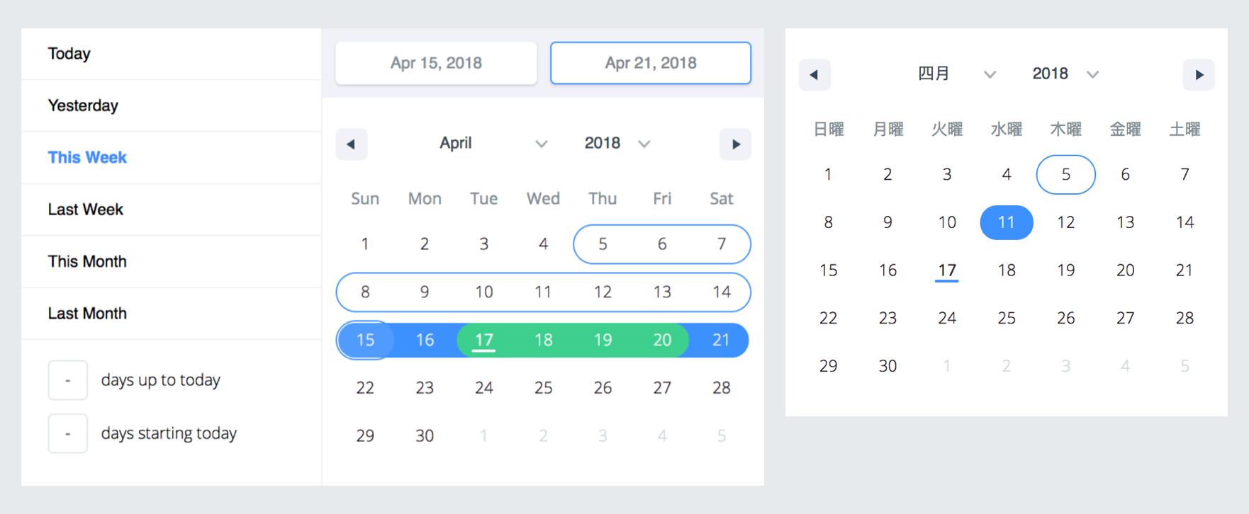
Live Demo : http://hypeserver.github.io/react-date-range
Getting Started
Installation
npm install --save react-date-range
This plugin expects react and date-fns as peerDependencies, It means that you need to install them in your project folder.
npm install --save react date-fns
Usage
You need to import skeleton and theme styles first.
import 'react-date-range/dist/styles.css';
import 'react-date-range/dist/theme/default.css';
DatePicker
import { Calendar } from 'react-date-range';
class MyComponent extends Component {
handleSelect(date){
console.log(date);
}
render(){
return (
<Calendar
date={new Date()}
onChange={this.handleSelect}
/>
)
}
}
DateRangePicker / DateRange
import { DateRangePicker } from 'react-date-range';
class MyComponent extends Component {
handleSelect(ranges){
console.log(ranges);
}
render(){
const selectionRange = {
startDate: new Date(),
endDate: new Date(),
key: 'selection',
}
return (
<DateRangePicker
ranges={[selectionRange]}
onChange={this.handleSelect}
/>
)
}
}
Options
| locale | Object | enUS from locale | you can view full list from here. Locales directly exported from date-fns/locales. |
| className | String | | wrapper classname |
| months | Number | 1 | rendered month count |
| showSelectionPreview | Boolean | true | show preview on focused/hovered dates |
| showMonthAndYearPickers | Boolean | true | show select tags for month and year on calendar top, if false it will just display the month and year |
| rangeColors | String[] | | defines color for selection preview. |
| shownDate | Date | | initial focus date |
| minDate | Date | | defines minimum date. Disabled earlier dates |
| maxDate | Date | | defines maximum date. Disabled later dates |
| direction | String | 'vertical' | direction of calendar months. can be vertical or horizontal |
| disabledDates | Date[] | [] | dates that are disabled |
| disabledDay | Func | | predicate function that disable day fn(date: Date) |
| scroll | Object | { enabled: false } | infinite scroll behaviour configuration. Check out Infinite Scroll section |
| showMonthArrow | Boolean | true | show/hide month arrow button |
| navigatorRenderer | Func | | renderer for focused date navigation area. fn(currentFocusedDate: Date, changeShownDate: func, props: object) |
| ranges | *Object[] | [] | Defines ranges. array of range object |
| moveRangeOnFirstSelection(DateRange) | Boolean | false | move range on startDate selection. Otherwise endDate will replace with startDate unless retainEndDateOnFirstSelection is set to true. |
| retainEndDateOnFirstSelection(DateRange) | Boolean | false | Retain end date when the start date is changed, unless start date is later than end date. Ignored if moveRangeOnFirstSelection is set to true. |
| onChange(Calendar) | Func | | callback function for date changes. fn(date: Date) |
| onChange(DateRange) | Func | | callback function for range changes. fn(changes). changes contains changed ranges with new startDate/endDate properties. |
| color(Calendar) | String | #3d91ff | defines color for selected date in Calendar |
| date(Calendar) | Date | | date value for Calendar |
| showDateDisplay(DateRange) | Boolean | true | show/hide selection display row. Uses dateDisplayFormat for formatter |
| onShownDateChange(DateRange,Calendar) | Function | | Callback function that is called when the shown date changes |
| initialFocusedRange(DateRange) | Object | | Initial value for focused range. See focusedRange for usage. |
| focusedRange(DateRange) | Object | | It defines which range and step are focused. Common initial value is [0, 0]; first value is index of ranges, second one is which step on date range(startDate or endDate). |
| onRangeFocusChange(DateRange) | Object | | Callback function for focus changes |
| preview(DateRange) | Object | | displays a preview range and overwrite DateRange's default preview. Expected shape: { startDate: Date, endDate: Date, color: String } |
| showPreview(DateRange) | bool | true | visibility of preview |
| editableDateInputs(Calendar) | bool | false | whether dates can be edited in the Calendar's input fields |
| dragSelectionEnabled(Calendar) | bool | true | whether dates can be selected via drag n drop |
| calendarFocus(Calendar) | String | 'forwards' | Whether calendar focus month should be forward-driven or backwards-driven. can be 'forwards' or 'backwards' |
| preventSnapRefocus(Calendar) | bool | false | prevents unneceessary refocus of shown range on selection |
| onPreviewChange(DateRange) | Object | | Callback function for preview changes |
| dateDisplayFormat | String | MMM d, yyyy | selected range preview formatter. Check out date-fns's format option |
| dayDisplayFormat | String | d | selected range preview formatter. Check out date-fns's format option |
| weekdayDisplayFormat | String | E | selected range preview formatter. Check out date-fns's format option |
| monthDisplayFormat | String | MMM yyyy | selected range preview formatter. Check out date-fns's format option |
| weekStartsOn | Number | | Whether the week start day that comes from the locale will be overriden. Default value comes from your locale, if no local is specified, note that default locale is enUS |
| startDatePlaceholder | String | Early | Start Date Placeholder |
| endDatePlaceholder | String | Continuous | End Date Placeholder |
| fixedHeight | Boolean | false | Since some months require less than 6 lines to show, by setting this prop, you can force 6 lines for all months. |
renderStaticRangeLabel(DefinedRange) | Function | | Callback function to be triggered for the static range configurations that have hasCustomRendering: true on them. Instead of rendering staticRange.label, return value of this callback will be rendered. |
staticRanges(DefinedRange, DateRangePicker) | Array | default preDefined ranges | - |
inputRanges(DefinedRange, DateRangePicker) | Array | default input ranges | - |
| ariaLabels | Object | {} | inserts aria-label to inner elements |
| dayContentRenderer | Function | null | Function to customize the rendering of Calendar Day. given a date is supposed to return what to render. |
*shape of range:
 {
   startDate: PropTypes.object,
   endDate: PropTypes.object,
   color: PropTypes.string,
   key: PropTypes.string,
   autoFocus: PropTypes.bool,
   disabled: PropTypes.bool,
   showDateDisplay: PropTypes.bool,
 }
**shape of ariaLabels:
{
dateInput: PropTypes.objectOf(
PropTypes.shape({
startDate: PropTypes.string,
endDate: PropTypes.string
})
),
monthPicker: PropTypes.string,
yearPicker: PropTypes.string,
prevButton: PropTypes.string,
nextButton: PropTypes.string,
}
Infinite Scrolled Mode
To enable infinite scroll set scroll={{enabled: true}} basically. Infinite scroll feature is affected by direction(rendering direction for months) and months(for rendered months count) props directly.
If you prefer, you can overwrite calendar sizes with calendarWidth/calendarHeight or each month's height/width with monthWidth/monthHeight/longMonthHeight at scroll prop.
scroll: {
enabled: PropTypes.bool,
monthHeight: PropTypes.number,
longMonthHeight: PropTypes.number,
monthWidth: PropTypes.number,
calendarWidth: PropTypes.number,
calendarHeight: PropTypes.number,
}),
Release workflow
- Merge everything that needs to be in the release to master
- Open a new release PR than:
- bumps version to appropriate one <new_version>
- Update CHANGELOG.md
- Make sure the demo and important features are working as expected
- After merging, tag the master commit with
release/<new_version> and let Github Action handle publishing
- = Profit 🙈
TODOs
- Make mobile friendly (integrate tap and swipe actions)
- Add tests
- Improve documentation


