Research
Security News
Malicious npm Packages Inject SSH Backdoors via Typosquatted Libraries
Socket’s threat research team has detected six malicious npm packages typosquatting popular libraries to insert SSH backdoors.
react-edit-text
Advanced tools
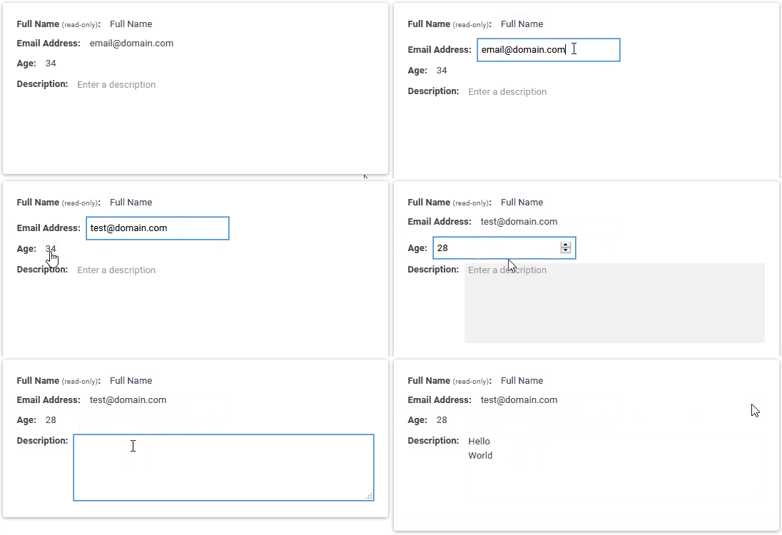
This is an easy-to-use editable text component for React. Simply click on the textbox to edit!
Made with ❤️ by Brian Min

Please visit https://brianmin.com/react-edit-text/ for a live demo and various examples.
npm install react-edit-text --save
npm install @types/react-edit-text --save-dev
Make sure to import the CSS stylesheet before using the component.
import React from 'react';

import { EditText, EditTextarea } from 'react-edit-text';
import 'react-edit-text/dist/index.css';

export default function Example() {
  return (
    <div>
      <EditText showEditButton />
      <EditTextarea />
    </div>
  );
}
| Prop | Type | Required | Default | Description |
|---|---|---|---|---|
| id | string | No | HTML DOM id attribute | |
| name | string | No | HTML input name attribute | |
| className | string | No | HTML class attribute for the display component | |
| inputClassName | string | No | HTML class attribute for the input component | |
| value | string | No | Value of the component | |
| defaultValue | string | No | Default value of the component | |
| placeholder | string | No | '' | Placeholder value |
| formatDisplayText | function | No | (x) => x | Callback function applied on the value to display the formatted value |
| onSave | function | No | Callback function triggered when input is saved | |
| onChange | function | No | Callback function triggered when input is changed | |
| onEditMode | function | No | Callback function triggered when component is clicked | |
| onBlur | function | No | Callback function triggered when input is blurred | |
| style | object | No | Sets CSS style of input and view component | |
| readonly | bool | No | false | Disables the input and only displays the view component |
| Prop | Type | Required | Default | Description |
|---|---|---|---|---|
| type | string | No | 'text' | HTML DOM input text type |
| inline | bool | No | false | Sets inline display |
| showEditButton | bool | No | false | Displays an edit button that can be pressed to enable edit mode |
| editButtonContent | node | No | Sets the content for the edit button. This can be any valid element | |
| editButtonProps | object | No | {} | Sets the props passed to the edit button. This can be any valid DOM attribute |
| Prop | Type | Required | Default | Description |
|---|---|---|---|---|
| rows | number | No | 3 | Number of visible rows |
Contributions are very much appreciated and welcome. Please refer to the contributing guidelines for more details.
MIT © Brian Min
FAQs
Simple editable text component for React
The npm package react-edit-text receives a total of 2,766 weekly downloads. As such, react-edit-text popularity was classified as popular.
We found that react-edit-text demonstrated a not healthy version release cadence and project activity because the last version was released a year ago. It has 1 open source maintainer collaborating on the project.
Did you know?

Socket for GitHub automatically highlights issues in each pull request and monitors the health of all your open source dependencies. Discover the contents of your packages and block harmful activity before you install or update your dependencies.

Research
Security News
Socket’s threat research team has detected six malicious npm packages typosquatting popular libraries to insert SSH backdoors.

Security News
MITRE's 2024 CWE Top 25 highlights critical software vulnerabilities like XSS, SQL Injection, and CSRF, reflecting shifts due to a refined ranking methodology.

Security News
In this segment of the Risky Business podcast, Feross Aboukhadijeh and Patrick Gray discuss the challenges of tracking malware discovered in open source softare.