React element spinner
A customizable loading spinner for React that overlays divs and blocks buttons.
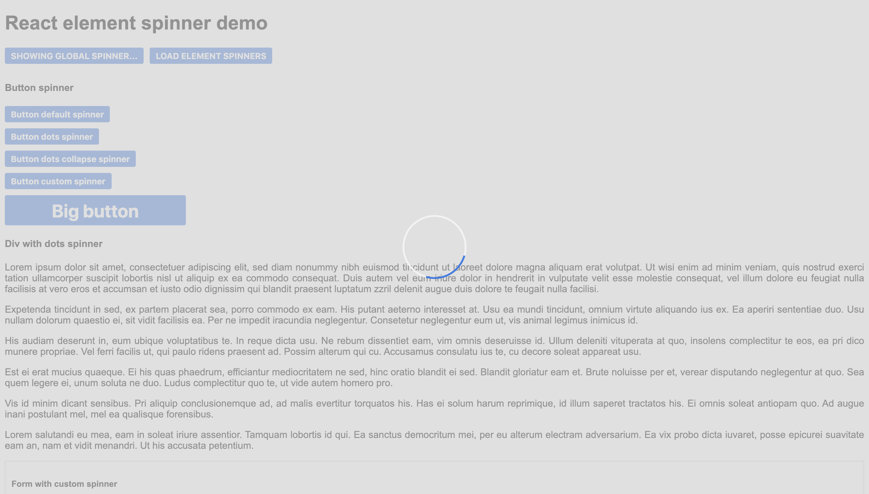
Demo
There is a demo with some examples here.
The repo with the code is this one.
Quick start
This code would create a global spinner, it would block all the page.
import { SpinnerComponent } from 'react-element-spinner';
<SpinnerComponent loading={true} position="global" />
This code would create a spinner that blocks the form.
import { SpinnerComponent } from 'react-element-spinner';

<form>
    <SpinnerComponent loading={true} position="centered" />
    <input type="text" name="address"/>
    <button>SAVE</button>
</form>
This code would create a spinner that blocks the button.
import { SpinnerComponent } from 'react-element-spinner';

<button>
  Button
  <SpinnerComponent loading={true} position="inline" color="#498DFF"/>
</button>

Properties
| Name | Type | Required | Default | Description |
|---|
| loading | boolean | true | - | Whether the spinner has to be shown or not. |
| position | string | true | - | Position of the spinner: "global" for all the page, "centered" to overlay a div and "inline" to be next to the content (for example a button). |
| color | string | false | #3578e5 | Color of the spinner |
| secondaryColor | string | false | #f3f3f3 | Secondary color of the default spinner. |
| backgroundColor | string | false | #d3d3d3 | Color of the background div (only for "centered" and "global"). |
| resize | boolean | false | false | Whether to resize the overlay div or not when dimensions change (only for "centered"). |
| spinnerType | string | false | "default" | Choose one of the three available spinners: "default", "circle-dots" or "circle-dots-collapse". |
| customSpinner | ReactElement | false | undefined | Custom spinner to use instead of the default ones. |
| message | string | false | undefined | Message to show under the spinner. |
Custom styling
The spinner component is easily customizable by overriding its css classes.
| Class | Element |
|---|
| loader-container | The main div. |
| loader | The spinner div. |
| background | The background div. |
| span | The message. |


