Security News
Fluent Assertions Faces Backlash After Abandoning Open Source Licensing
Fluent Assertions is facing backlash after dropping the Apache license for a commercial model, leaving users blindsided and questioning contributor rights.
react-hint
Advanced tools
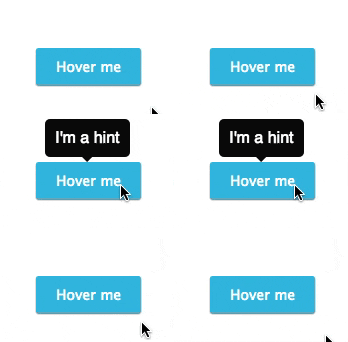
React-hint is a small tooltip component for React which is developed with simplicity and performance in mind. It also plays nicely with Preact and Inferno.


npm i -S react-hint
// React
import React from 'react'
import ReactHintFactory from 'react-hint'
const ReactHint = ReactHintFactory(React)

// Preact
import {h, Component} from 'preact'
import ReactHintFactory from 'react-hint'
const ReactHint = ReactHintFactory({createElement: h, Component})

// Inferno
import Inferno from 'inferno-compat'
import ReactHintFactory from 'react-hint'
const ReactHint = ReactHintFactory(Inferno)

// UMD
const ReactHint = window.ReactHintFactory(window.React)
| ReactHint Property | Type | Default Value | Description |
|---|---|---|---|
| attribute | String | "data-rh" | Allows setting a custom tooltip attribute instead of the default one. |
| autoPosition | Boolean | false | Autopositions tooltips based on closeness to window borders. |
| className | String | "react-hint" | You can override the tooltip style by passing the className property. |
| delay | Number | 0 | The default delay before showing/hiding the tooltip. |
| events | Boolean or {click: Boolean, focus: Boolean, hover: Boolean} | false | Enables/disables all events or a subset of events. |
| onRenderContent | Function | Passing a function which returns a react node allows rendering custom content with attached event handlers. | |
| persist | Boolean | false | Hide the tooltip only on outside click, hover, etc. |
| position | "top", "left", "right", "bottom" | "top" | Allows setting the default tooltip placement. |
| ref | Function | You can pass a function which will get a reference to the tooltip instance. |
| DOM Element Attribute | Type | Default Value | Description |
|---|---|---|---|
| data-rh | String | Sets the tooltip's content. | |
| data-rh-at | "top", "left", "right", "bottom" | "top" | Allows overriding the default tooltip placement. |
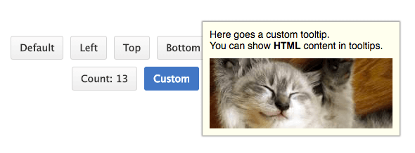
You don't need to include ReactHint in every component which uses tooltips, just include it once in the topmost container component. In case you need to define multiple instances of ReactHint, you can customise the attribute name per instance. ReactHint also supports custom tooltip content with attached event handlers by overriding the content renderer and returning a react node.
import React from 'react'
import {render} from 'react-dom'
import ReactHintFactory from 'react-hint'
import 'react-hint/css/index.css'

const ReactHint = ReactHintFactory(React)
class App extends React.Component {
	onRenderContent = (target, content) => {
		const {catId} = target.dataset
		const width = 240
		const url = `https://images.pexels.com/photos/${catId}/pexels-photo-${catId}.jpeg?w=${width}`

		return <div className="custom-hint__content">
			<img src={url} width={width} />
			<button ref={(ref) => ref && ref.focus()}
				onClick={() => this.instance.toggleHint()}>Ok</button>
		</div>
	}

	render() {
		return <div>
			<ReactHint autoPosition events delay={100} />
			<ReactHint persist
				attribute="data-custom"
				className="custom-hint"
				events={{click: true}}
				onRenderContent={this.onRenderContent}
				ref={(ref) => this.instance = ref} />

			<button data-rh="Default">Default</button>
			<button data-rh="Top" data-rh-at="top">Top</button>
			<button data-rh="Right" data-rh-at="right">Right</button>
			<button data-rh="Bottom" data-rh-at="bottom">Bottom</button>
			<button data-rh="Left" data-rh-at="left">Left</button>

			<button data-custom
				data-custom-at="bottom"
				data-cat-id="10913">Click Me</button>

			<button data-custom
				data-custom-at="bottom"
				data-cat-id="416088">Click Me</button>
		</div>
	}
}

render(<App />, demo)
MIT
FAQs
Tooltip component for React, Preact, Inferno
We found that react-hint demonstrated a not healthy version release cadence and project activity because the last version was released a year ago. It has 1 open source maintainer collaborating on the project.
Did you know?

Socket for GitHub automatically highlights issues in each pull request and monitors the health of all your open source dependencies. Discover the contents of your packages and block harmful activity before you install or update your dependencies.

Security News
Fluent Assertions is facing backlash after dropping the Apache license for a commercial model, leaving users blindsided and questioning contributor rights.

Research
Security News
Socket researchers uncover the risks of a malicious Python package targeting Discord developers.

Security News
The UK is proposing a bold ban on ransomware payments by public entities to disrupt cybercrime, protect critical services, and lead global cybersecurity efforts.