Research
Security News
Kill Switch Hidden in npm Packages Typosquatting Chalk and Chokidar
Socket researchers found several malicious npm packages typosquatting Chalk and Chokidar, targeting Node.js developers with kill switches and data theft.
react-json-explorer
Advanced tools
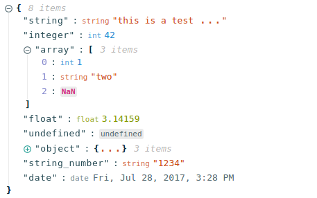
Interactive react component for displaying javascript arrays and JSON objects.
![]()
This namespace is a reference to react-json-view.
RJV is a react component for displaying and editing javascript arrays and JSON objects.
RJV provides a responsive interface for displaying arrays or JSON in a web browser. NPM offers a distribution of the source that's transpiled to ES5; so you can include this component with any web-based javascript application.
Check out the Interactive Demo
// import the react-json-view component
import ReactJson from 'react-json-view'
// use the component in your app!
<ReactJson src={my_json_object} />


Install this component with NPM.
npm install --save react-json-view
Or add to your package.json config file:
"dependencies": {
    "react-json-view": "latest"
}
| Name | Type | Default | Description |
|---|---|---|---|
src | JSON Object | None | This property contains your input JSON |
name | string or false | "root" | Contains the name of your root node. Use null or false for no name. |
theme | string | "rjv-default" | RJV supports base-16 themes. Check out the list of supported themes in the demo. A custom "rjv-default" theme applies by default. |
style | object | {} | Style attributes for react-json-view container. Explicit style attributes will override attributes provided by a theme. |
iconStyle | string | "circle" | Style of expand/collapse icons. Accepted values are "circle", triangle" or "square". |
indentWidth | integer | 4 | Set the indent-width for nested objects |
collapsed | boolean or integer | false | When set to true, all nodes will be collapsed by default. Use an integer value to collapse at a particular depth. |
collapseStringsAfterLength | integer | false | When an integer value is assigned, strings will be cut off at that length. Collapsed strings are followed by an ellipsis. String content can be expanded and collapsed by clicking on the string value. |
enableClipboard | boolean | true | When set to true, the user can copy objects and arrays to clipboard |
displayObjectSize | boolean | true | When set to true, objects and arrays are labeled with size |
displayDataTypes | boolean | true | When set to true, data type labels prefix values |
onEdit | (edit) => {} | false | When a callback function is passed in, edit functionality is enabled. The callback is invoked before edits are completed. Returning false from onEdit will prevent the change from being made. see: onEdit docs |
onAdd | (add) => {} | false | When a callback function is passed in, add functionality is enabled. The callback is invoked before additions are completed. Returning false from onAdd will prevent the change from being made. see: onAdd docs |
onDelete | (delete) => {} | false | When a callback function is passed in, delete functionality is enabled. The callback is invoked before deletions are completed. Returning false from onDelete will prevent the change from being made. see: onDelete docs |
onEdit, onAdd and onDelete props allow users to edit the src variableRJV now supports base-16 themes!
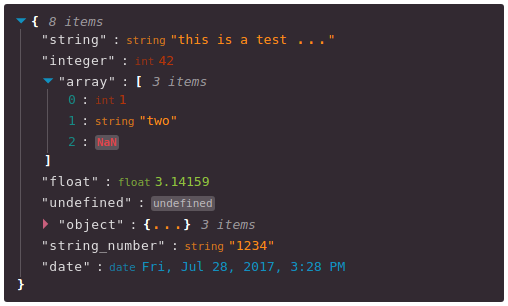
You can specify a theme name or object when you instantiate your rjv component.
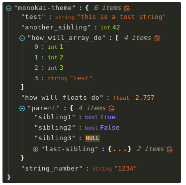
<ReactJson src={my_important_json} theme="monokai" />
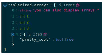
Check out the list of supported themes in the component demo.


You can supply your own base-16 theme object.
To better understand custom themes, take a look at my example implementation and the base-16 theme styling guidelines.
Pass callback methods to onEdit, onAdd and onDelete props. Your method will be invoked when a user attempts to update your src object.
The following object will be passed to your method:
{
    updated_src: src, //new src value
    name: name, //new var name
    namespace: namespace, //list, namespace indicating var location
    new_value: new_value, //new variable value
    existing_value: existing_value, //existing variable value
}
Returning false from a callback method will prevent the src from being affected.
Use Docker to run the source code in a local development environment:
docker build -t react-json-view .sudo to run docker commandscd react-json-view./docker/dev-server.shsudo to run the server fileYour source code will be mounted inside the docker container. The container is built on the latest Node:slim image.
Webpack-dev-server is running in the container and hot-reloading when changes are made locally.
All node modules are installed within the container, so make sure to rebuild your container if you make changes to package.json (see step 2, above).
Development workflow is setup for linux users with Docker installed. You can contribute with other configurations but I have not tested them.
cd react-json-view
npm install
npm run dev:hotI drew a ton of design ideas from react-json-tree. Thanks to the RJT contributors for putting together an awesome component!
I'm also inspired by users who come up with interesting feature requests. Reach out to me with ideas for this project or other projects you want to collaborate on. My email address is listed on my github user page.
onEdit, onAdd and onDelete propsFAQs
Interactive react component for displaying javascript arrays and JSON objects.
The npm package react-json-explorer receives a total of 2 weekly downloads. As such, react-json-explorer popularity was classified as not popular.
We found that react-json-explorer demonstrated a not healthy version release cadence and project activity because the last version was released a year ago. It has 1 open source maintainer collaborating on the project.
Did you know?

Socket for GitHub automatically highlights issues in each pull request and monitors the health of all your open source dependencies. Discover the contents of your packages and block harmful activity before you install or update your dependencies.

Research
Security News
Socket researchers found several malicious npm packages typosquatting Chalk and Chokidar, targeting Node.js developers with kill switches and data theft.

Security News
pnpm 10 blocks lifecycle scripts by default to improve security, addressing supply chain attack risks but sparking debate over compatibility and workflow changes.

Product
Socket now supports uv.lock files to ensure consistent, secure dependency resolution for Python projects and enhance supply chain security.