
Research
Security News
Kill Switch Hidden in npm Packages Typosquatting Chalk and Chokidar
Socket researchers found several malicious npm packages typosquatting Chalk and Chokidar, targeting Node.js developers with kill switches and data theft.
react-mobile-datepicker
Advanced tools
a lightweight react date picker for mobile, Not more than 4k
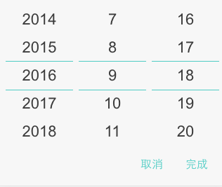
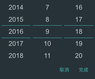
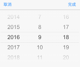
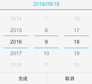
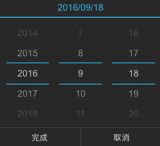
react-mobile-datepicker provides a component that can set year, month and day by sliding up or down.
Using npm:
$ npm install react-mobile-datepicker --save
The following guide assumes you have some sort of ES2015 build set up using babel and/or webpack/browserify/gulp/grunt/etc.
// Using an ES6 transpiler like Babel
import  React from 'react';
import ReactDOM from 'react-dom';
import DatePicker from 'react-mobile-datepicker';
class App extends React.Component {
	state = {
		time: new Date(),
		isOpen: false,
	}

	handleClick = () => {
		this.setState({ isOpen: true });
	}

	handleCancel = () => {
		this.setState({ isOpen: false });
	}

	handleSelect = (time) => {
		this.setState({ time, isOpen: false });
	}

	render() {
		return (
			<div className="App">
				<a
					className="select-btn"
					onClick={this.handleClick}>
					select time
				</a>

				<DatePicker
					value={this.state.time}
					isOpen={this.state.isOpen}
					onSelect={this.handleSelect}
					onCancel={this.handleCancel} />
			</div>
		);
	}
}


ReactDOM.render(<App />, document.getElementById('react-box'));
| Property | Type | Default | Description |
|---|---|---|---|
| isPopup | Boolean | true | whether as popup add a overlay |
| isOpen | Boolean | false | whether to open datepicker |
| theme | String | default | theme of datepicker, include 'default', 'dark', 'ios', 'android', 'android-dark' |
| dateFormat | Array | ['YYYY', 'M', 'D'] | according to year, month, day format specified display text. E.g ['YYYY年', 'MM月', 'DD日'] |
| value | Date | new Date() | date value |
| min | Date | new Date(1970, 0, 1) | minimum date |
| max | Date | new Date(2050, 0, 1) | maximum date |
| onSelect | Function | () => {} | the callback function after click button of done, Date object as a parameter |
| onCancel | Function | () => {} | the callback function after click button of cancel |
Anyone and everyone is welcome to contribute to this project. The best way to start is by checking our open issues, submit a new issues or feature request, participate in discussions, upvote or downvote the issues you like or dislike.
FAQs
一个移动端时间选择器react组件
The npm package react-mobile-datepicker receives a total of 4,925 weekly downloads. As such, react-mobile-datepicker popularity was classified as popular.
We found that react-mobile-datepicker demonstrated a not healthy version release cadence and project activity because the last version was released a year ago. It has 1 open source maintainer collaborating on the project.
Did you know?

Socket for GitHub automatically highlights issues in each pull request and monitors the health of all your open source dependencies. Discover the contents of your packages and block harmful activity before you install or update your dependencies.

Research
Security News
Socket researchers found several malicious npm packages typosquatting Chalk and Chokidar, targeting Node.js developers with kill switches and data theft.

Security News
pnpm 10 blocks lifecycle scripts by default to improve security, addressing supply chain attack risks but sparking debate over compatibility and workflow changes.

Product
Socket now supports uv.lock files to ensure consistent, secure dependency resolution for Python projects and enhance supply chain security.