
Research
Security News
Malicious npm Packages Inject SSH Backdoors via Typosquatted Libraries
Socket’s threat research team has detected six malicious npm packages typosquatting popular libraries to insert SSH backdoors.
react-native-action-view
Advanced tools
Native container view for enabling swipe actions (for example to enable swipe to delete and such)
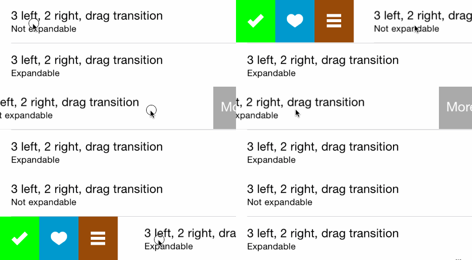
react-native-action-view is an easy to use component that allows displaying swipeable buttons with a variety of transitions.
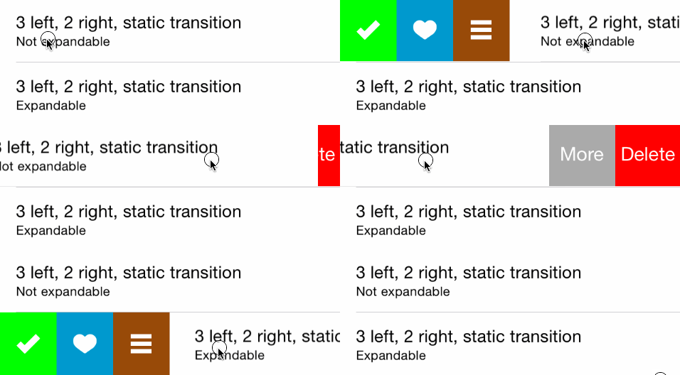
Import the component:
import { SwipeActionView } from 'react-native-action-view';
Use the component:
<SwipeActionView rightExpansionSettings={{buttonIndex: 0}}
                 leftExpansionSettings={{buttonIndex: 0}}
                 rightButtons={[{title: 'Red', color: 'rgb(255, 0, 0)', callback: () => {alert('Red button tapped.');}},
                                {title: 'Green', color: 'rgb(0, 255, 0)', callback: () => {alert('Green button tapped.');}},
                                {title: 'Blue', color: 'rgb(0, 0, 255)', callback: () => {alert('Blue button tapped.');}}]}
                 leftButtons={[{title: 'Red', color: 'rgb(255, 0, 0)', callback: () => {alert('Red button tapped.');}},
                                {title: 'Green', color: 'rgb(0, 255, 0)', callback: () => {alert('Green button tapped.');}},
                                {title: 'Blue', color: 'rgb(0, 0, 255)', callback: () => {alert('Blue button tapped.');}}]}
                >
  <Text style={styles.welcome}>
    Welcome to React Native!
  </Text>
  <Text style={styles.instructions}>
    To get started, swipe this view.
  </Text>
  <Text style={styles.instructions}>
    Tap on a button or swipe fully.
  </Text>
</SwipeActionView>
Possible props are:
leftButtons, rightButtons
title or image, color, callbackleftExpansionSettings, rightExpansionSettings - Control the button expansion settings
buttonIndex - The button to expand (Number)fillOnTrigger - Whether to fill the button upon expansion (Boolean)threshold - The treshold, in points, before expansion begins (Number)leftSwipeSettings, rightSwipeSettings - Control swipe settings
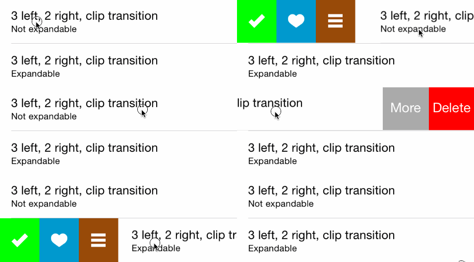
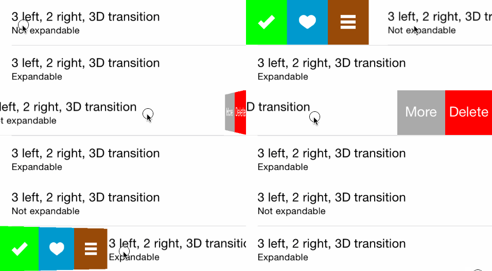
transition - The transition type (String)
"static" (default), "border", "drag", "clipCenter", "rotate3d", "grow"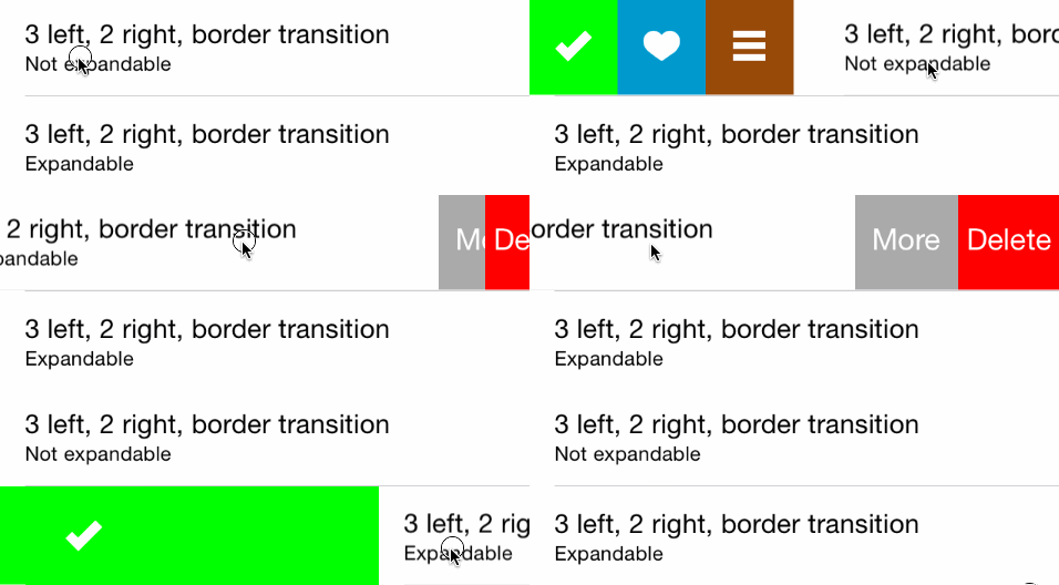

FAQs
Native container view for enabling swipe actions (for example to enable swipe to delete and such)
The npm package react-native-action-view receives a total of 30 weekly downloads. As such, react-native-action-view popularity was classified as not popular.
We found that react-native-action-view demonstrated a not healthy version release cadence and project activity because the last version was released a year ago. It has 7 open source maintainers collaborating on the project.
Did you know?

Socket for GitHub automatically highlights issues in each pull request and monitors the health of all your open source dependencies. Discover the contents of your packages and block harmful activity before you install or update your dependencies.

Research
Security News
Socket’s threat research team has detected six malicious npm packages typosquatting popular libraries to insert SSH backdoors.

Security News
MITRE's 2024 CWE Top 25 highlights critical software vulnerabilities like XSS, SQL Injection, and CSRF, reflecting shifts due to a refined ranking methodology.

Security News
In this segment of the Risky Business podcast, Feross Aboukhadijeh and Patrick Gray discuss the challenges of tracking malware discovered in open source softare.