Security News
Fluent Assertions Faces Backlash After Abandoning Open Source Licensing
Fluent Assertions is facing backlash after dropping the Apache license for a commercial model, leaving users blindsided and questioning contributor rights.
react-native-alert-pro
Advanced tools
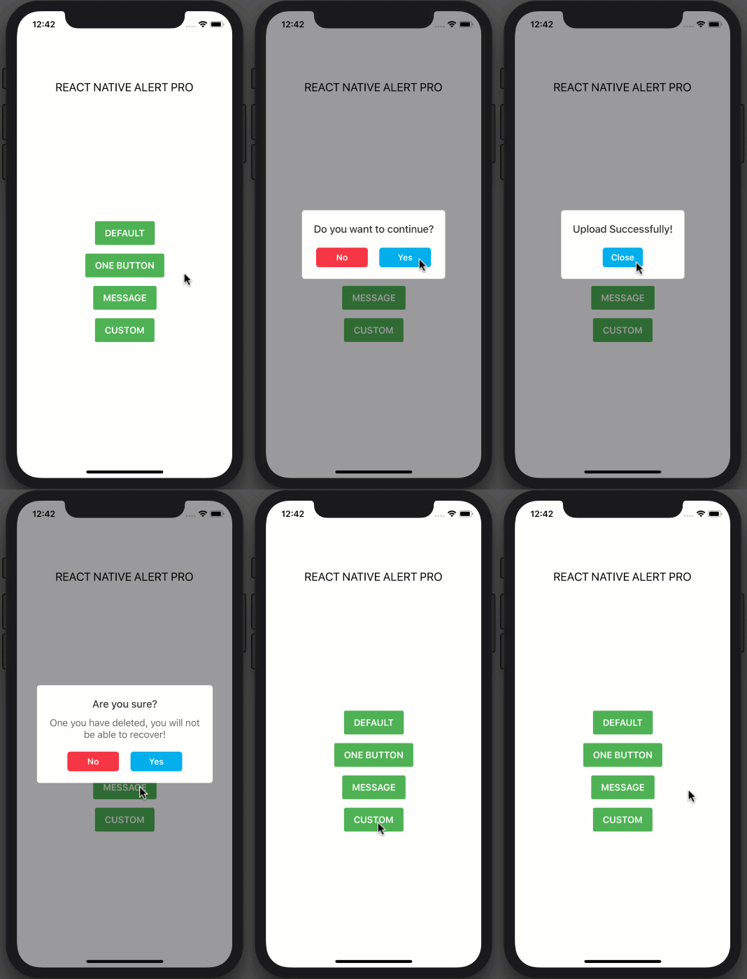
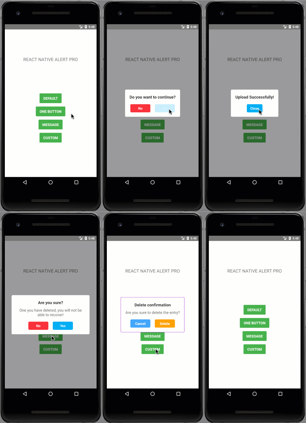
| iOS | Android |
|---|---|
 |  |
npm i react-native-alert-pro --save
yarn add react-native-alert-pro
import React, { Component } from "react";
import { StyleSheet, View, TouchableOpacity, Text } from "react-native";
import AlertPro from "react-native-alert-pro";

class Example extends Component {
  render() {
    return (
      <View style={styles.container}>
        <Text style={styles.title}>REACT NATIVE ALERT PRO</Text>
        <View style={styles.buttonContainer}>
          <TouchableOpacity
            onPress={() => this.AlertPro.open()}
            style={styles.button}
          >
            <Text style={styles.text}>CUSTOM</Text>
          </TouchableOpacity>
        </View>

        <AlertPro
          ref={ref => {
            this.AlertPro = ref;
          }}
          onConfirm={() => this.AlertPro.close()}
          title="Delete confirmation"
          message="Are you sure to delete the entry?"
          textCancel="Cancel"
          textConfirm="Delete"
          customStyles={{
            mask: {
              backgroundColor: "transparent"
            },
            container: {
              borderWidth: 1,
              borderColor: "#9900cc",
              shadowColor: "#000000",
              shadowOpacity: 0.1,
              shadowRadius: 10
            },
            buttonCancel: {
              backgroundColor: "#4da6ff"
            },
            buttonConfirm: {
              backgroundColor: "#ffa31a"
            }
          }}
        />
      </View>
    );
  }
}

const styles = StyleSheet.create({
  container: {
    flex: 1,
    alignItems: "center",
    backgroundColor: "#fff"
  },
  title: {
    fontSize: 20,
    marginTop: 120
  },
  buttonContainer: {
    flex: 1,
    alignItems: "center",
    justifyContent: "center",
    backgroundColor: "#FFFFFF"
  },
  button: {
    backgroundColor: "#4EB151",
    paddingVertical: 11,
    paddingHorizontal: 17,
    borderRadius: 3,
    marginBottom: 15
  },
  text: {
    color: "#FFFFFF",
    fontSize: 16,
    fontWeight: "600"
  }
});

export default Example;
renderItem = (item, index) => (
    <View>
      <Button title=`OPEN AlertPro-${index}` onPress={() => this[AlertPro + index].open()} />
      <AlertPro
        ref={ref => {
          this[AlertPro + index] = ref;
        }}
        title=`AlertPro-${index}`
        onConfirm={() => () => this[AlertPro + index].close()}
      />
    </View>
  );
| Prop | Type | Description | Default |
|---|---|---|---|
| title | string | AlertPro's title | "Do you want to continue?" |
| message | string | AlertPro's message | "" |
| showCancel | boolean | Show a Cancel button | true |
| showConfirm | boolean | Show a Confirm button | true |
| textCancel | string | Text display on Cancel button | "No" |
| textConfirm | string | Text display on Confirm button | "Yes" |
| closeOnPressMask | boolean | Close AlertPro when press on mask (The empty space area) | true |
| closeOnPressBack | boolean | Press back android to close Bottom Sheet (Android only) | true |
| useNativeDriver | boolean | Allowing native code to perform the animation | false |
| customStyles | object | Custom style to AlertPro | {} |
| onCancel | function | Event on Cancel button | null |
| onConfirm | function | Event on Confirm button | null |
| onClose | function | Callback function when AlertPro has closed | null |
customStyles: {
  title: {...}, // AlertPro's title
  message: {...}, // AlertPro's message
  mask: {...}, // The empty space area
  container: {...}, // AlertPro container
  buttonCancel: {...}, // Cancel button
  buttonConfirm: {...}, // Confirm button
  textCancel: {...}, // Cancel button's Text
  textConfirm: {...} // Confirm button's Text

}
| Method Name | Description |
|---|---|
| open | Open AlertPro |
| close | Close AlertPro |
Always set ref to AlertPro and call each method by using this.AlertPro.methodName() like example above.
If you think this project is helpful just give me a ⭐️ Star is enough because i don't drink coffee :D
This project is licensed under the MIT License - see the LICENSE.md file for details
Made with ❤️ by NY Samnang.
FAQs
The Pro Version of React Native Alert (Android & iOS)
The npm package react-native-alert-pro receives a total of 38 weekly downloads. As such, react-native-alert-pro popularity was classified as not popular.
We found that react-native-alert-pro demonstrated a not healthy version release cadence and project activity because the last version was released a year ago. It has 1 open source maintainer collaborating on the project.
Did you know?

Socket for GitHub automatically highlights issues in each pull request and monitors the health of all your open source dependencies. Discover the contents of your packages and block harmful activity before you install or update your dependencies.

Security News
Fluent Assertions is facing backlash after dropping the Apache license for a commercial model, leaving users blindsided and questioning contributor rights.

Research
Security News
Socket researchers uncover the risks of a malicious Python package targeting Discord developers.

Security News
The UK is proposing a bold ban on ransomware payments by public entities to disrupt cybercrime, protect critical services, and lead global cybersecurity efforts.